Happy Monday friends!
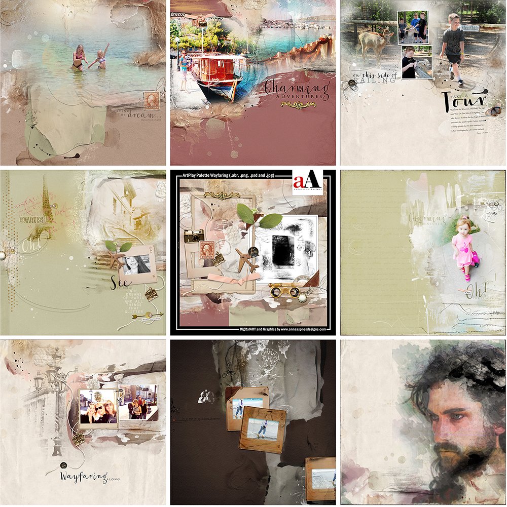
I hope you had a wonderful weekend. The [aalogo] Gallery is full of new inspiration from the [aalogo] Creative Team using ArtPlay Palette Wayfaring and supporting DigitalART products.
You can view the entire release here for a limited time.
Click on the image below to view more gallery inspiration, or visit the AnnaTeam Layouts board on Pinterest.
Gallery HighLights. Click on the images to access complete digital supply lists, plus process notes on how each team member put their pages together.
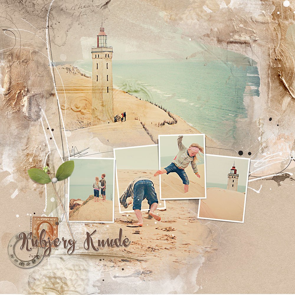
Rubjerg Knude | Ulla-May
1. Create an Extraction. I love how Ulla-May has used the frames to showcase her extracted images. Learn how to use a Layer Mask to extract photos in Photoshop and Elements in the upcoming AnnaBlendz LIVE workshop in October.
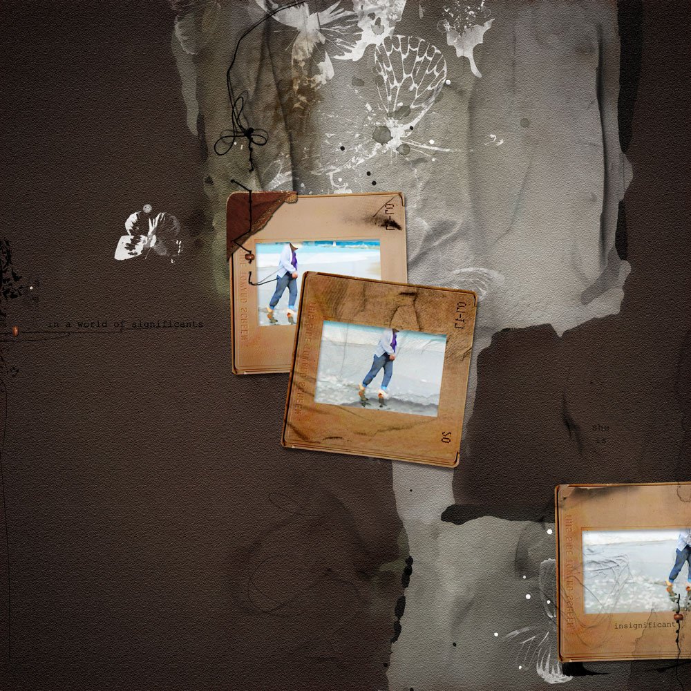
Insignificant| Adryane
2. Embellish Frames. Clip brush layers to different elements, such as the frames in Adryane’s layout, then apply blending modes of your choice to create depth and texture.
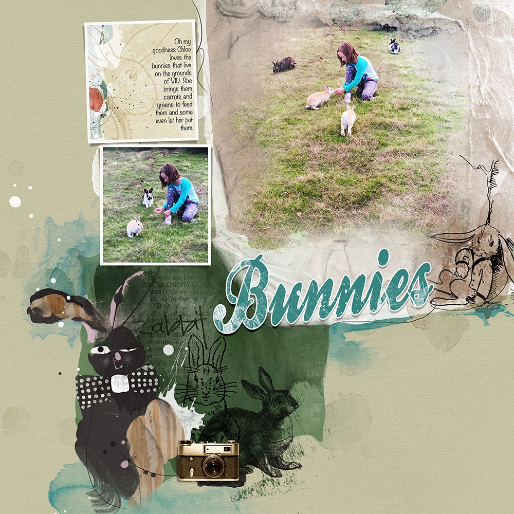
Bunnies | Heather
3. Introduce Color. Add an unexpected color to your page to better co-ordinate with your photos. Heather had add a blue title and stains to her layout to better support the color palette of her images.
