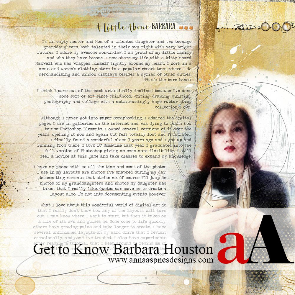
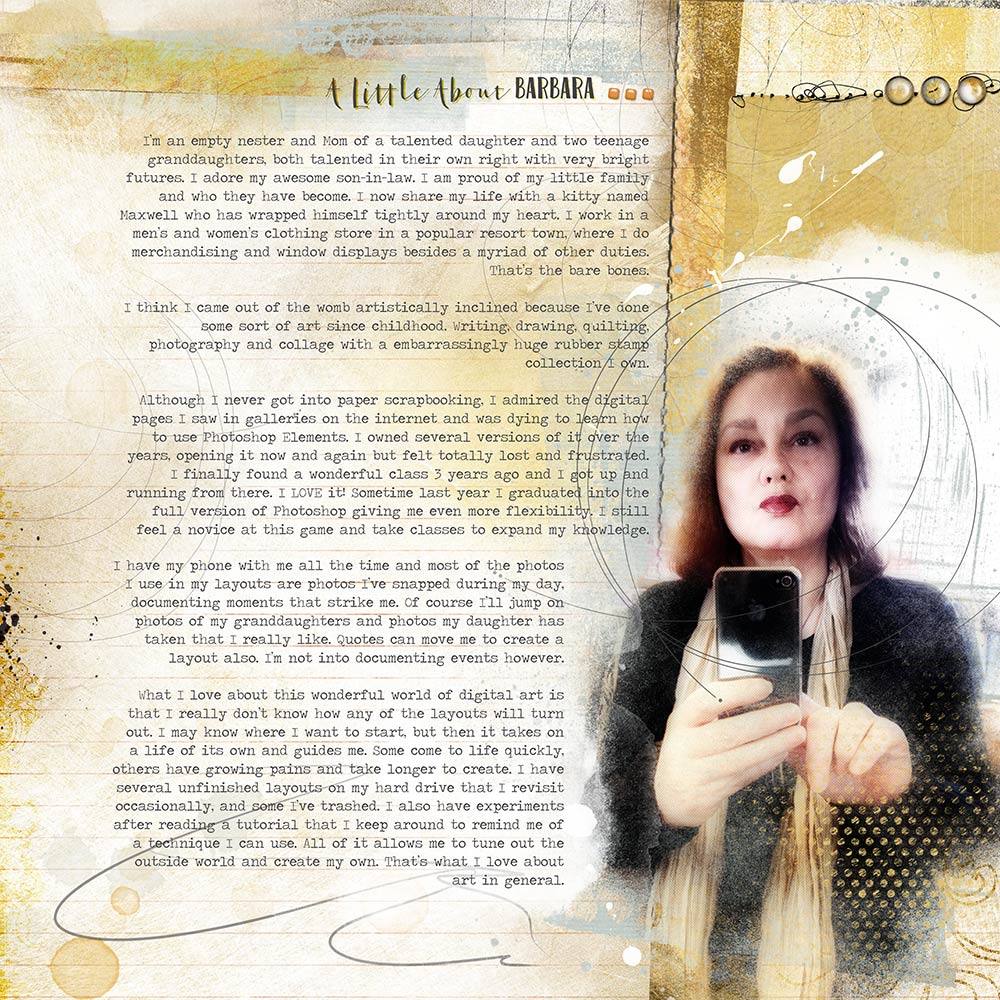
Today we are getting to know aA Creative Team Member Barbara Houston.
Art has always been a solace in my life, I couldn’t exist without it. As Mark Twain said, “The most important days of your life are the day you are born and the day you find out why.” Creating is my ‘why’ in life. I unintentionally turned my back on art for a time and found myself becoming frustrated with life in general. An artist friend of mine told me that not to do art wasn’t good for me and I should turn to it once again. She was right.
aA Creative Team Member Barbara Houston
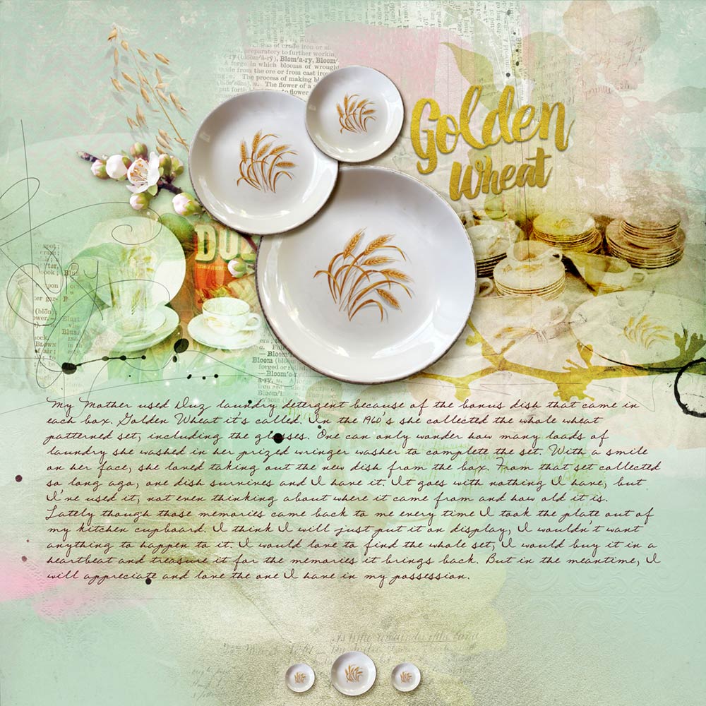
Sometimes a layout is inspired by a memory. This wheat dish is the only one left of my Mother’s Duz laundry detergent collection. I use it all the time, mostly not thinking where it came from or who had owned it, until one day it hit me and I felt the need to commemorate it. I extracted the plate from a photo I took of it and to show the story, I found the other two photos on the internet.
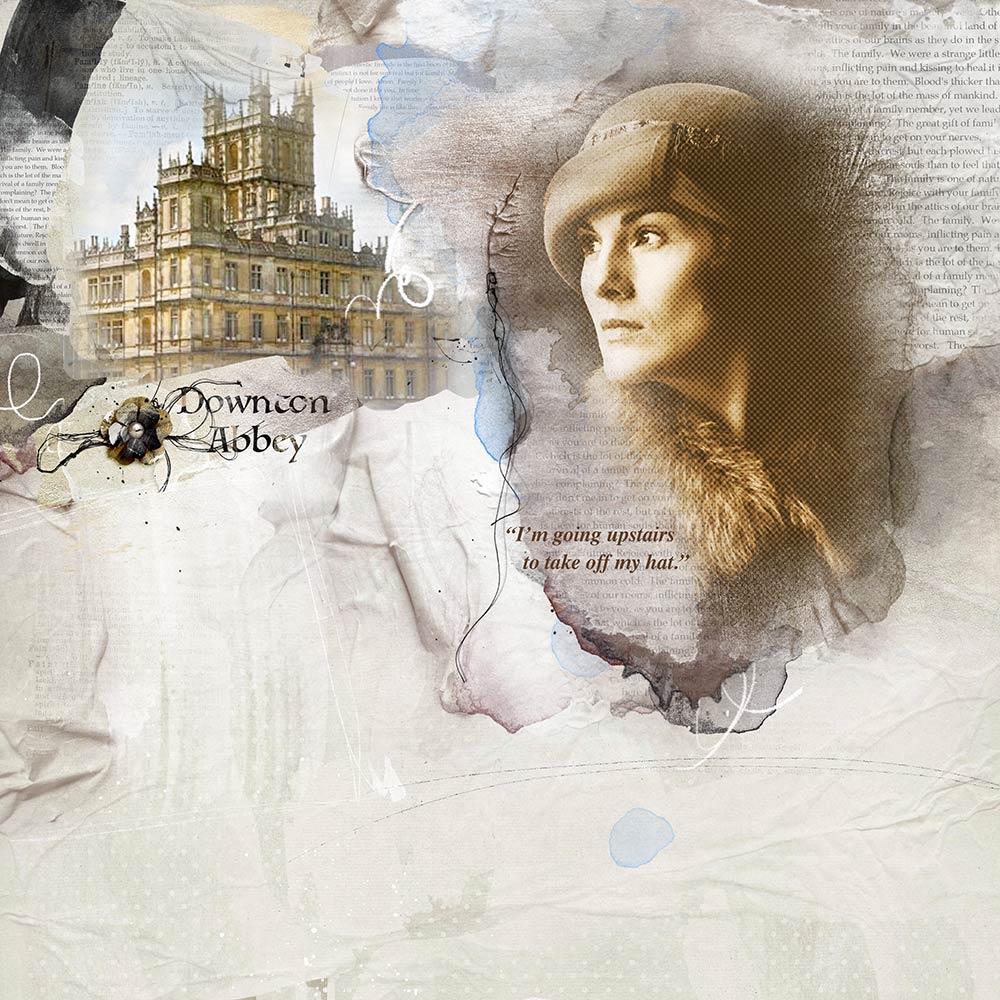
Television shows can inspire a layout. Downtown Abbey is one of my all time favorite series and I hated when it ended last year. There are so many memorable lines in the episodes that are worth writing down and this was one Mary said that really struck me. Using one of my favorite kits, ArtPlay Palette Family, I dabbled with filters on the photo of Mary.
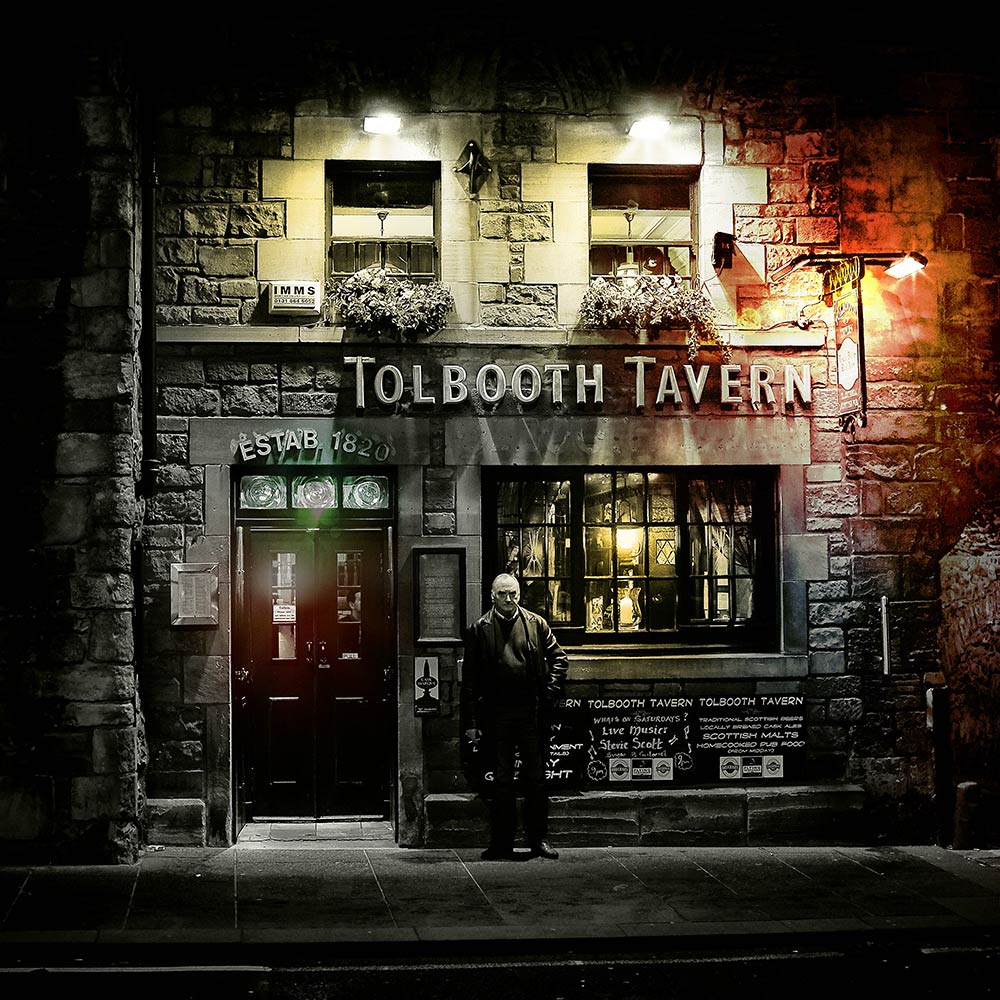
I wasn’t intending to do a layout, just play. I had downloaded this photo from MorgueFile really not knowing what I was going to do with it. I just knew I loved that old man standing in front of the tavern obviously in a mood. Opening it in Photoshop one afternoon, I decided to find out how the FotoGlows would work with the lights in the photo. Using Blending Modes, this is how it came out and I was happy with that.
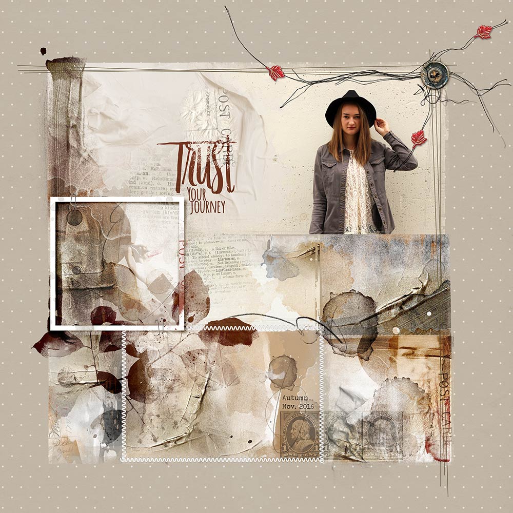
This is one of my favorite pages. Using a photo of my Granddaughter Autumn, I followed this wonderful tutorial by Fiona Applechick. With this layout I loosened up a bit with the photo. It sometimes bothers me that I allow the photo to rule and not the idea behind the layout. By that I mean, should I be able to be creative with the photo if it would make a better page? I duplicated the photo a couple of more times and blended it with transfers, giving a more artsy look to the photo and it was freeing.
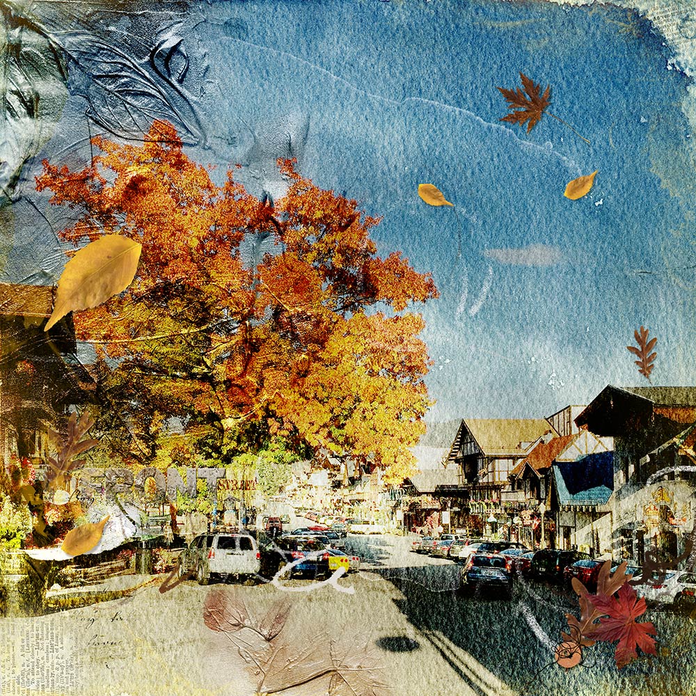
I love the autumn colors and this particular tree in town. I used Photoshop filters and because its a full page photo layout I didn’t want to put the title in the sky because it represented the white space to me. My solution was to hide the title within the ‘busy-ness’ of the photo itself clipping transfers to the font I used.
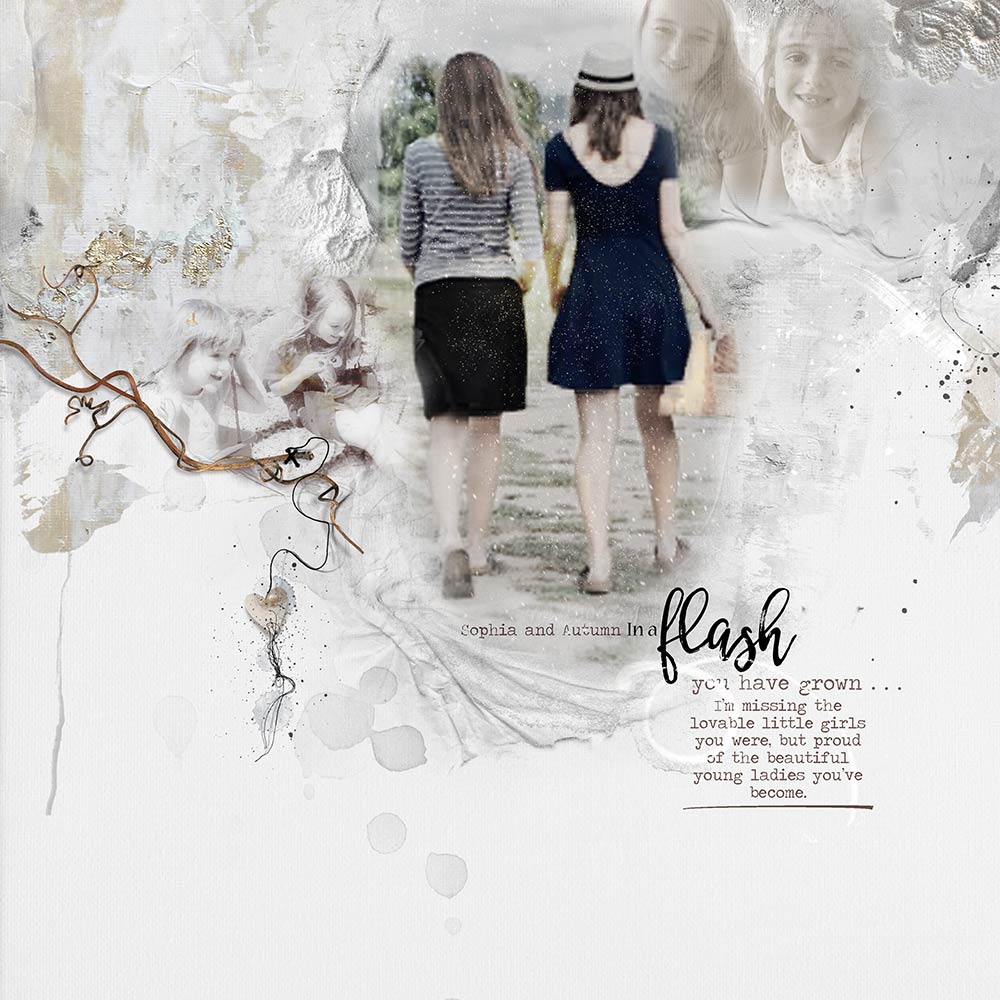
The idea behind this layout was the lamenting of the seemingly quick passage of time, especially when it comes to my Granddaughters. The focal photo is very poor quality, but it doesn’t bother me, because it’s the idea, sentiment, that is the most important to me. Life isn’t perfect and neither are photos and sometimes you have to use what you got.
It’s all about the love of the process for me, to watch the thing grow and reveal itself as I move something here or there, play with Blending Modes, or put an element in to try out. There’s nothing like the surprise and excitement of seeing an experiment work out better than expected, and the learning from failures. It’s best for me to walk away from the finished layout for a day to return to it with fresh eyes when I see things I missed before that I might want to correct, or just say it’s truly done.





Thanks for sharing your layouts and parts of your life, Barbara. You do the most gorgeous layouts and one of my favoriter is the one with your granddaughter Autumn. It’s stunning in every way.
Thanks for sharing Barbara! I love your work.
It is so nice to learn more about who you are and the explanations about your wonderful artwork. I don’t have a favorite really, I just love them all. Some of the pages that you do with your granddaughters strike me the most as I have many grandchildren that I love to do pages about. Such a wonderful collection you have!!
Thanks for sharing Barbara, I have always loved your work and am often inspired by one of your layouts.
So nice to get to know you better Barbara!! I adore your art and thank you for sharing your process with us!
I love Barbara’s work. It’s always inspriring!
Love learning more about you! Your artwork is inspirational!
Thank you so much for this Barbara. Your work is so varied, creative and beautiful. My favorite is the one of your granddaughters, in which you so aptly, and beautifully, evoked that swift passage of time that we so often take for granted.
Most of all though, I enjoyed reading of all the places you find inspiration! You are truly an artist and you see the world with the incredible enhancements of creativity.
Thanks for sharing Barbara! Love your pages .. they are so inspiring for me.
Thank you so much ladies, your comments mean so much to me, you have no idea! It makes my heart sing to know that I inspire such a wonderful, creative community. It always takes me by surprise. 😀
I love this Barbara, learning more about you and your wonderful art! The Tolbooth Tavern is in Edinburgh so if you are ever thinking of visiting Scotland we can visit it for real 🙂 Thank you for sharing!
Barbara thanks for telling your Story, it was very interesting. I love your Art but there is one page I love the most and that’s The Tolbooth Tavern, this page is really amazing in all it’s ways, I hope you will hang it on your wall. It’s great to know a little more about you now.