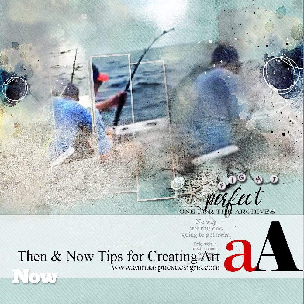
As part of the 5 years of Anna Aspnes Designs at Oscraps celebrations, members of the Creative Team, are looking back at their art practice and sharing FIVE things they’ve learned or ways they’ve grown over the years.
Here’s what Laura sees when she looks at creating ART Then and Now.
Creating ART Then and Now
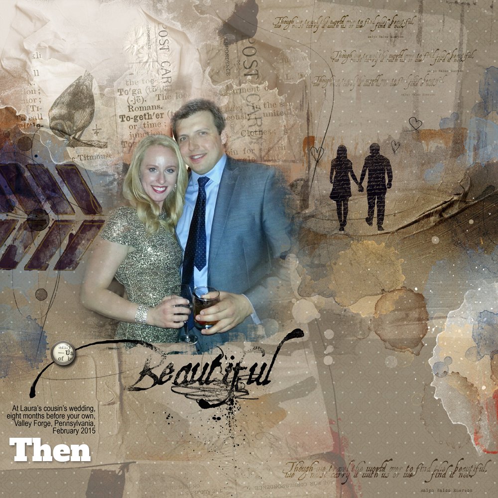
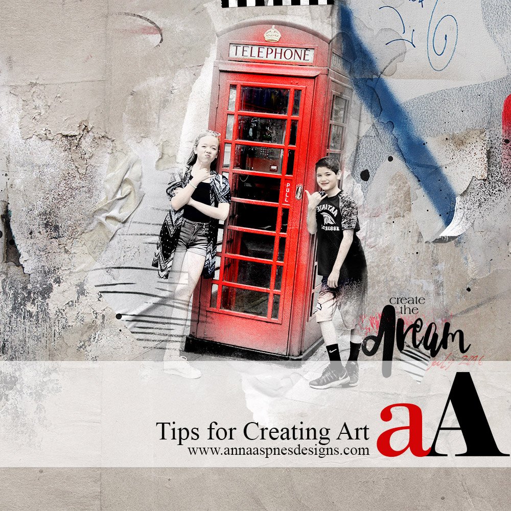
Here’s a layout I created 5 years ago.
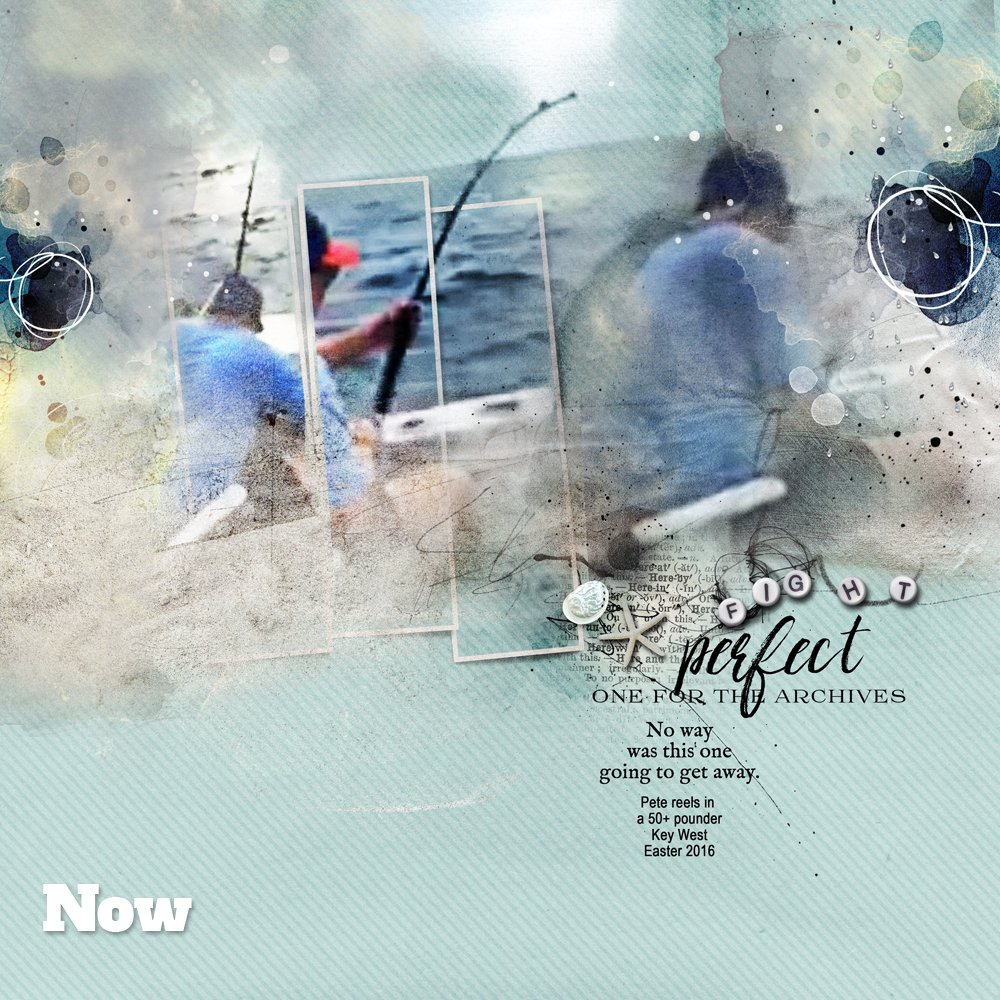
And one I created more recently.
5 Things I’ve Learned
1. Not every photo is a good candidate for blending. Photos with close crops in particular can come out looking awkward, especially if, when blended, they appear to be floating off the page. Now I am much more choosy about what I frame and what I blend. And sometimes the way out of a sticky spot is to both frame and blend so you get the soft edges plus the anchoring effect of a frame.
2. Just because I like an element doesn’t mean it belongs on the page. For me this pertains especially to birds, which I tend to try to sneak in everywhere. Now I try to focus on using only the elements that actually reinforce the story I’m trying to tell.
3. Flow can be a tricky thing. If patterns, textures, stains, word art, and elements go every which way, so will your eye. Now I try to be a bit more intentional with the flow of a design and really try hard to resist the temptation to go all over the place (see #2).
4. Good vibes can come from bad photos. I used to trash poor-quality photos, but now I work with the imperfections, layering up the photos with textures, transfers, and stains to create all sorts of nifty effects.
5. The internal ART critic CAN be silenced! No more getting all hot and bothered for me. If a layout isn’t working, I just close the cover of my laptop, take a walk, think about the story I’m trying to tell—and WHY—and let nature reshuffle my priorities. Works almost every time.





Recent Comments