As part of the 5 years of Anna Aspnes Designs at Oscraps celebrations, members of the Creative Team, are looking back at their art practice and sharing FIVE things they’ve learned or ways they’ve grown over the years.
Here is Marianne’s creating ART then and now tips.
Creating ART Then and Now Tips
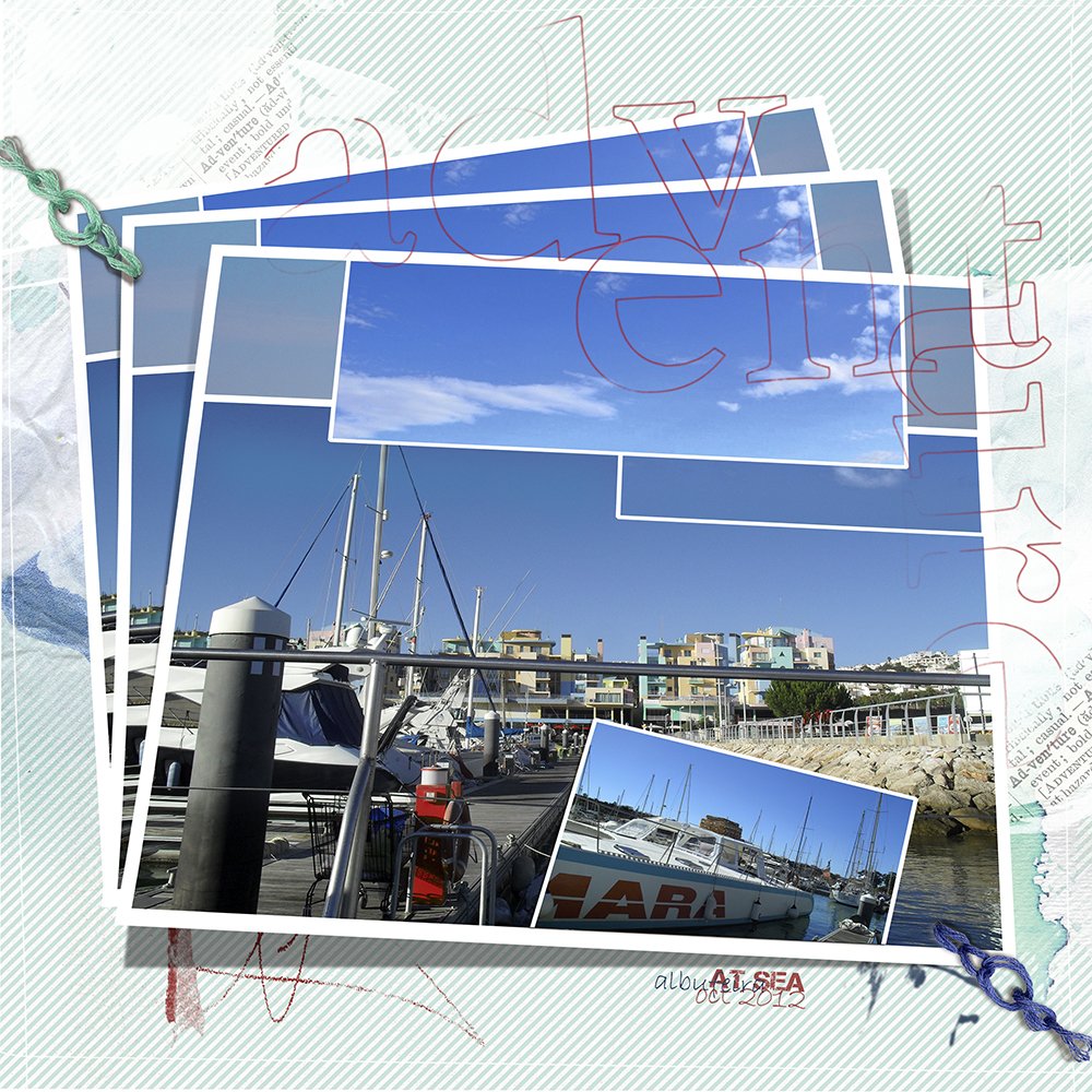
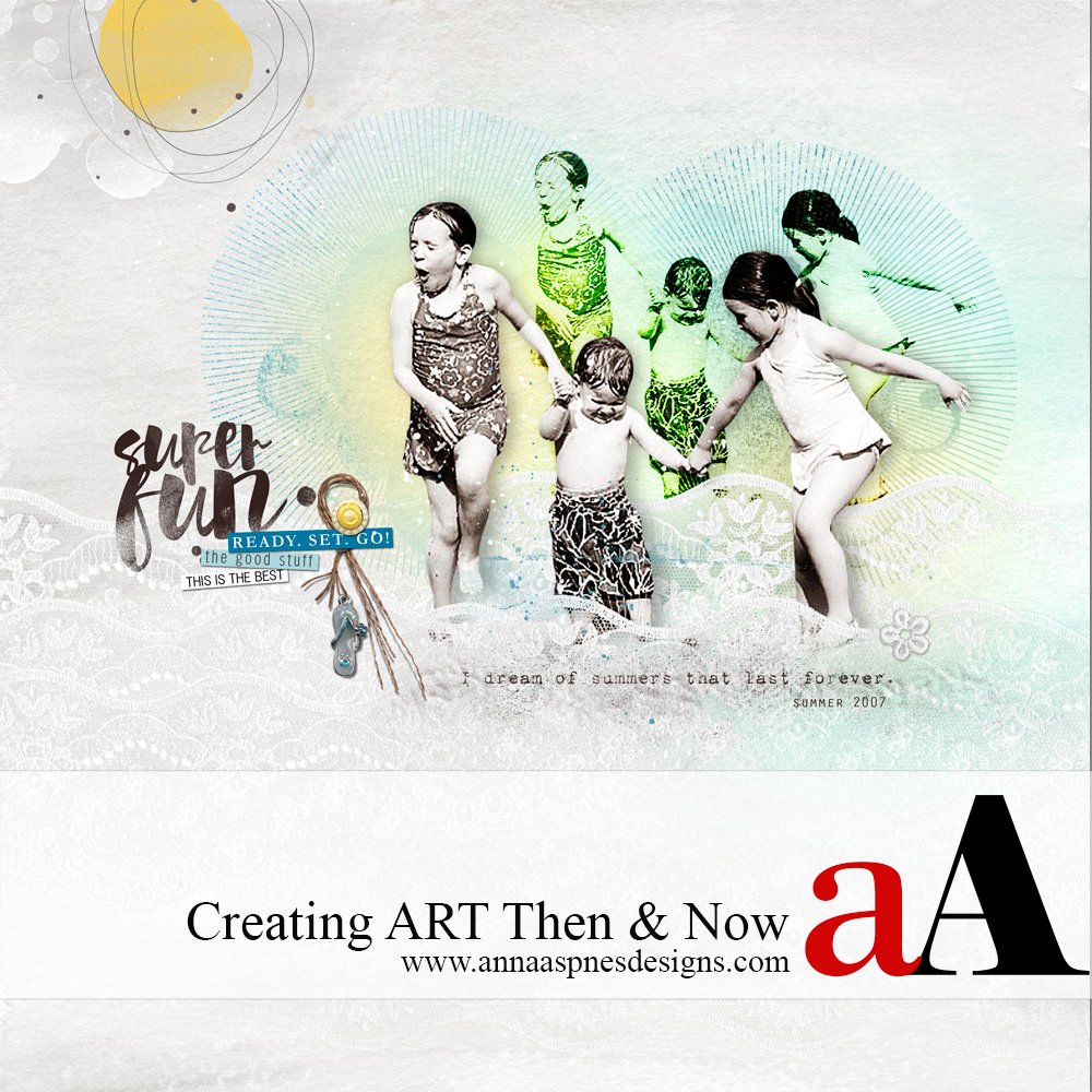
Here’s a layout I created 5 years ago.
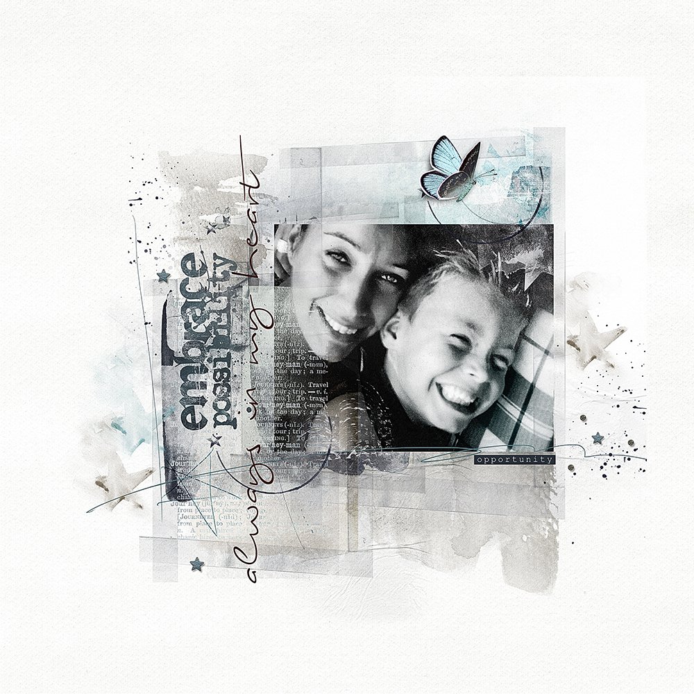
And one I created more recently.
1. Have patience in the process of creating digital artistry and scrapbooking. My pages have become more dynamic and interesting to the eye. There is more to see, more movement and detail. Simply through the passage of time my pages have evolved with practice and experimentation.
2. Use part of a photo or design element – You don’t always have to use something exactly as it is provided! I used to automatically use the whole photo but now I will select just a small part of the image or create an interesting crop to alter the perspective. Note that two photos can also be used be blended to create a unique custom background. I apply similar principles to the use of DigitalART supplies by Anna Aspnes Designs. Make use of brushes with Layer Masks so that you can blend different products easily.
3. Be mindful of proportions in your layouts. The text and stitches in my first pages were much too big. Zoom in at 100% often to ensure the elements of your page are appropriately sized. You can also perform a test print which can help you catch any anomalies.
4. Try something new and get out of your comfort zone. My pages have become more artsy through experimentation and I developed my own style. There is so much to learn in Photoshop and it pays off to go slow and add to your repertoire one technique at a time. I recently introduced plugins and actions to my process. The use of artistic filters in Photoshop enhance the mood in my layouts and enable me to use my photos more artistically.
5. Spend a bit more time on the details. After merging my file, I look at the sharpness, contrast, and color tones. I can easily make corrections through the use of Adjustment Layers as needed and will often using the high pass filter. I save my files very carefully too – one process at a time and not with an action.





Thank you for these tips. I am the worst at thinking I have to use the whole photo as is. I’ve also wondered how you know you have something sized appropriately. Many times, I have thought it looked o.k. until it was printed. What a shocker!
Thanks for your reply Vivian. I think a lot of digital scrapbookers come across these things are in their learning process! As I said, this takes some time and practice, but from mistakes you can learn and most importantly always remains still the fun in creating and learning things! It is not the same seeing things on the screen as it is on a paper! But on the other hand, it is easy to restore little errors (before printing) while working on your computer.
Great tips, Marianne. You are amazing at using filters and colors to enhance your art. I love to deconstruct your designs, because I always learn a cool new technique. Thanks for sharing your artistry!
Thanks Christy for your sweet words!