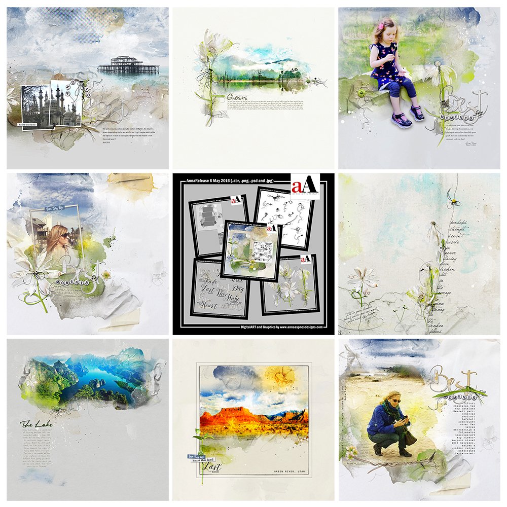
Today we are sharing digital designs inspiration Heartland.
AnnaRelease Heartland is the latest collection of digital designs for scrapbookers, photographers, artists and crafters to be released in the Anna Aspnes Designs store.
AnnaRelease Heartland
The aA Creative Team are have been adding a little heart to their digital artistry and scrapbooking using ArtPlay Palette Heartland and supporting DigitalART products.
Digital art inspiration for AnnaRelease Heartland can be found in the AnnaGallery.
View all the digital art products found in AnnaRelease Heartland and save almost 50% for a limited time.
Note that the AnnaRelease bundled option is available for ONE week only.
Click on the image below to view more Digital Scrapbooking Designs Inspiration Sunkissed or visit the AnnaTeam Layouts board on Pinterest.
Digital Designs Inspiration Heartland
See our Gallery HighLights by clicking on the images to access complete digital design supply lists. You will also find process notes and digital scrapbooking tutorials from each team member to provide new digital inspiration for using aA DigitalART designs.
Mix Your WordART
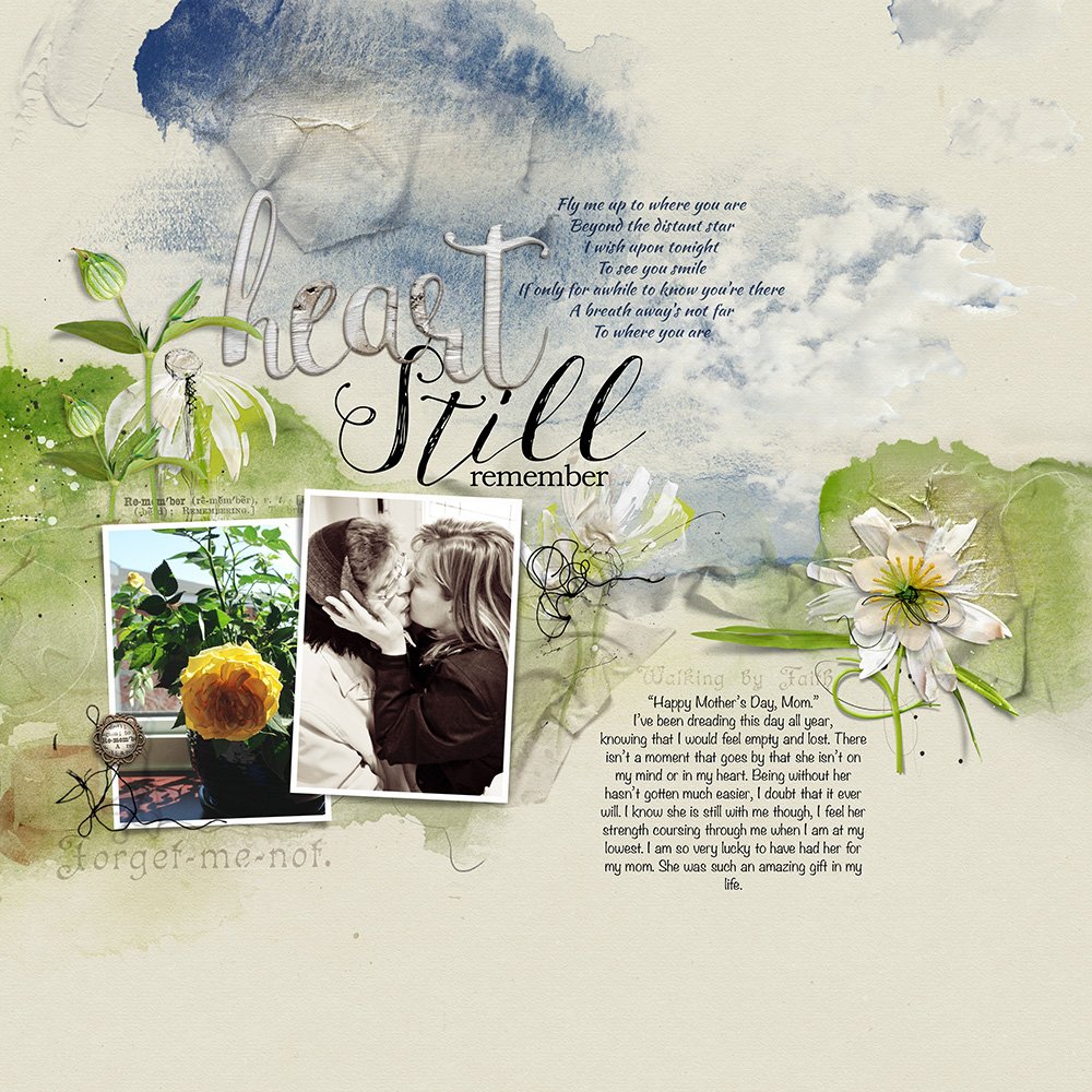
A heart-wrenching page and beautiful tribute from Heather who lost her mother last year. I love how she’s taken different pieces of WordART and pieced them together to create her own custom WordART title. I have recently started creating WordART Mix collections for this purpose but you can pretty much mix and match WordART from the many aA series.
Leading Lines
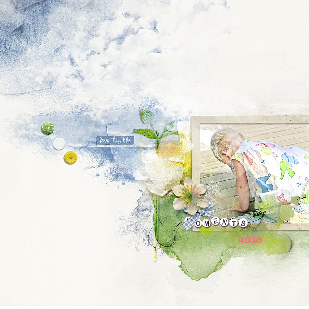
Ulla-May has created a diagonal design in which the eye is drawn to the framed photo in the bottom right corner of the page. The transfers and element placed around the image then lead the eye to to top left corner of her layout. Notice how the triple line of buttons helps transition the eye from one side of the page to the other. Ulla-May shared more about her use Leading Lines with Stitching in a recent blog tutorial.
Contrasting Landscape
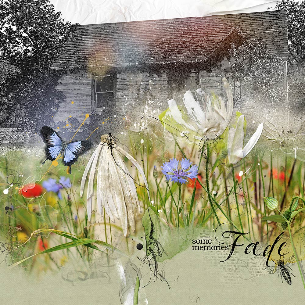
Blend 2 photos, one color and one black and white, to create a contrasting landscape then create visual interest and a level of dimension by placing elements on top of your composite to support the imagery in your layout. I love the color contrast in Barbara’s layout and the way she’s placed the MultiMedia Daisies No. 2 and elements over her landscape for the perfect finishing touch





Recent Comments