
Today we’re getting really artsy with digital designs inspiration Travel Template Album No. 2
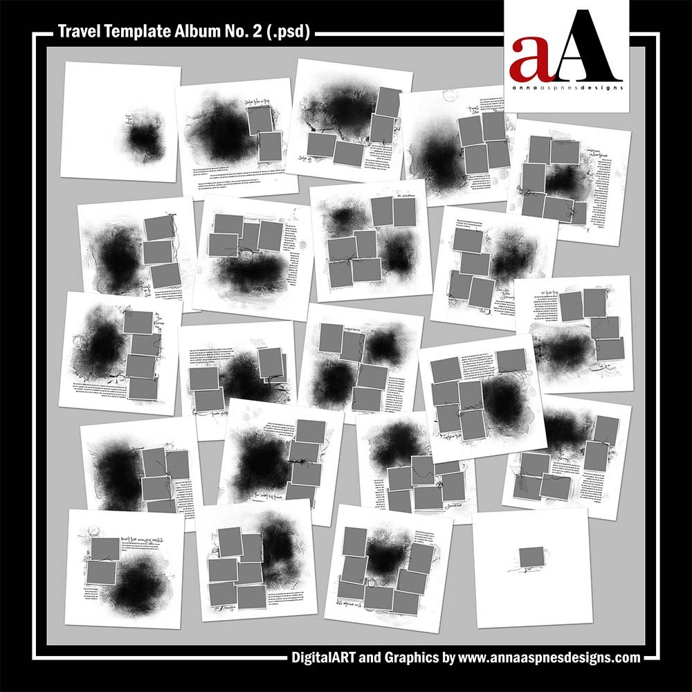
Travel Template Album No. 2 is the latest collection of digital designs for scrapbookers, photographers, artists and crafters in the Anna Aspnes Designs store.
Travel Template Album No. 2
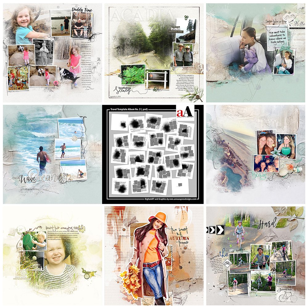
The aA Creative Team have been busy over the weekend sharing their digital scrapbooking and artistry pages using Travel Template Album No. 2 and supporting DigitalART products.
More digital art inspiration for Travel Template Album No. 2, of course, can be located in the AnnaGallery.
Save almost 50% on Travel Template Album No. 2 for a limited time.
Click on the image below to view more digital designs inspiration Travel Template Album No. 2 or visit the AnnaTeam Layouts board on Pinterest.
Digital Designs Inspiration Travel Template Album No. 2
See our Gallery HighLights by clicking on the images to access complete digital design supply lists. You will also find process notes and digital scrapbooking tutorials from each team member to provide new digital inspiration for using aA DigitalART designs.
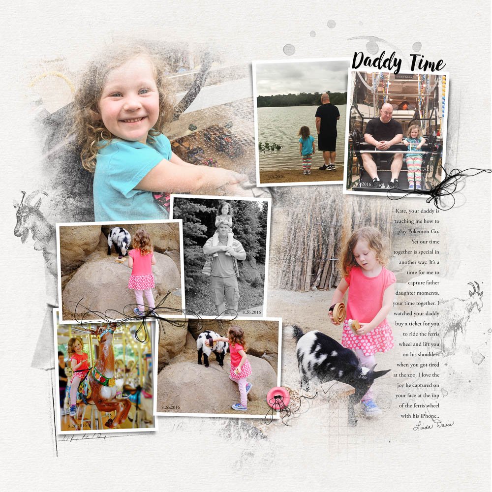
Daddy Time | Linda
Color and Black/White. MultiPhoto layouts can become visually complex quickly as a result of using a larger number of photos. A favorable approach is to convert some of your images to black and white to create some separation between the photos. It works particularly well for photos that showcase many hues or ones that might not fit into a series of images because it/they are different in color. Notice how the black/white image allows the eye to rest between the 2 blended photos.
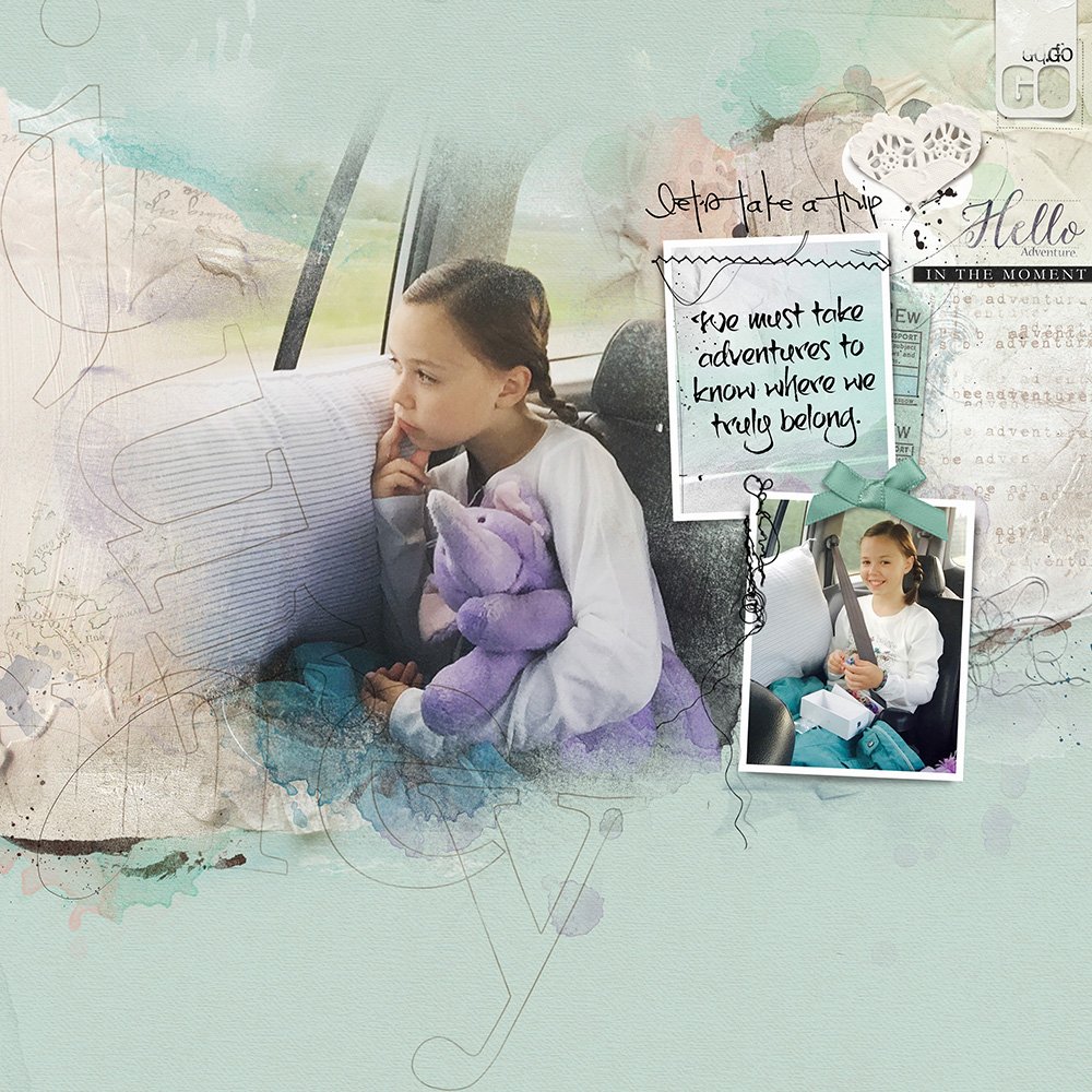
Adventures | Heather
Alternate Use for Frames. Typically you might clip photos to the frames in your templates but this doesn’t always have to be the case. You can use a digital paper from an ArtPlay Palette, ArtsyKardz or ArtsyTransfer as well as use frames for text or scanned/found images. I love how Heather has used one of the frames for her layout sentiment.
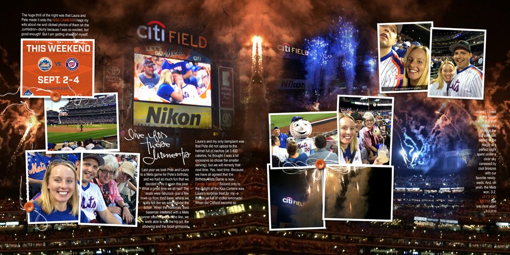
Go Mets! | Laura
Mirror Images. When working on a double page spread it helps to mirror images diagonally to create balance in the design and lead the eye across the page. This can be achieved through color (blue) or subject matter (the cute young couple). Notice also how Laura has used a not only a dark background for her page with white text but she’s make use of a single large photo further unifying the design.
For more guidance on using templates in Adobe Photoshop and Elements, watch the following videos:
- Working With DoublePage Templates
- 5 Step Process to Creating MultiPhoto Layouts
- Easy Blended FotoART with Templates
Post your layouts in the AnnaGallery. We love to see what you create.





Recent Comments