Today, Creative Team Member, Linda Davis shares her process for Finding and Using Inspiration.
Finding and Using Inspiration
Introduction
A Process for Finding and Using Inspiration in your photo artistry and digital scrapbooking.
- Each week the Anna Team selects one creative page from the Anna gallery as the weekly AnnaLift Challenge.
- It’s an honor for the person whose layout is chosen as it is always an outstanding page from the gallery.
- It’s also a wonderful opportunity for those who play along to learn in the process of lifting the chosen page, whether it’s the design, the color, the word art, the photo or just the topic.
Sources of [aalogo] Inspiration
Understand how to use [aalogo] DigitalART in your own layout designs.
- Layouts are deconstructed on the [aalogo] Blog.
- Inspiration shared in the weekly ‘AnnaNews’ newsletter.
- The AnnaGallery itself offers a plethora of ideas and inspiration.
- There are MANY opportunities in the [aalogo] community to learn from one another.
Lift a Layout
Get inspired and started by copying photo artistry and digital scrapbooking layouts in the Anna Gallery.
- Several years ago, I replicated a birthday page that Adryane Driscoll created using an older ArtPlay Palette Birthday.
- It took me two days, but when I finished my layout looked exactly like Adryane’s layout, except for the photos of course.
- View the complete layout here here if you would like to see it.
Enjoy the Process
The Evolution from recreating a layout.
- You learn a LOT in the process of recreating a layout, if nothing more than how to arrange those products in the same design.
- However, when you change your thinking about how you approach lifting a page, and move beyond duplicating the work of another, you begin to learn far more about how to use both Photoshop and [aalogo] DigitalART.
- My process continues to improve with practice as I learn to look at layouts differently for inspiration.
- I also know that my creative process, like everyone’s, is rather circuitous as I experiment on my pages.
Guidance for Moving Forward.
What to look for in making the magic happen.
- Analyze what works and appeals to you.
- Consider the [aalogo] DigitalART products you like to use.
- Read the process notes provided by [aalogo] Creative Team Members in their AnnaGallery layout postings.
- Observe the design details to create something new and develop your own scrapbooking style.
Layout Analysis Approach
Are you wondering what my lifting process looks like in scrapbooking terms?
- Since I began with an example from my own experience replicating one of Adryane’s pages, I am going to share how I looked at another of her more recent pages, Word for Word, for inspiration and explain how it influenced my own layout, Stand By Your Man.
- I will share what inspired me on Adryane’s layout as well as some basic process steps describing what I think she did to create her layout.
- While I don’t usually write an analysis of any layout, I thought you might like to know specifically what I noticed and what inspired me in Adryane’s layout, Word for Word.
- But remember, I am not Adryane – I don’t think the way Adryane does; my background learning Photoshop isn’t the same; my scrapbook pages don’t look like Adryane’s pages, well except for that birthday page I did three years ago.
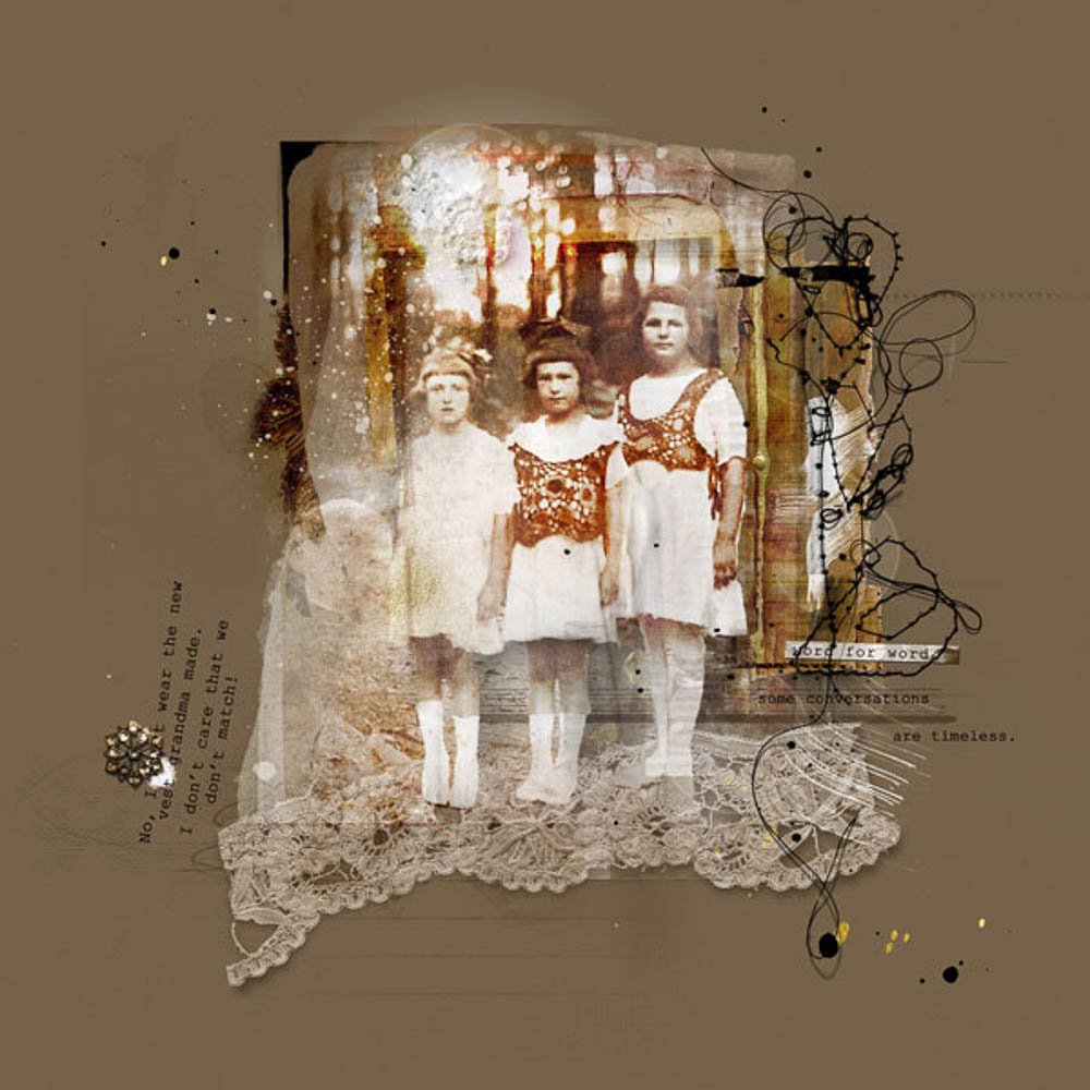
1. Photos
- I am always inspired by what Adryane does with the wonderful collection of old heritage photos that she inherited from a grandmother.
2. Color
- Old photos are generally sepia or black and white.
- Adryane’s photo of the three girls might have had sepia tones based on what she did with the color in the photo.
- But more important to me as I analyze her layout, she chose warm neutrals and black for her color scheme for this page.
3. Products
- From the list of the products Adryane used for this page, I focused on the ArtsyTransfers that are now available in .psd format, the UrbanStitchez, a frame from ArtPlay Wilderness and lace from ArtPlay Palette Tinge.
4. Design and Techniques
- First I noticed the frame behind the girls – That design element really increases the depth on her page and see that frame as a door opening to the scene behind the girls.
- I also noticed the black edge on the top left of the photo, just behind the girls’ legs and above the stitching? Those lines extend the frame and define the scene’s space.
Process for Frame and Brushwork
- Adryane opened her photo in Photoshop and dragged it onto the center of a new blank document using the Move Tool from the Tools Panel.
- Moved the frame from ArtPlay Palette Wilderness onto her page, placed it behind the extraction of the girls and above copies of the photo.
- See process below for the additional photo copies and artsy transfers.
- Applied a drop shadow layer style to the frame.
- Created a New Layer and stamped Brush_9 from ArtPlay Palette Love Story in black along the edges.
- Established at least two more layers and stamped a brush from Ruled Lines No. 1 and Scanty JournalLines No. 1.
Note.
- Based on Adryane’s process notes – I know she placed all the layers of a .psd artsy transfer from ArtsyTransfers Love on her page.
- In addition, she also described how she used two layers of the lace.
Process for Artsy Transfers and Lace
- Adryane moved all the layers of one transfer from ArtsyTransfers Love onto her photo artistry layout.
- She duplicated her photo and clipped a copy of her photo to each of the transfer layers.
- She states in her process notes that the .psd layers were already set to a variety of Blending Modes so there wasn’t a lot of work for her to do, though Opacity may have been adjusted.
- She moved the lace onto her layout and placed it below the girls.
- She duplicated the lace and changed the Blending Modes, one to Linear Burn and the other to Soft Light.
Note.
- Next I noticed the placement of the element from UrbanStitchez Heart, the journaling, button and splatters.
- I love the way Adryane separated her journaling.
- The ‘word for word’ label, and the reference to timeless conversations on the right side of the page, sum up, not only the conversation placed on the left, but also the photograph as well, and makes a great substitution for a title.
- In a way, the girls appear ethereal, much like ghosts of the past, but the conversation, added in an ‘old typewriter’ font, could have been said this
morning. - I love the unexpected humor in her journaling for this photo.
- The journaling placement and elements add interest and balance to Adryane’s page.
Process for Elements and Journaling
- A New Layer was created for each of the splatters – Stamped in black, white and gold.
- Two separate text boxes ‘house’ her journaling.
- The Text Box on the left was rotated.
- The other Text Box was repositioned just above the ruled line she had stamped on a separate layer.
- She arranged the heart stitching, UrbanStitchez, a LabeledWord and a button onto her photo artistry design.
Layout Inspired Techniques
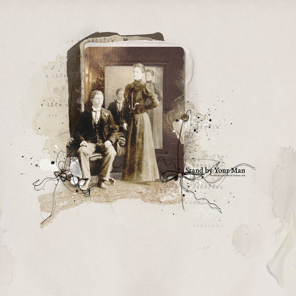
Try applying ideas from an inspirational layout in new ways that reflect who you are as a photo artist.
There were five specific ideas from Adryane’s layout that I incorporated into my own page:
- using a frame to create depth
- adding layers of lace to extend the floor below the couple
- using layers from a .psd artsy transfer
- creating interest and balance with elements
- adding unexpected words from a song for my title.
My Inspired Process
Using a Frame and Lace to Create Depth in a Layout
- Like Adryane, I also used one old photo, but I placed it slightly off center, creating an asymmetrical page design. I
- The couple was extracted from my image and a frame placed behind the extraction.
- Inside the frame, another copy of the photo was placed to provide a context for the Extraction.
- Layer Masks were applied to duplicate copied of the photo to make it appear that my extraction was in the foreground.
- I followed Adryane’s process notes for using the lace, but I warped the lace and placed it so that it appeared to be an extension of the floor below the couple.
- Adding the framed photo and lace created more depth in my
layout.
Process for Photo, Frame and Lace
- Select and open a photo on a New Layout.
- Reduce the size of the photo using the Transform Controls.
- Duplicate the photo three times and link all the layers.
- Turn off the visibility of the lowest layer to create a backup in case you make a mistake at some point or you need a clean copy.
- Use the Pen Tool or method of choice to extract the couple.
- Rather than deleting the background when making your selection, click the Add Layer Mask button.
- Note that for some photos, it is easier to work off a mask rather than a typical extraction where everything in the background is deleted.
- Reposition the photo layers on the page as preferred
- Make another copy of the photo and place it below the extraction.
- Attach a Layer Mask to the extra copy of your photo to bring back in the shadows and a little of the floor and background.
- Move the .psd layers of the ArtPlay Palette Autumn Elegance frame onto the layout, and place below BOTH the extracted photo, and masked photo that you used to bring back in the shadows.
- Make another copy of the photo, unlink it from the original and clip it to the mask.
- Adjust the position as preferred.
- Duplicate the extraction twice.
- Change the Blending Mode on one copy to Color Burn and the second copy to Hard Light.
- Reduce the Opacity as needed.
- Move a copy of the lace element onto the page and place it below the lowest extracted photo layer.
- Use the Warp Tool available in Photoshop to adjust the shape to make it appear it is coming out below their feet.
- Place it partially over the photo’s floor.
- Change the Blending Mode to Linear Burn.
- Duplicate the lace element and change that Blending Mode to Soft Light.
- Add a Color Adjustment Layer to the lace to blend it with the photo.
Process for ArtsyTransfers
The layers from ArtsyTransfers Memorable were used to create a foundation for my framed photo as opposed to clipping a photo to the ArtsyTransfer layers as Adryane has done., t
- Drag the layers for an ArtsyTransfer below the framed photo’s shadow.
- Delete and adjust the position of layers as needed.
- Recolor stains to fit your photo.
- Adjust the blend modes and opacity as needed
Creating Balance and Interest with Elements
- On my layout I used brushes, UrbanThreadz, a button, splatters and an art stroke to create a Visual Triangle.
- This Visual Triangle helps to BALANCE the position of my title and disguises the problems that I had with my extraction on the left.
- The PaperTexture on the right also adds balance to my asymmetrical design.
Process for Using Elements
- Create New Layers for Splatters, ArtsyStains and paint elements.
- Stamp each brush in a different color on a New Layer using the Paint Brush Tool.
- Position the layers to create a foundation for the other elements.
- Stamp UrbanThreadz using an .abr brush file and the the Paint Brush Tool. on new layers or drag .png copies onto the page, adjusting the placement with the Move Tool.
- Drag buttons, key elemenyt and ArtStroke onto the page and position.
- Add Drop Shadows to the elements using AnnaStyle Shadows No. 1.
Unexpected Title
- I have always wondered why a man sat while a woman stood in old wedding photos.
- The words, from an old song by Tammy Wynette, are unexpected for a formal wedding photo.
- I added them in an older font, I’m Fell English, to fit my photo.
- Knowing my family, I think they will smile when they read the title.
Summary
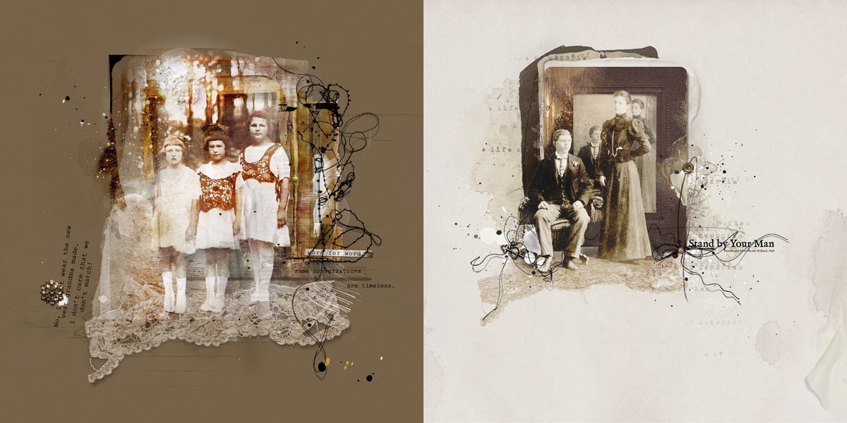
When the photo artistry layouts are placed side-by-side:
- Other than the subject, an old photo, one might initially wonder what inspired me from Adryane’s layout.
- The layouts don’t look anything alike and the STYLES are very different.
- But I hope it’s evident now that I did indeed lift some ideas from Adryane’s layout and applied them in different ways to my own photo artistry design.
Lasting Thoughts…
- When I view one of Anna’s instructional videos, available here, read a post on Anna’s blog, see a layout in Anna’s gallery or take a class from another source on some aspect of Photoshop, I deliberately look for ways to apply the information in a new way.
- For example, I won’t make the page outlined in a lesson, but instead I will try to create something new with the ideas or techniques.
- By doing this the techniques, concepts or processes become part of my skills set, something that I know well enough that I can apply the information in new or different ways on my layouts.
- This approach to learning, whether lifting a page or taking a class, is ‘making it my own.’
- Try making your learning YOUR OWN by applying the ideas that inspire you in the pages in AnnaGallery in new ways.
I want to extend a special thank you to Adryane for allowing me to lift one more layout.
- Adryane’s work is beautiful; her design skills are outstanding and I learn something from every page she creates.
- Thank you Adryane for sharing your art – I love your work and the inspiration I find in your pages.

One Response
I don’t know how I missed this! THIS is just the kind of information I crave, Linda! I know it must have been a doozy to write/create! LOL But, the tips you gave, coupled with the ‘WHY’ make all the difference in the world to me! I like it that you walked us through, not just one, but, two, layouts, with your notes on each step. It just helps – ALOT!
You can learn a lot from reading the notes beneath the Gallery images and I do this! And, when I do ‘lift’ or follow a tutorial, I try to make it my own, also. I want to get the ‘feel’ of the piece and can’t get it if I am just mimicking another layout.
Thank you so very much!
Su