Monthly Digital Scrapbooking Using FotoInspired March 2022.
Monthly Digital Scrapbooking Using FotoInspired March 2022
New to FotoInspired?
Learn about FotoInspired.
Join the dedicated FotoInspired community on Facebook.
The FotoInspired Stats
A total of 4 double-page spreads.
- Everyday photos
- Spring Break + My Birthday
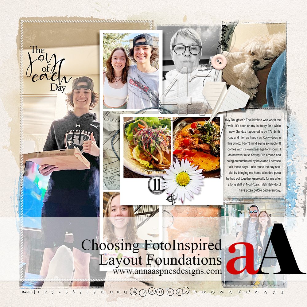
Here are my layouts, PLUS some thoughts on choosing FotoInspired layout foundations for your digital scrapbook pages.
March 2022
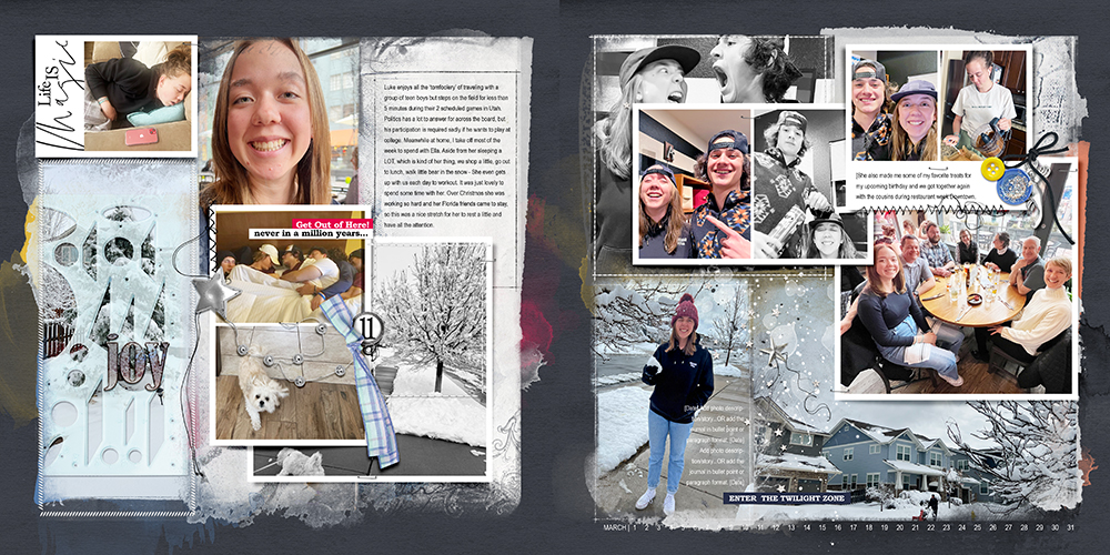
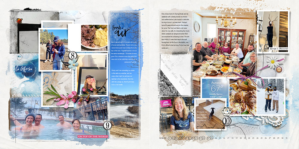 Week 8,9 and 10 | Random Photos
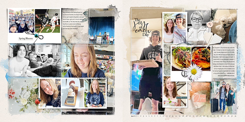 Week 11 | Spring Break + My Birthday
 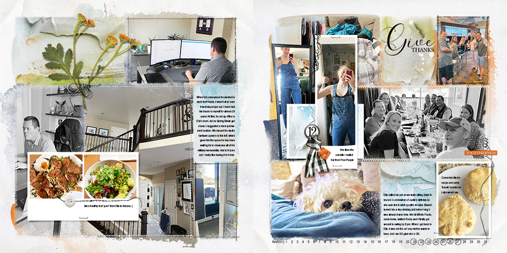 Week 12 | More Everyday Photos
Choosing FotoInspired Layout Foundations
Personal preference for my layout foundations.
- Solid cardstock style backgrounds with Uniform and Subtle Texture.
- This means the chosen Solid Background can be duplicated easily without having Repetition of a fold/crease or stain at the edge of my digital scrapbooking design.
- The foundations are nearly always Light in color, as I have found this the most Simple approach for supporting multiple photos that differ in subject and color.
- I typically use Neutrals, such as white, cream, being,e or tan, but also tend toward blue and green, which coordinate well with outdoor photos.
- Small, unobtrusive patterns add Tension to your digital scrapbooking pages when the Theme is appropriate.
- Photos that include a lot of white or Light Colors, such as our Colorado winter photos, create Contrast against Dark navy, brown, and gray backgrounds.
- Ultimately, the choice of Solid Paper for your FotoInspired Template Backgrounds will be determined by the Colors in your photos.
Try This.
- Assess the Colors of your photos and determine which color(s) is/are most Prominent.
- Choose a Neutral Solid Paper and one of the Lighter Shade in the identified prevailing colors.
- Drag the 2 papers directly above the Background layer of your digital scrapbooking layout using the Move Tool from the Tools Panel.
- Position the papers on one side of the foundation, then Duplicate by dragging the 2 layers down to the New Layer icon in the Layers Panel.
- Reposition the ‘copy’ paper layers to the other side of the digital scrapbooking layout foundation.
- Now add a Darker Solid Paper and repeat the duplication steps above.
- You should now have 3 Different Layout Foundation options.
- Click on the ‘eye’ icon next to each of the paper layers to see which works best with your photos.
