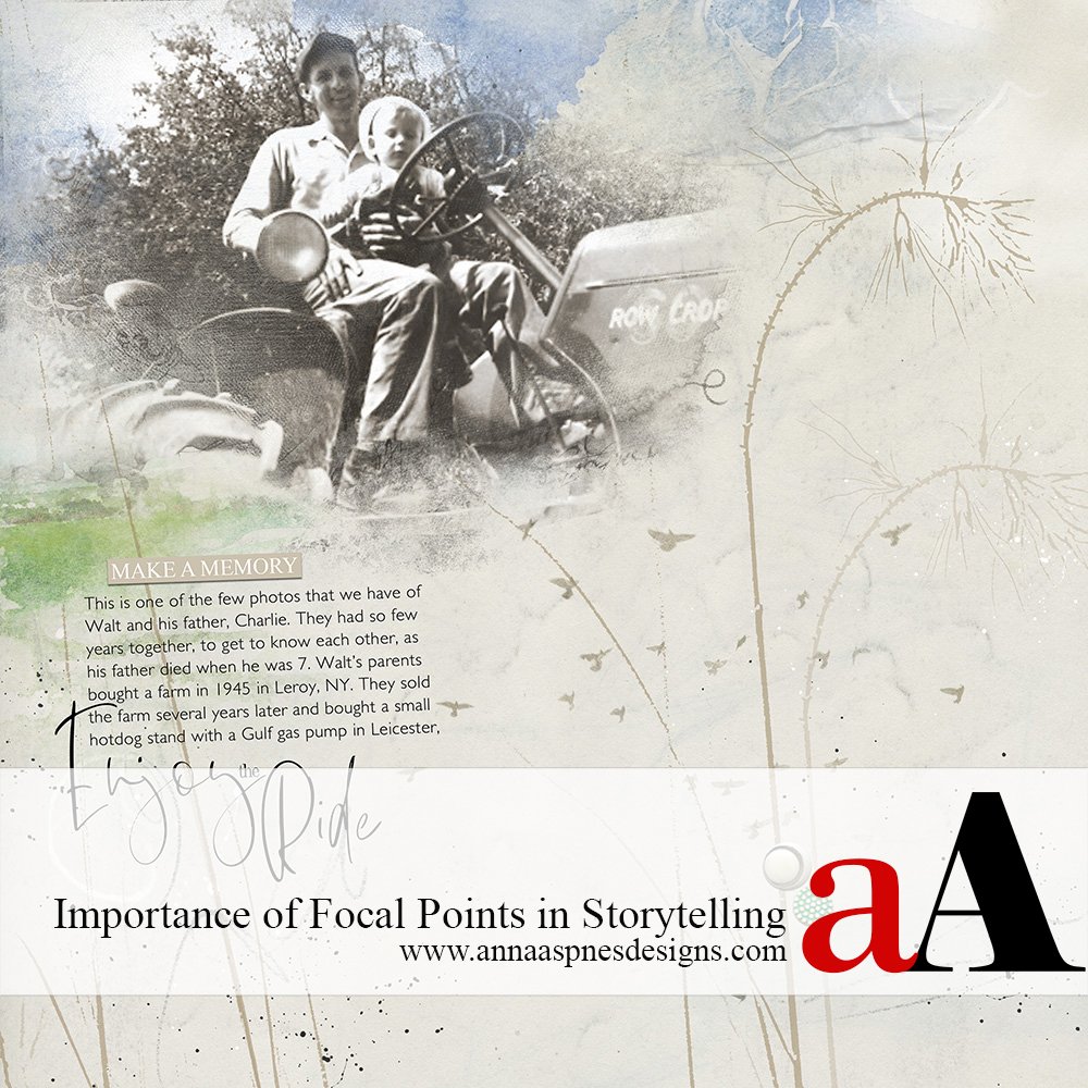
Today, Creative Team Member, Miki is sharing the Importance of Focal Points in Storytelling in her Before and After ART rePLAY No 10.
Importance of Focal Points in Storytelling
In this series of tutorials, the aA Creative Team are reworking older layouts to show you how they made improvements.
Background
This is a page for my husband’s heritage album.
We have so few photos of him as a child that each one is a treasure.
We’re not sure why, but they did move around a lot and could have been lost or they just didn’t take many pictures while he was growing up.
Before:
After:
Focal Point
The story comes through more clearly when the page has a defined focal point.
This is the place where the eye naturally rests as you look at a digital artistry or scrapbooking layout.
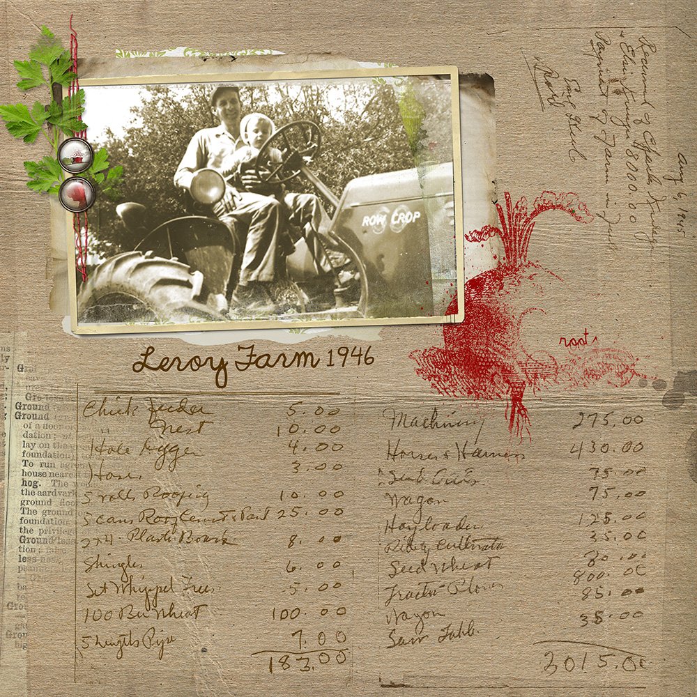
The BEFORE page tells the story of starting a farm after World War II.
We found a handwritten note by his mother, listing the items bought for the farm, and the receipt of payment of $8,000 from his uncle – These two pieces of paper are treasures in themselves.
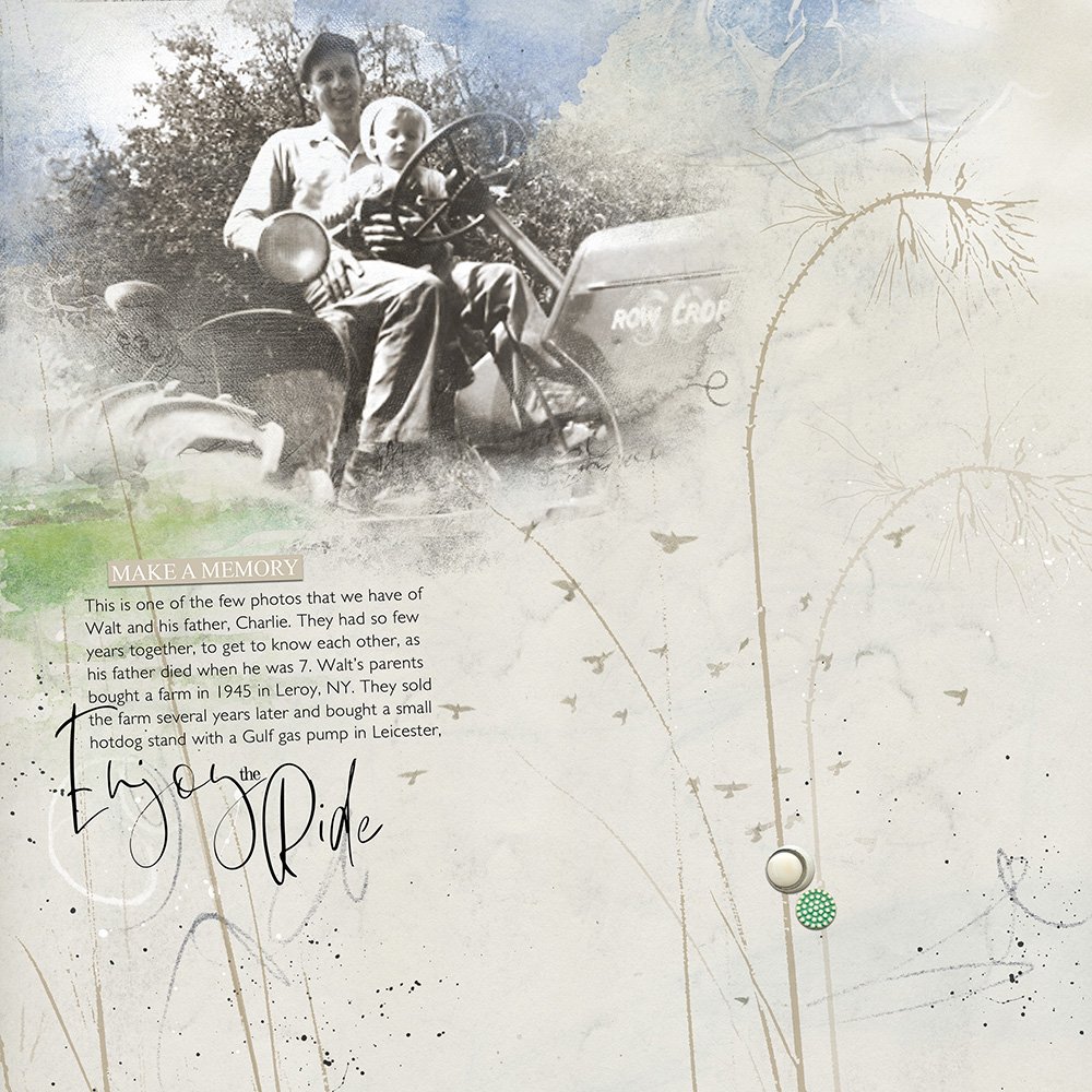
But I wanted the AFTER page to be more about the relationship between father and son, and less about the farm.
The journaling tells about one of the fleeting moments that they had together.
FotoBlendz Masks
The use of the FotoBlendz masks in the AFTER page opens up the photo giving it space to be.
The photo in the BEFORE page is framed, constraining it.
Note that you can use 2 FotoBlendz when a single mask doesn’t completely cover the areas of the image.
- Duplicate the photo and link the 2 layers together in the Layers Panel.
- Clip the photo layers to the FotoBlendz masks using the clipping mask function in Photoshop/Elements.
- The masks can be modifed by resizing and rotating them.
- Adjust the Blending Mode of the mask layer to add contrast and visual interest to your layout.
Color
Digital Artistry offers the ability to adjust color with ease.
A sepia tone was applied to the photo via a Hue/Saturation Adjustment Layer to remove the yellow cast and give the image a more earthy look.
Visual Texture
Visual Texture is a result of using a variety of artistic elements such as line, shading and color.
The way these elements come together creates the illusion of having physical texture.
For example, rough surfaces can be active, in a visual sense, and smooth surfaces can give the illusion of being restful.
- The lines of the where elements also yield texture and lead the eye to the photo.
- The splatters and ArtStrokes provide contrast and shape to the design.
ArtsyTransfers
ArtsyTransfers are so versatile.
The layers can be used individually to enhance a page or assembled to create variety.
Several transfers from SkyTransfers No. 1 were layered behind the image:
- To give the impression of being outdoors.
- To add more color to the page.
- To integrate the photo into the background.
See Ways to Use Artsy Transfers and Artsy Transfers 101 The Easy Way to Blend Photos for further guidance.
Click on the above image to see digital supplies used in Importance of Focal Points in Storytelling.
Stay tuned for more Creative Team insights to be shared in the Before and After ART rePLAY series.







Recent Comments