Description
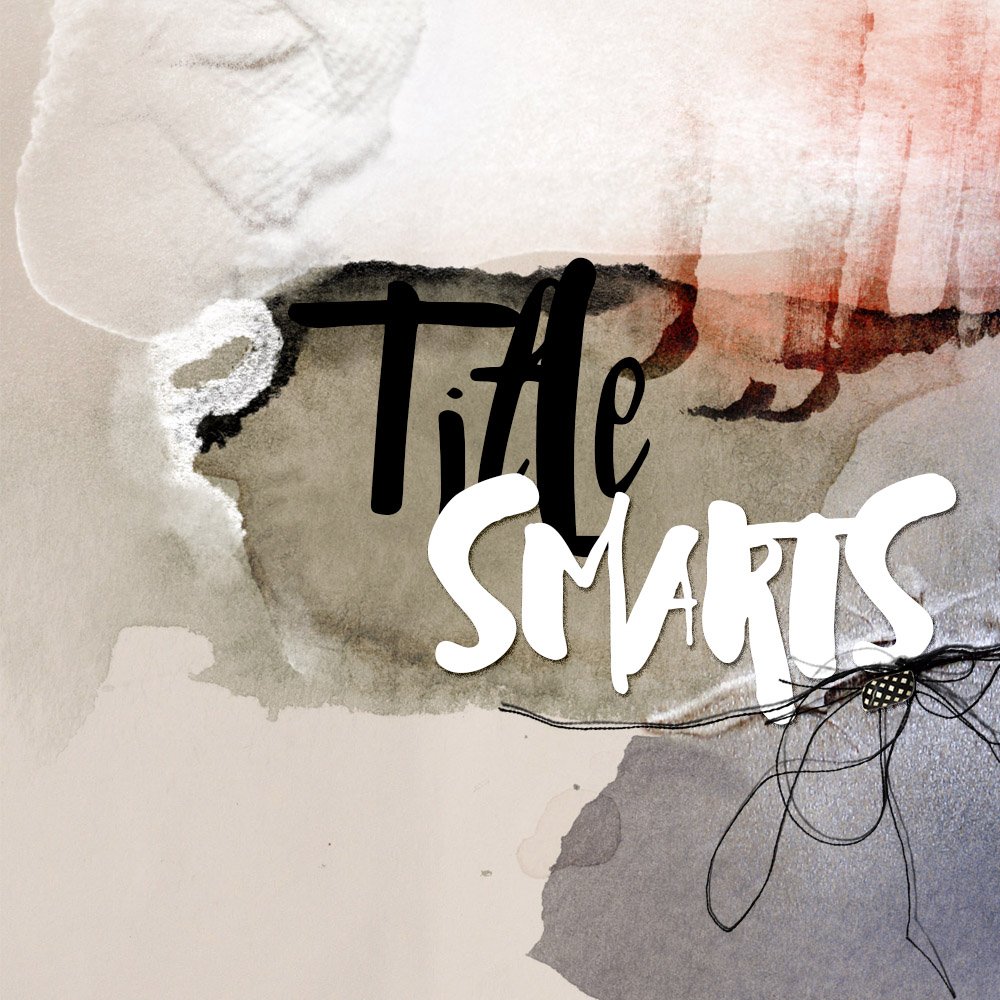
Master The Art of Fabulous Titles
A self-pace workshop providing guidance and best practices for getting ‘Smart with Titles’
This workshop was inspired by a clear need to help you identify the right types of fonts and place them appropriately on your pages.
Content is delivered via a total of 92 layout examples and demonstration of my 5 Step process to creating a title in Adobe Photoshop CC.
The aim of TitleSmarts is to help you understand and streamline your options, learn to manage your fonts, as well as provide recommendations and guidance for consistently creating winning titles.
Course Content
1. Introduction
Building and managing your collection of fonts.
- Why fonts are like clothing
- Build a functioning library of fonts
- Thoughts on font organization
- Demystifying font terminology
2. Font Basics
Considerations for choosing fonts for your library.
- How to select fonts
- What to look for in a functioning font
- Understanding Practicality, Commonality, Functionality, Hierarchy and Storytelling components in font selection
- Sans v. Sans Serif fonts
3. Timing Matters
When to add titles to your page.
- Topics for consideration.
4. Anatomy of a Title
A step-by-step guide to creating an WINNING title every time.
- Where to place a title
- Formatting/How to arrange words
- Creating focus
- Special Effects (Drop shadows, Sticker Effect, Styles, Distressing, Clipping Masks and Blending Modes)
- Title embellishment and revision
5. Font Selection
Choosing the right font for your titles.
- Using words to identify style
- Difference in Artistry and Layout style
- Thoughts on communication
- Establish style via story
- Font properties and classification
- Personal favorites
6. Conclusion
And of course classes by Anna Aspnes Designs are ALWAYS jam-packed with additional extras
Who Is This For?
TitleSmarts is designed for both Novice and Advanced Digital Artists/Designers, Scrapbookers, and Memory Keepers who have a desire to improve their titlework.
- Learn everything you need to know about building an managing a functioning font library.
- Employ my own personal 5-step title process to create winning titles on every layout.
- Be empowered by words to add meaning to your artistry and scrapbooking pages.
What to Expect from TitleSmarts
- Self-paced workshop.
- 3 hrs 20 mins hours of videos delivered in 10 sessions.
- MP4 format sessions range from approx 2 -30 minutes each.
- Dedicated Facebook group to connect and share with other students of this course.
Complementary Downloads
- Supporting detailed .pdf handout (40 pages including images).
Software Requirements
- Demonstrations are conducted in Adobe Photoshop CC, but can easily be followed by Adobe Photoshop and Elements users.





Trish Hoskin (verified owner) –
I loved Class – I learnt so much from it. I have been often haphazard with the placement and choice of titles and this class really made me think about how I was portraying my piece and the choice of fonts. Anna’s classes are always informative and fun. Highly recommended.
nancy Morin (verified owner) –
I loved this class! I struggle with placement of a title and of course which font to use. This class gave easy steps and lots of examples of titles. I also loved all the info on fonts. It was fun and always so much information! I highly recommend this class!
dianeweber0206 (verified owner) –
Taking this class was a title-changing experience! In an effort to speed things along in my journaling, each year I choose a basic typeface (font, size, placement) for my titles. It worked. But now I have learned how to add title pizzazz to my pages. AND, it does’t have to take a long time. By going through the class materials and practicing (I redid the titles of about 20-30 pages from earlier in the year in addition to about 20-30 current pages), I now can bang out pretty cool titles in record time. I feel a lot more confident about fonts and title placements and the creation of word art. Really learned a lot! I highly recommend the class!
jessie.trotter (verified owner) –
This course was chocked full of very useful information. I loved that I can go back and re-watch the parts that I need the most. The PDF handout is also very useful to print out and read on parts that I need to review. There are some great tips on how to make your titles real stand out! Loved it! Thanks!
Anna Aspnes –
Thank you so much for the glowing review.
mollywoodphotos (verified owner) –
This class was very good for me. I really learned a lot. The fonts are so fun to play with. I use this not only in scrapbooking but subway art also.
Anna Aspnes –
Nice! So HAPPY to hear this.
Louise Workman (verified owner) –
Thank you, once again, Anna–Title Smarts is a terrific class! The analogy of fonts being like clothes in our closet helped tremendously. I am making an artsy album with a lot of text, and have decided to make chapter titles rather than page titles. That way I don’t have to use valuable space on every page for a title. After watching this incredible training series, I got an idea. I built a PSD worksheet with three columns, and selected title fonts, caption fonts, and text fonts to see how they would look together. It was quite revealing as I looked across the columns to see which “outfit” came together best. By moving the textboxes up and down in their columns, I tried various caption fonts with each title font. Then I experimented with text fonts. Once I was finished, it became clear that the personality of one font set was more appropriate for my project than what I had been using. Now, by following your thoughtful instruction, I am customizing the chosen title font for each chapter-title page. What I had before was okay, but this is definitely an improvement. I LOVE learning! It helps me move forward with confidence, and I always feel re-energized and inspired when I see new possibilities and better results!
Anna Aspnes –
Yes to this Thank you Louise