
Creative Team Member, Laura, shares her techniques for a unified page flow with a template unity tutorial conducted in Adobe Photoshop Elements.
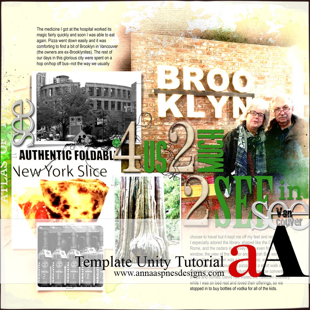
Everyone has those pages that just won’t come together in a photo book, built of images that are more about memories than artistic quality.
In these cases, I’ve found that using four simple strategies can help create a pleasing unified page flow that minimizes the effect of poor or mismatched photos.
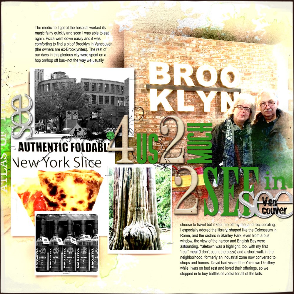
In the example shown here, I fell ill while visiting Vancouver, so had a hodgepodge of memories that I nevertheless wanted to document.
This is what I did to create template unity.
Template Unity
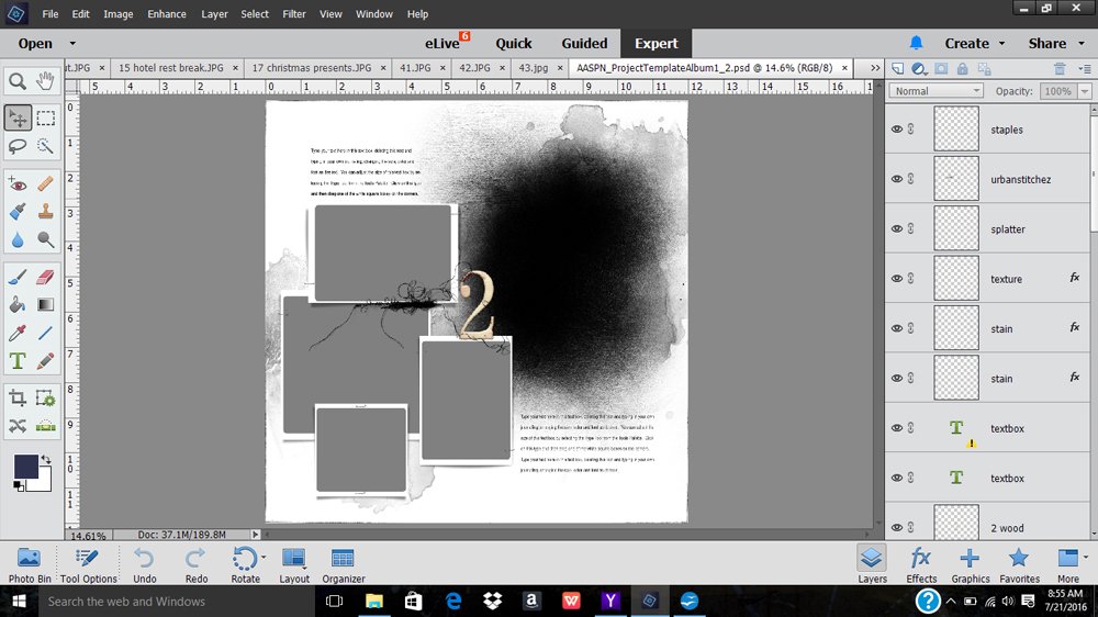
1. Choose a Template. Anna offers templates as Artsy Layered single templates and as whole Album sets, in both 12 x 12 and 8 x 8 sizes. I often mix and match templates in my albums depending on my photos. Here I chose Template 2 from the Project Template Album No. 1.
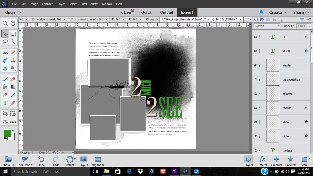
2. Establish Page Direction. This can be across, up, down, or diagonal, but it is surprising how much unity a strong sense of direction can give a page. When I have a particularly mismatched selection of photos, I often use typography to create direction because strong word groupings carry lots of visual weight, leading the eye across the page. Here I wanted to create a horizontal linear design, so I duplicated the numeral 2 that came with the template and added green type in complementary fonts.
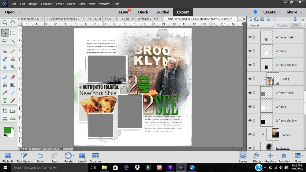
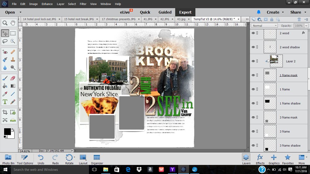
3. Crop and Scale. Reinforce your chosen directional flow with a tightly cropped image, the visual weight of which will invite the eye to that area first. In this layout I added a big photo to the template’s Fotoblendz clipping mask, then clipped in a cropped pizza sign from a restaurant run by former Brooklynites (a welcome sight in Vancouver). I also added some color to a stain to match the green font and reinforce the linear flow.
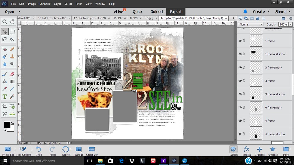
4. Desaturate. Compare the difference between the saturated and desaturated photos in the layout. I loved Vancouver’s Colosseum-shaped library and how it reminded me of our travels in Rome, but the photo added nothing to the layout. Desaturating the photo made it less intrusive while allowing me to preserve the memory.
To desaturate in PSE14, go to Enhance->Convert to Black and White, and choose the option that is most appealing. At this stage I also added additional type to the right of the layout; I took a hint from the way the word “Brooklyn” was broken up in the photo to break up the word “Vancouver.” NOTE: Since I am self-printing my album, I am not worried about getting things too close to the edge the way I would be if I were going through a professional printer, where safety zones really do matter.
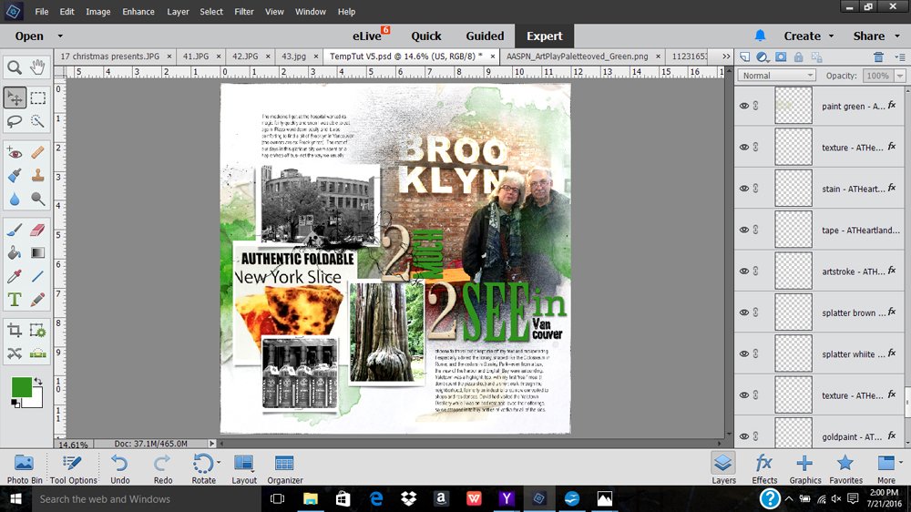
5. Add color. Color can be a great page unifier. In this layout I pulled in bright green Artsy Transfers but you could also use paints or stains. At this point I also desaturated the photo of the vodka bottles when I realized that I liked the shapes more than the colors, which were pulling my eye away from the linear direction I was trying to establish.
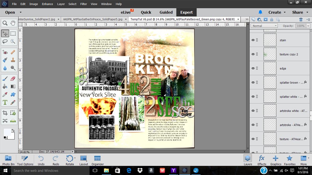
6. Embellish and Complete. Every layout is different when it comes to adding those finishing touches. Because I like a full effect, to finish this composition I pulled in the numeral 4 from another page in the template set, made another word block, added the acrylic words and a button, and, finally, two page overlays to define the page edges. I also tweaked the position of the photo/Fotoblendz on the layout and added some brushwork to match the color of the brickwork.
We would love to see your layouts creating Template Unity!
Click on the above photos for additional process notes and Anna Aspnes Digital Designs supplies used.






Recent Comments