As part of the 5 years of Anna Aspnes Designs at Oscraps celebrations, members of the Creative Team, are looking back at their art practice and sharing FIVE things they’ve learned or ways they’ve grown over the years.
Here’s what Miki view of then and now creating ART.
Then and Now Creating ART
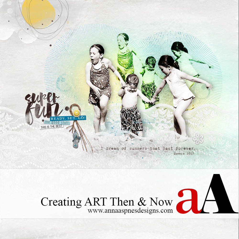
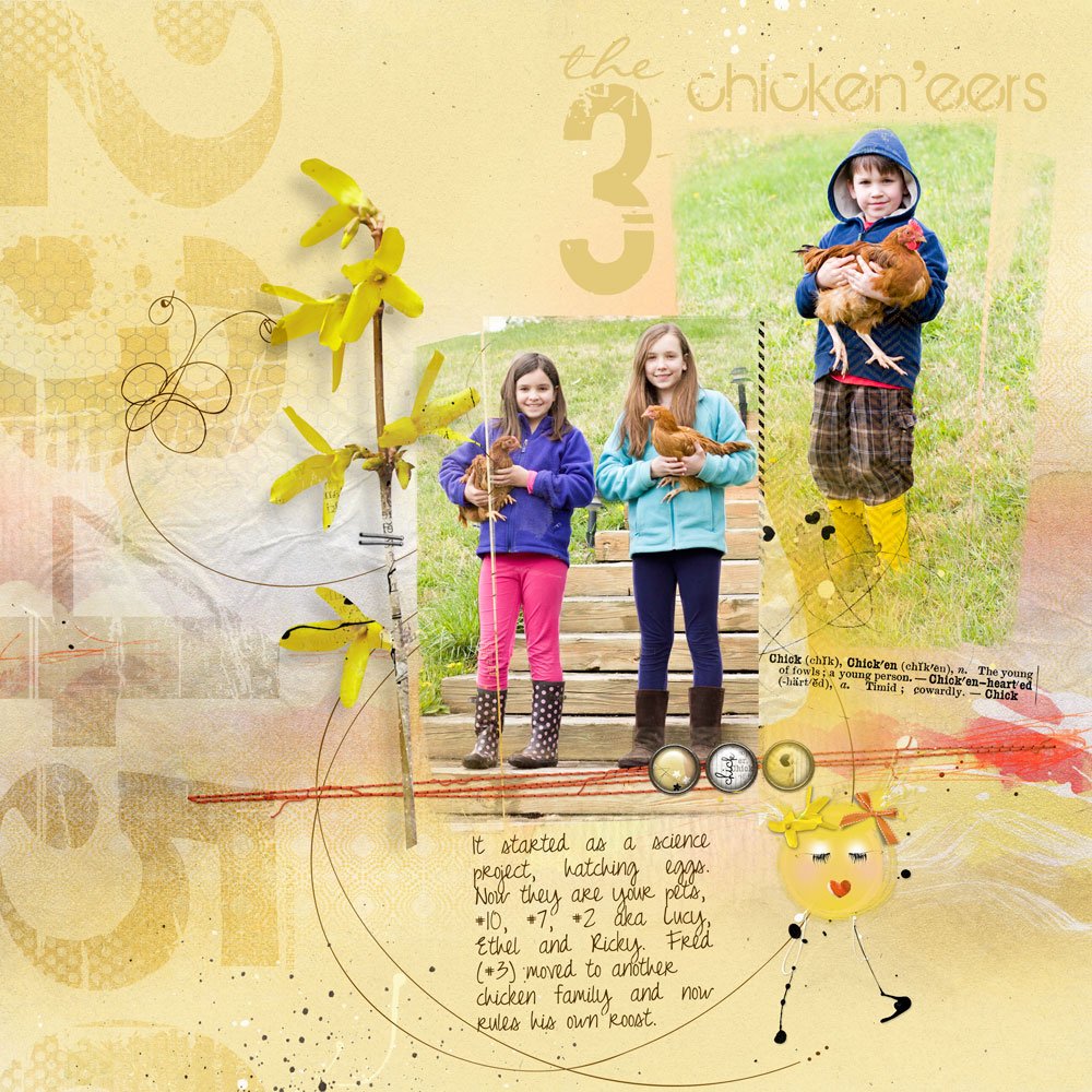
Here’s a layout I created 5 years ago.
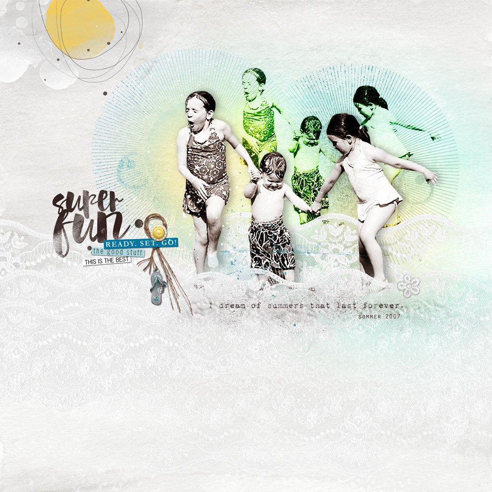
And one I created more recently.
1. When there is more than one photo on the page and they are essential to the story just placing them with a mask doesn’t always work. I like to extract them. By extracting the photo it gets rid of the cluttered background. It’s also easier to blend the odd photo with the others to make it look like it was one moment in time together. Is nothing real in Photoshop?
2. I love the the effect of a good black and white photo. Conflicting colors fight each other. I’m all about harmony now. Adding a custom shadow behind the photo gives it more depth.
3. I think big! If there is any empty space, I feel the need to fill it with something. Working with white space is a struggle for me. I challenge myself every time I create a page. My mantra has become … white space … white space … white space …
4. Even after saying my mantra several times, I still feel the need to fill up all the empty space. And then Anna created texture! There are so many different types of texture in the shop to choose from! Not only does it fill up space, but it also adds depth and detail to a page! Thank you, Anna!
5. The story comes through more clearly when the page has a defined focal point, a place where the eye naturally rests as you look at the scrapbook page layout. Choosing a font for the title is important. Bold fonts draw the eye to the page. Just because everyone else is using it, doesn’t mean it’s going to work for your page. I also like to cluster items near the title. It ties everything together and creates more of that wonderful white space! Color also can play an important part in focusing the eye on the subject and creating continuity on a page. Again, I’m all about harmony these days.





Thanks, Miki, for sharing your best ideas and techniques. Your art is always an inspiration, I especially admire how you add accents/elements for added interest and dimension. You are the best at combining a more traditional scrapbooking style with artsy design. You make ordinary exceptional.
Thank you, Christy, for the kind words. I’m awed by all the amazing talent in the galleries. So much inspiration!,