
In celebration of Anna’s five years at Oscraps, members of the Creative Team are looking back at their art practice and sharing 5 things about artthey’ve learned or ways they’ve grown over the years. Team member Linda Davis shares her then and now tips in an excerpt from her blog.
Then and Now Tips for Creating ART
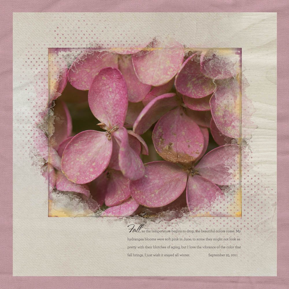
At the same time that Anna is celebrating five years at Oscraps, I am celebrating the beginning of my journey playing with Anna’s designs. September marks five years of ArtPlay for me. On Saturday, September 25, 2011, I posted my first layout, “Fall Hydrangeas,” in Anna’s gallery at Oscraps, a layout that I created with designs I bought at the first sale at the opening of Anna’s Oscraps store.
Back then I didn’t know a lot about how to work with Anna’s designs, but I was drawn to Anna’s freeform shapes and the concept of blending.
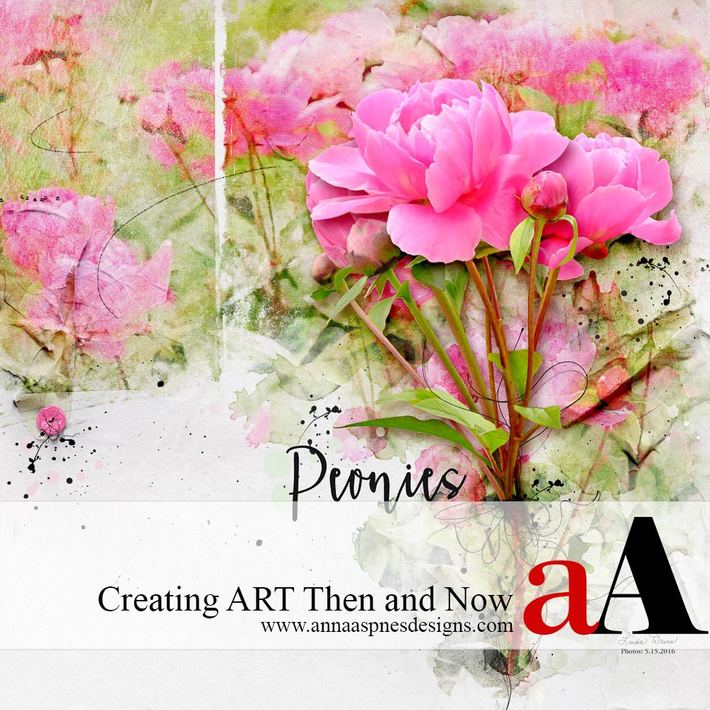
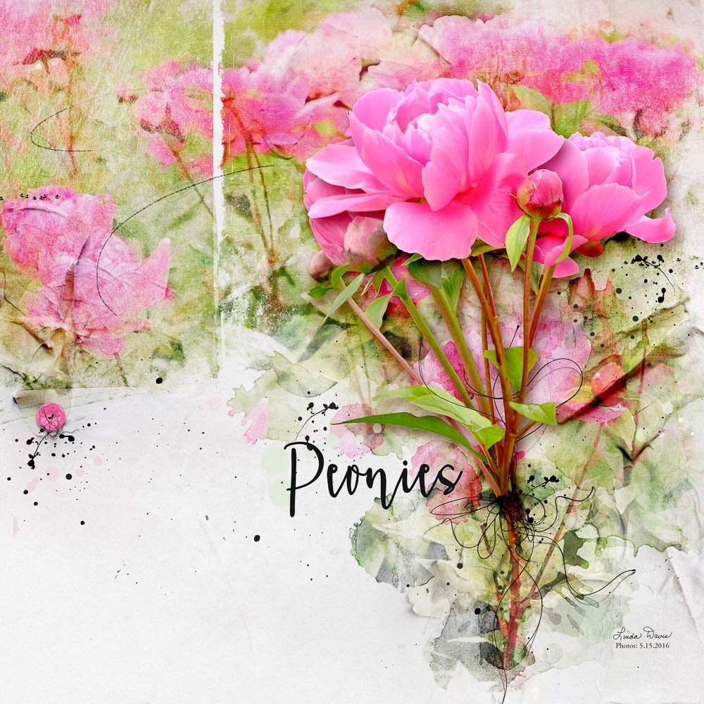
Using a more recent page, “Peonies,” I want to share five strategies that I’ve learned about creating interest on a page over the last five years.
1. Asymmetrical page design creates tension and that contributes interest to a page. On my “Fall Hydrangeas” layout, the focal photo is in the middle of the page. Yet, on the page with the peony blooms, on the right third is a far more interesting placement for the focal photo in comparison to what I did with the hydrangeas. In addition, the way the background mask is divided enhances the rule of thirds.
2. Mix photo treatments, i.e., watercolor, with standard photos on a single page. In “Peonies,” I applied a watercolor action to the background photo that I clipped to the mask. However, I created the extraction from photos as they came out of the camera.
3. There is nothing quite like the depth and dimension of an extraction to create interest on a page. It has taken me several years to develop my extraction skills not only on flowers but on people as well. Remember to ground an extraction and to add a custom shadow. On “Peonies,” the threads serve to ground or attach the flowers to the page.
4. Add elements, i.e., threads and buttons, for more dimension. The weight isn’t the same on both sides of “Peonies,” but the button and thread balance the bouquet in the mind’s eye.
5. Stamp brushes, i.e., splatters, texture, or stains, on your page. I like splatters so much that I’ve created a brush set of different splatters from Anna’s Artplay Palettes and templates. I continue to add to it. I also like the look of photos clipped to stains in the background, especially after changing the blend mode.
Yes, I’ve learned a lot in five years. I hope to continue to develop my artplay skills. Take advantage of the sale marking Anna’s FIVE Years at Oscraps. Anna also offers classes now, which will definitely help guide you as you play with her art.
I hope you enjoyed my Then and Now Tips for Creating ART.





Thanks, Linda, for sharing your skills and artistry with us. Your beautiful designs always chronicle the joys of everyday life. And are a gift to us all.
Thank you Christy for your kind words!!!
Thanks Linda…I learn a lot with your very clear explanations……great Art ….
Thank you, I’m learning a lot too just trying to explain my process!!!