

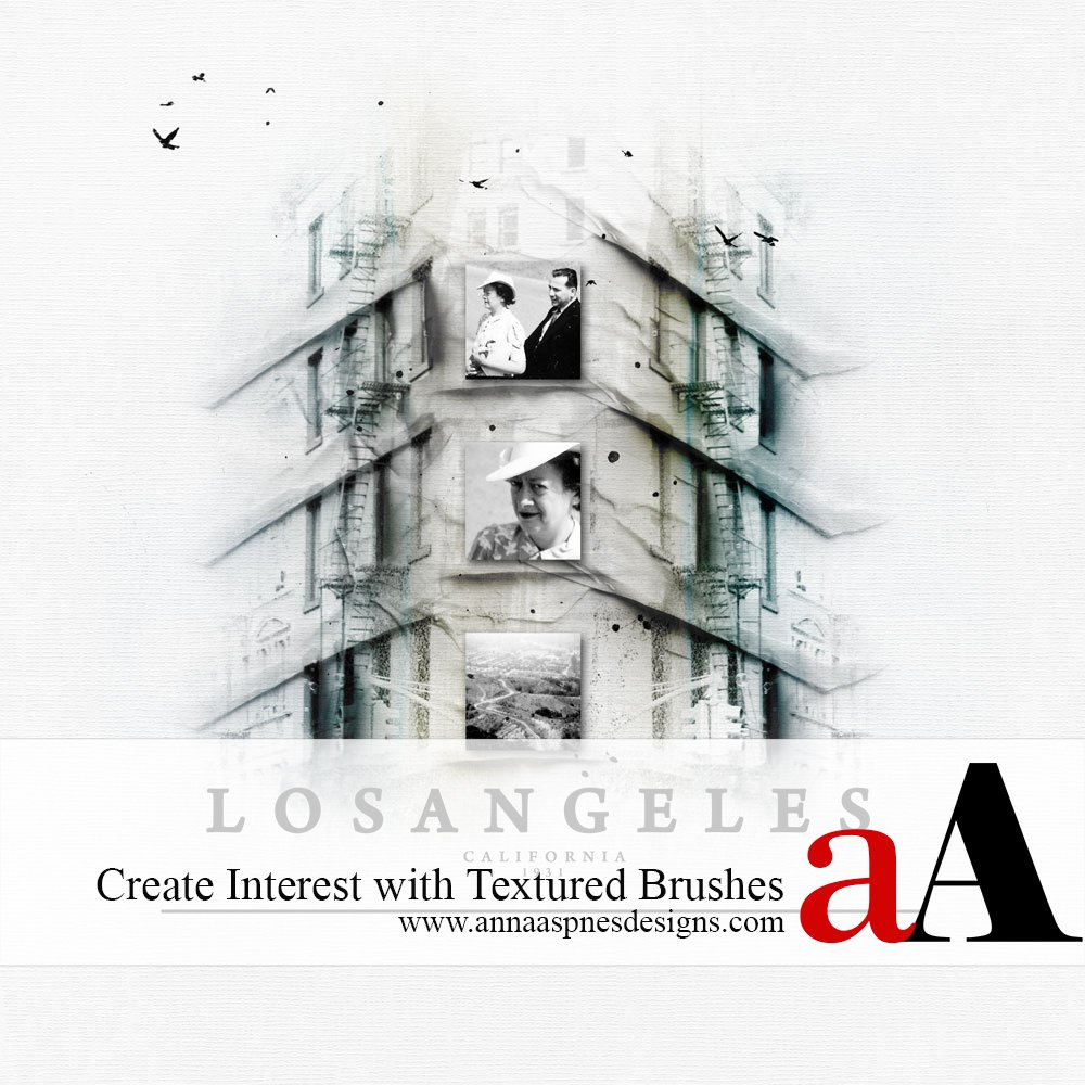
Creative Team Member, Adryane, shows us how to Enhance Digital Scrapbooking Pages with Textured Photoshop Brushes in Adobe Photoshop.
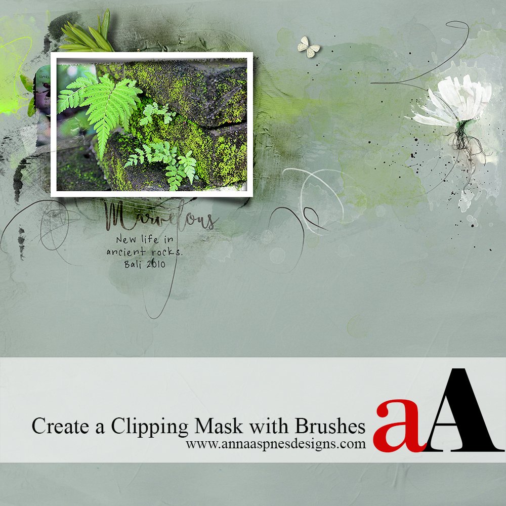
1. Complete your design, and then consider how the textures might make it better. The textures can be used to add depth, provide a a place for a photo to sit (shown here) or to create interest (shown here).
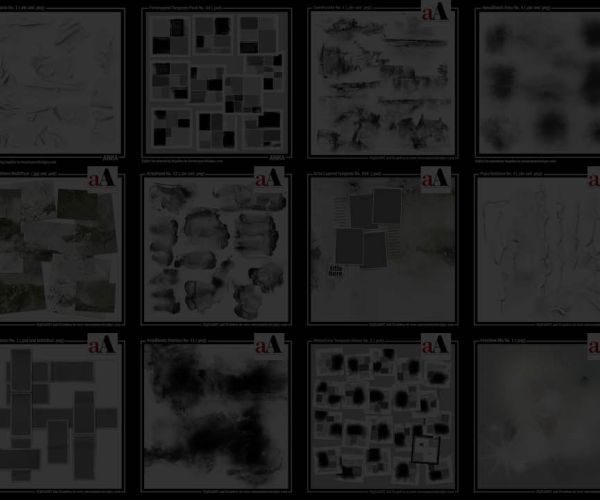
2. Load the textured brushes (Edit > Presets > Preset Manager > Load). For my layout, Los Angeles, I used only TapedTextures No.1, but I often combine the textures from the different Brush Sets.
3. Stamp the TapedTextures onto your design and position it. In my layout, the textures were stamped and positioned along the horizontal lines of the building. I used ArchiTextures No.2 to add the building to my layout.
4. The brushes layers can be stacked to create deeper shadows or the opacity/fill of the layers can be reduced to created softer shadows.
Below is my layout before an after adding the TapedTextures.
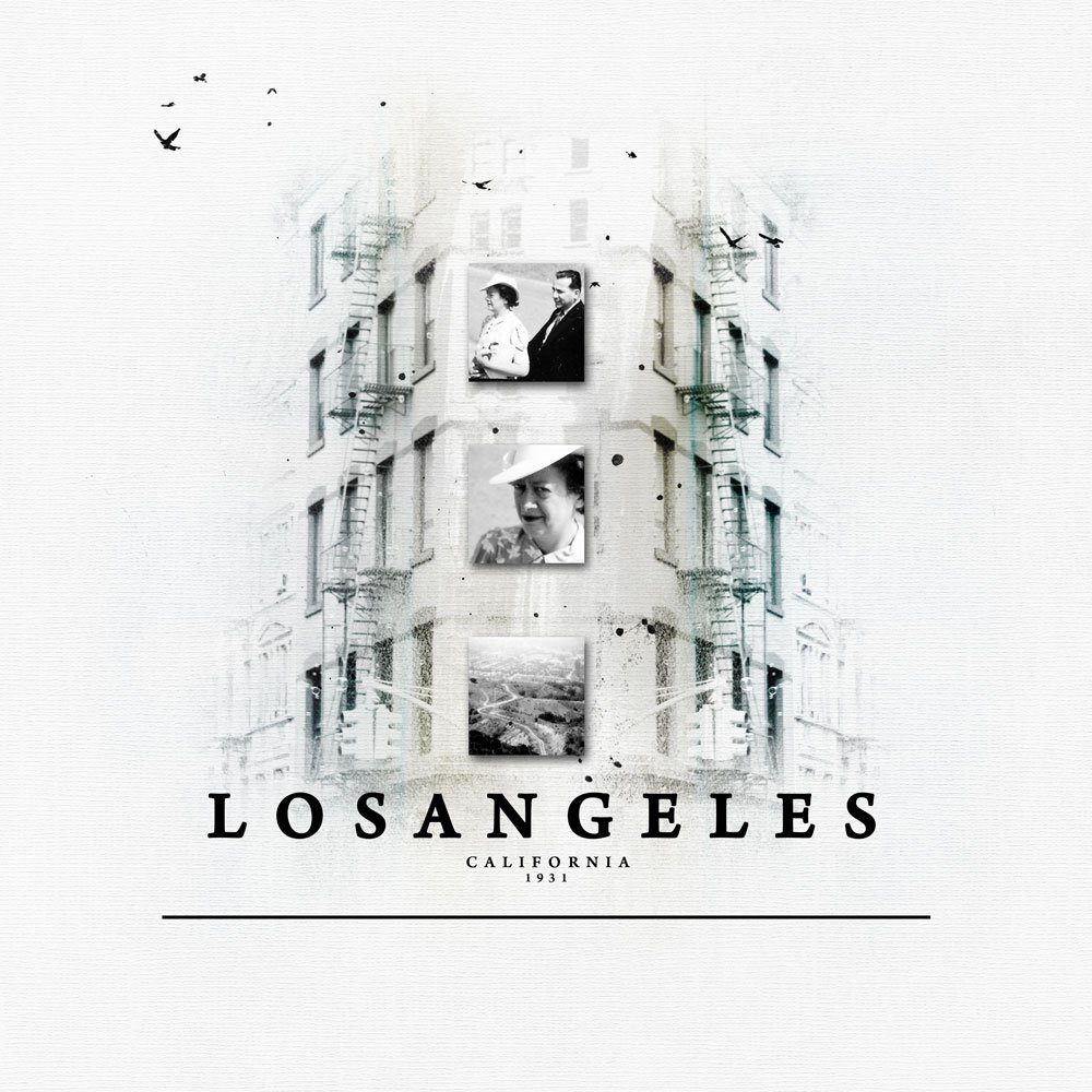
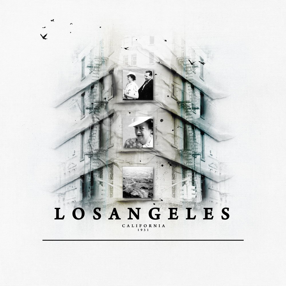
Click on the above photo for additional process notes and supplies used.


Thank you for this tut!!! The layout looks fantastic with the tape textures added! I have a question! What color do you use to stamp them with? I’ve played a bit with mine to see what I can do with them and black doesn’t seem right. Also, what blending mode would one use? I would certainly appreciate any help!
Su
Hi Su, the textures for this page were stamped in black. You can stamp the textures in other colors or add a color overlay to a stamped layer to change the color. Color overlays work especially well if you want a softer color for the texture. The burn blending modes will give you darker shadows. So, if you stamp a texture on a layer (setting the blend mode to Normal) and then duplicate the layer and set the blend mode of that layer to Multiply, Color Burn, or Linear Burn you will see that the shadows become much darker. If a shadow is too dark you can reduce the opacity of the second layer or use a layer mask to erase parts that you don’t want.
Thanks for the informative tutorial. I love using them on my layouts and enjoy seeing them in the gallery. I sometimes struggle with getting the look I’m after but some of your suggestions will be really helpful. Thanks again!!