Creative Team Member, Adryane, shows us how she uses MultiMedia Elements as Digital Scrapbooking Focal Points in Adobe Photoshop.
As I continue to work on my heritage project, I am trying to find new ways to work with old, grainy, faded photos and make them interesting.
One way to do this is to use an element as a focal point.
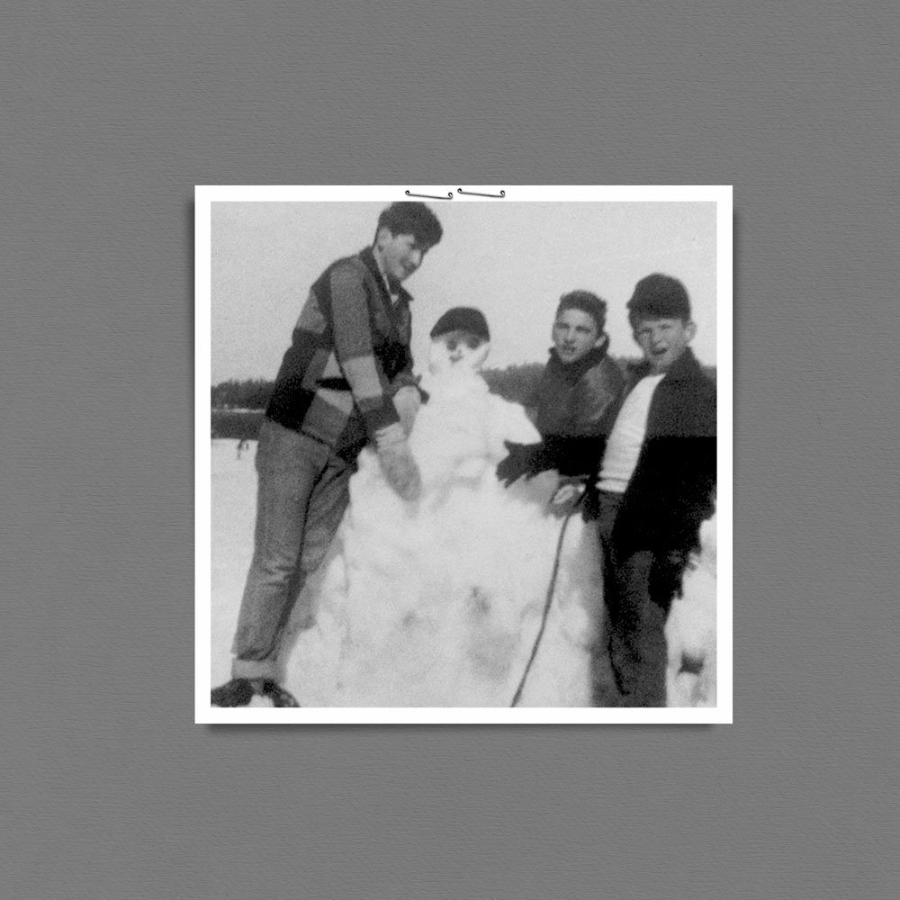
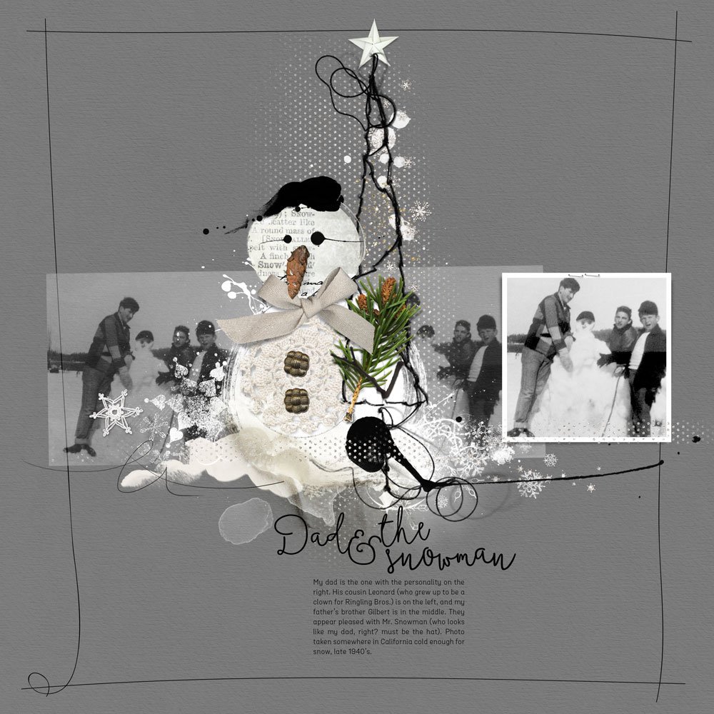
1. Choose an Element that Supports your Image. Here, I chose one of Anna’s MultiMedia Snowmen. The hat on the MultiMedia Snowman looked a lot like the hat on the snowman (and my Dad) in the photo. Place the element in the center of your page. Note: When working with oversized elements, I have found that they work best in a center-weighted design.

2. Position your Photo(s) Around the Element. You want the element to create interest in your photo. Here, the element was used to draw the viewer’s attention to the snowman in the photo and then the people around the snowman. To continue the theme of the people around the snowman, I duplicated the photo twice and moved the images in a horizontal line around the snowman. Depending on the element you choose, you might place your photos vertically, in a circle, or in some other formation that makes sense with your element choice.
3. Add Title and Journaling. When using this approach to a page, your title and journaling can be used to pull the element and photos together into a single story.
Click on the above photo for additional process notes and supplies used.





2 Responses
Great information… I will put it to good use!
This is great! Sharing your design ideas and tips is so helpful! Thank you!
Su