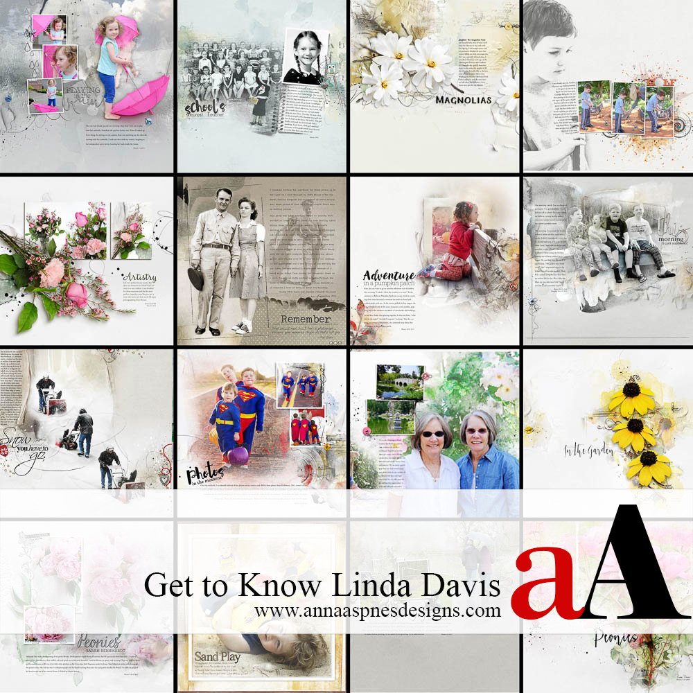
Today aA Creative Team Member Linda Davis, shares her thoughts on finding her own style in an excerpt from her blog post, Finding My Style.
I like to think that I’m an artist with both my camera, a Fuji X-T2, and the scrapbook pages that I create, at least I feel that way when I am making photographs or playing in Photoshop with Anna’s designs. My process objectives for scrapbooking are rather simple: choose the photos that speak to me and write the stories of those photos, stories that I want my family to remember. After giving some thought to what I wanted to share about myself as a member of Anna’s Creative Team, I decided that you might like to know more about where I am at in my journey towards developing my own scrapbooking style, not that I’ve finished the process yet.
aA Creative Team Member Linda Davis
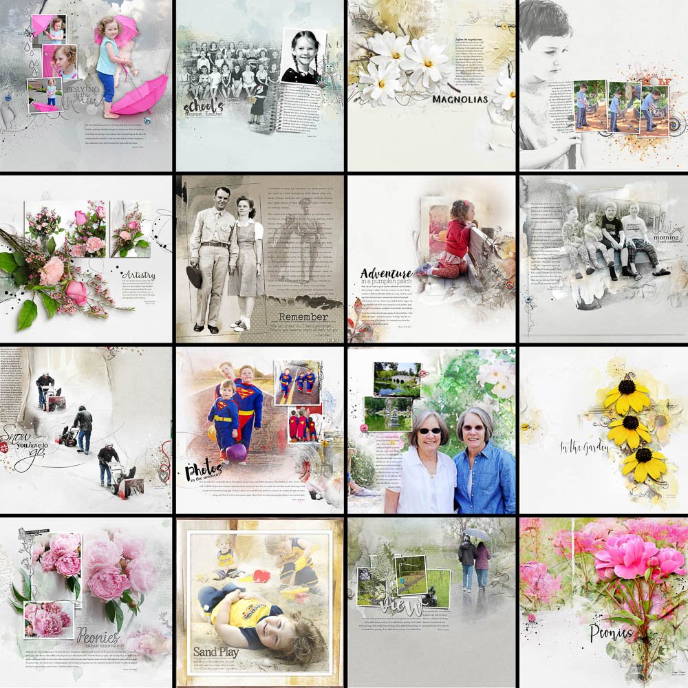
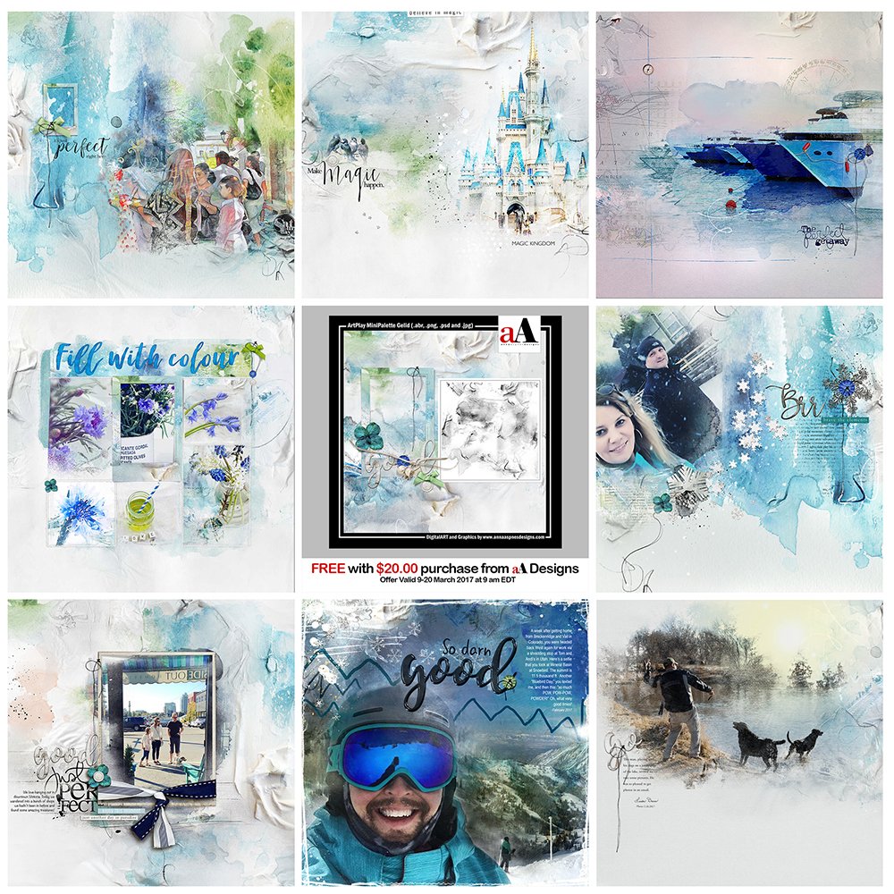
In preparation for this post, I created a grid page with some of my favorite layouts over the years that I have been digitally scrapbooking. (Note that I never scrapped with paper.) The layouts pictured above span my early efforts at creating artsy pages from 2011 until the present. After finishing the grid, I made a list of common elements I noticed on these favorites. This is my list of the elements common to those pages.
- Focus on Photos
- Include Blending and Extractions
- Include Journaling
- Relatively Clean and Freeform Overall Appearance
- Adapt One of Anna’s Templates or Paper Designs
- Color on Neutral Solids
Below are some examples of what I mean by the terms I used to describe my style characteristics.
Focus on Photos
I have always been the family photographer, with a little Instamatic when my children were young. I placed those often somewhat blurry photos in albums, chronologically, along with some older family photos. Fast forward to the present, I am currently capturing memories for my family with a mirror-less Fuji X-T2. When I don’t have my Fuji with me, I use my iPhone. The old photos in those albums have all been digitized now and labeled with keywords and captions in Lightroom.
I really do believe that as my photography skills have improved, so has my scrapbooking. That’s why I continue to take photography classes and practice. It is much easier for me to create pages if my photos are the best that I can make.
Blending and Extractions
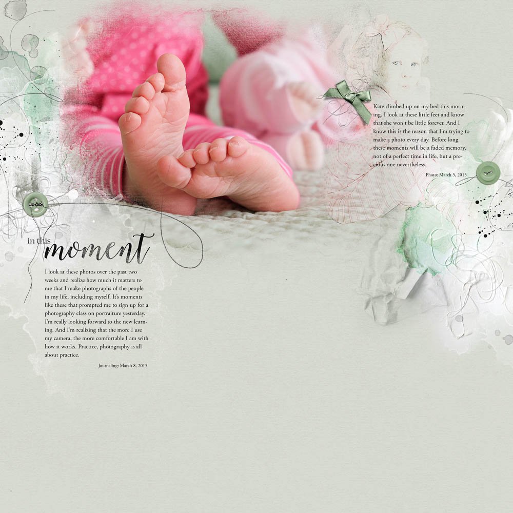
What first drew me to Anna’s artsy designs was the concept of blending. In the fall of 2011, I enrolled in a course with Jana Morton just to learn how to blend. This layout combines both blending and an extraction, two techniques I love to incorporate in my pages.
With additional classes and practice, I have learned to work comfortably with the Pen Tool, the Quick Selection Tool and masking. Most of my layouts include at least blending and often extractions as well. This recent layout combines all six elements of my style: blending, extractions, color on neutrals, journaling, focus on photography, adapting a template and a clean free form design.
Journaling
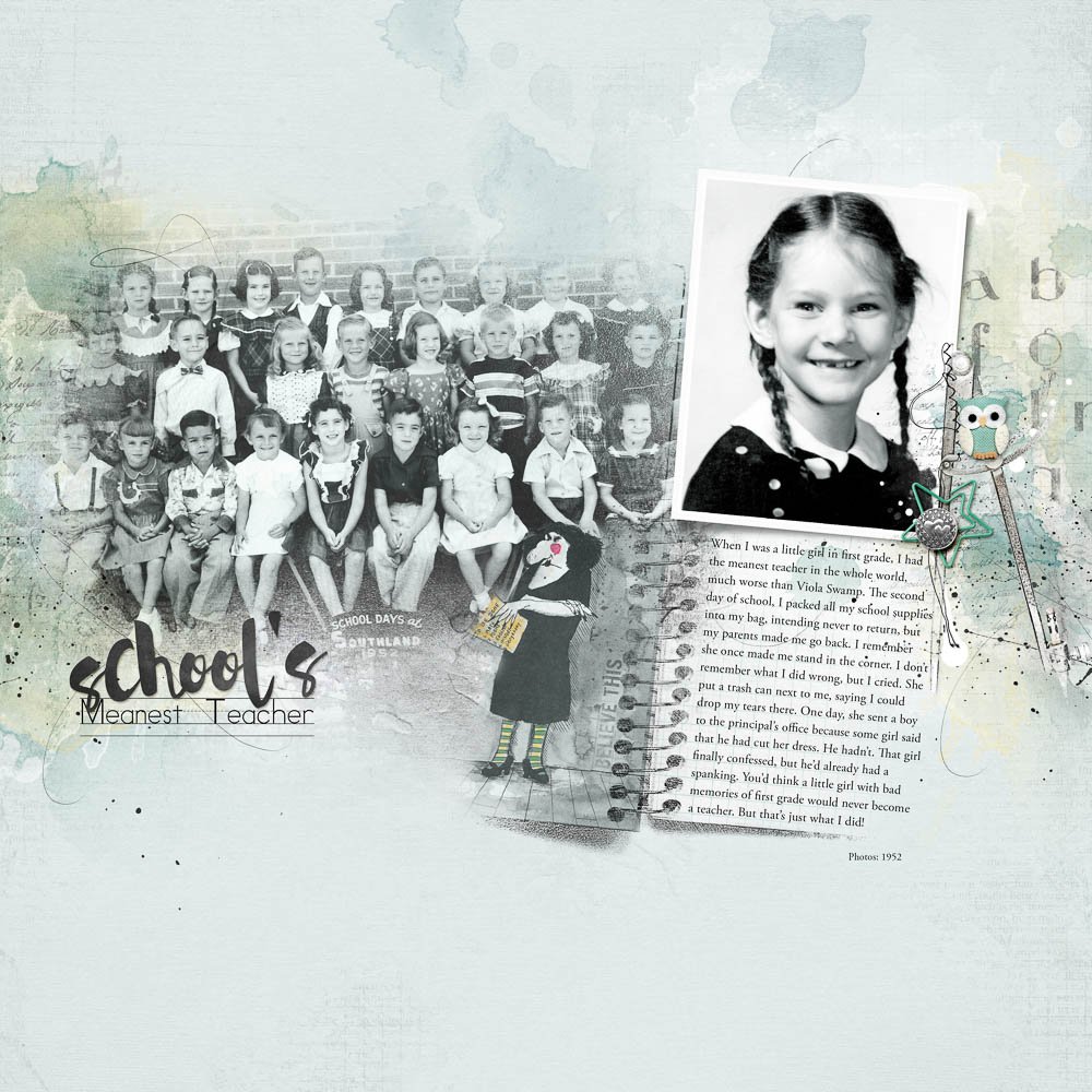
Telling stories about photos is important to me. My dad used to tell me stories about his childhood. I only wish I had them in writing. I know he’d love this medium of combining photos and stories. I include journaling on the majority of my layouts as is the case of this layout with two old school photos and journaling about an influence in my decision to become a teacher.
Clean Freeform Design
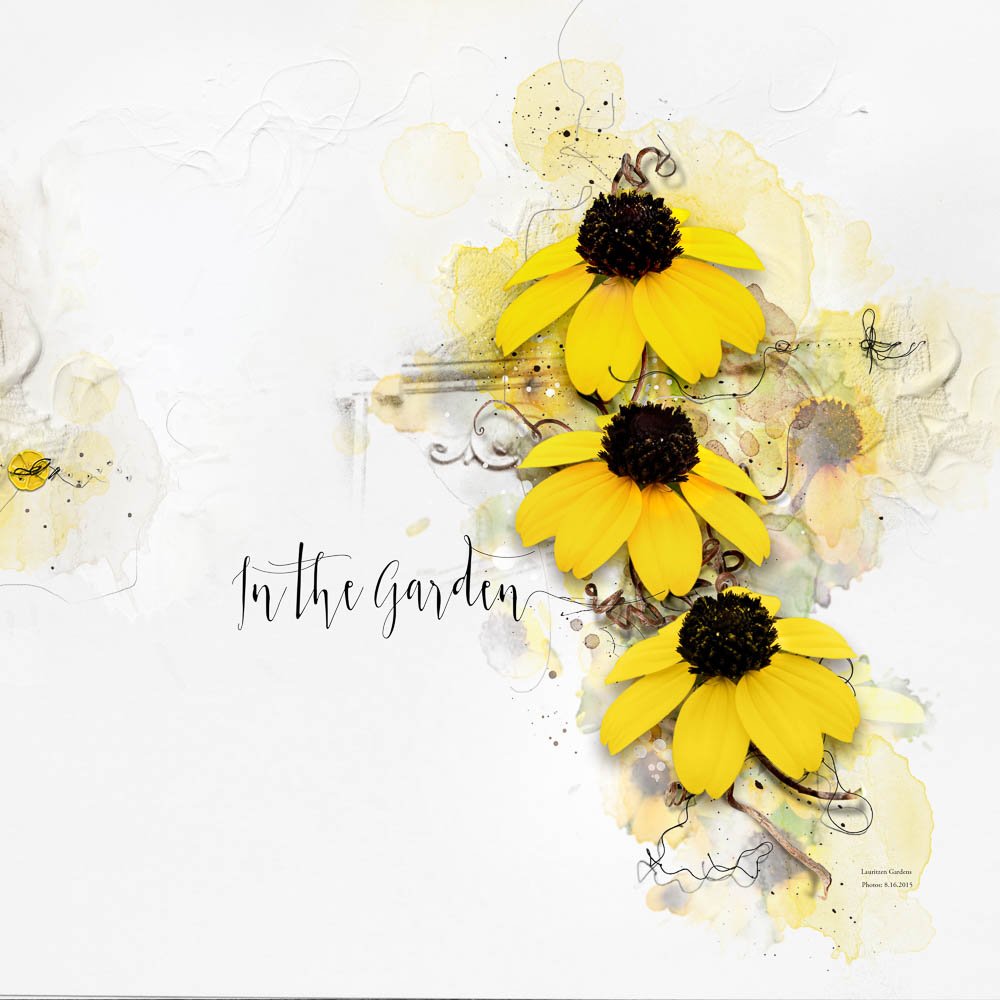
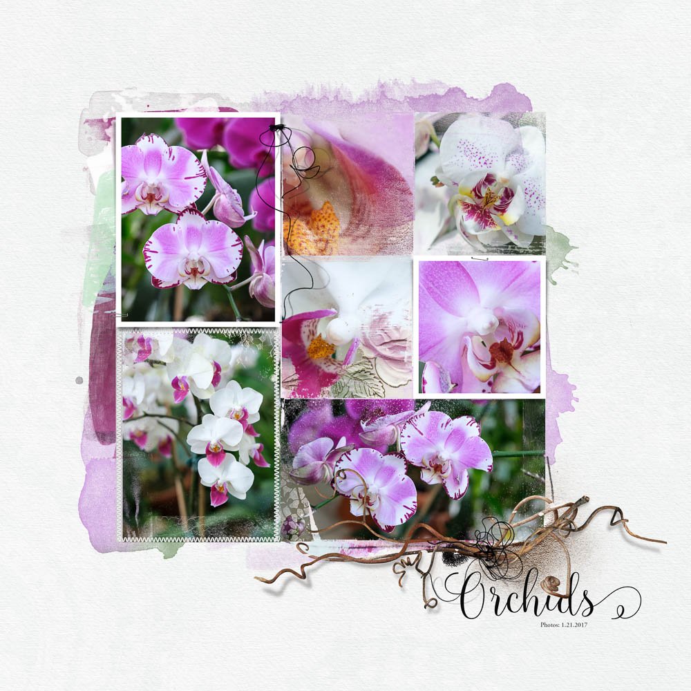
I like the relaxed, free form shapes of Anna’s designs. I like that I have the freedom to create clean pages as opposed to a more grunge or art journaling style with her designs. On this page, I used some of Anna’s brushes, Transfers, Twigs and Texture to create art with flower photos. There are a few Splatters, but overall, the white space and content create a clean look.
Adapt a Template or Artsy Paper Design
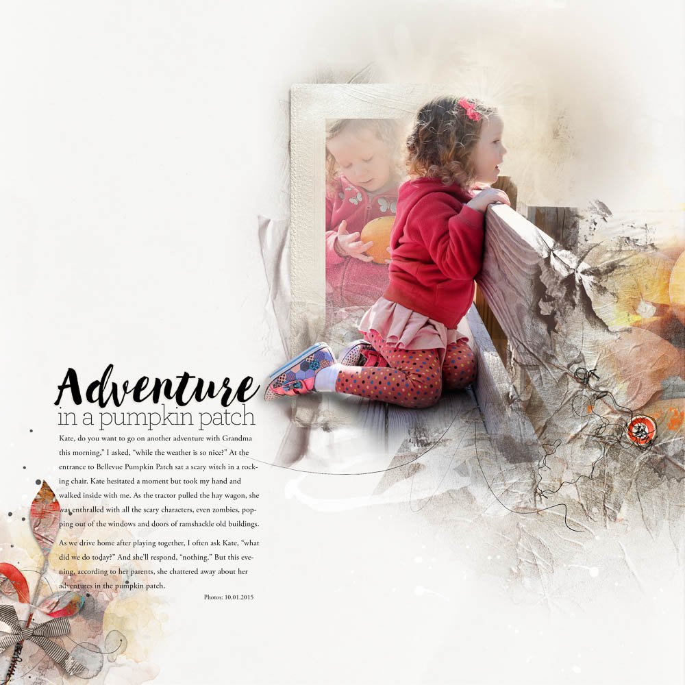
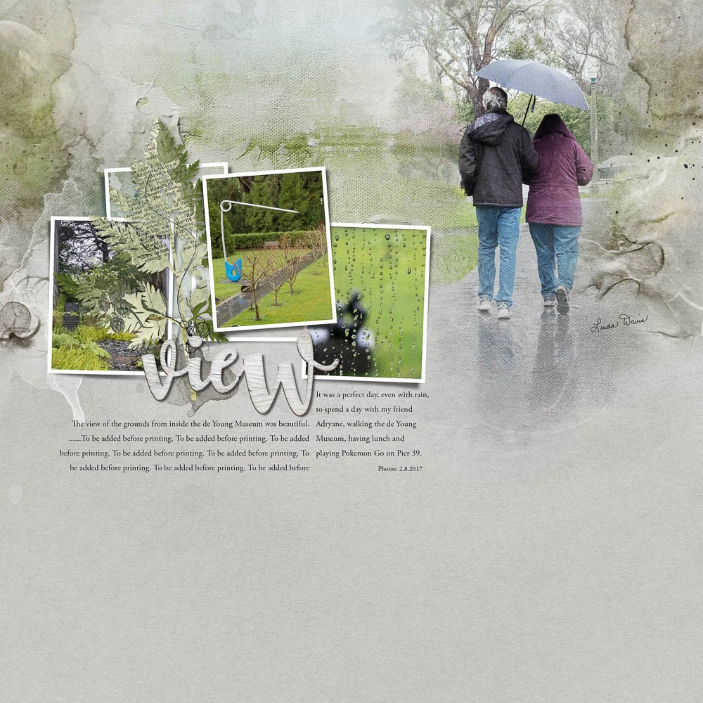
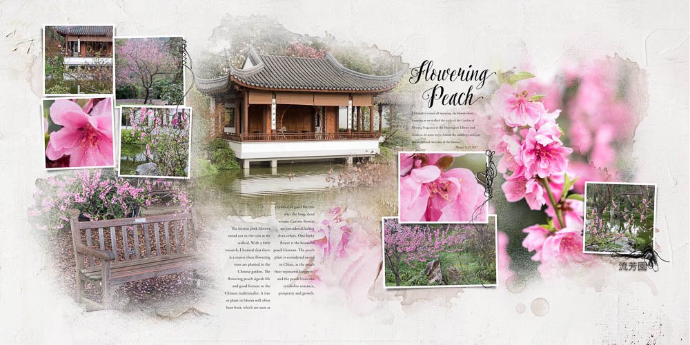
I often rely on the design of Anna’s Templates and/or Artsy Papers to create my pages. They are a design learning tool for me. After participating in several of her classes, I know much better now how to adapt them to fit my needs so that my pages look unique. You probably can’t readily see the specific artsy paper on the layout below because I combined two papers and transfers, nor the templates’s basic design because I adapted the small frames to accommodate my blended focal photo.
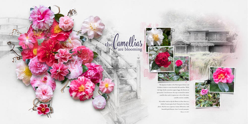
I am working more with Anna’s Templates to create two page spreads that I publish in books. This has been part of my learning in Anna’s classes, and adapting them something that I’ve adopted as part of my style. The templates fit with my objective to share photos and tell stories.
Color on Neutrals
I use primarily neutrals for the backgrounds of my pages so that the color in my photos pop in contrast to the background. As I create double page spreads for my books, I am finding that I don’t have to use only one paper throughout the book. It’s cohesive enough for me to use lighter backgrounds and blend in sections of Artsy Papers when desired.
You might consider creating a grid of favorite layouts for yourself if finding your personal style has frustrated you as a scrapbooker. After taking classes, experimenting and imitating the work of others, I often wondered about who I was as an artist. I didn’t want to be someone else. I tried to reflect on my pages while I learned, what I really liked, what skills I wanted to develop further, what was fun to create, what was important that I include on my pages. Believe me, there have been a number of my pages that I have not liked in the process of developing my own style. Knowing what characteristics I value in my style gives me more confidence when looking at new trends, the art of others or class content. It’s not that I won’t change with new learning, rather it’s more that there are style elements that just feel right for me as an artist.





Thank you Linda, I really enjoyed reading your article. I can’t seem to find what I think is my own style, still trying to copy others that I like, but kind of hopping around in the process. I like your idea of creating a grid of my favorite layouts, maybe it will help me really focus on what elements I like for myself! Again, thank you, I truly think your pages are works of art.
Thank you so much Karen, as you hop around in your process, your style will come and I hope the grid helps you see the common elements in your work!!
Linda, your work is keeps getting better and better—just like a fine wine! And your photography skills amaze me. Not only are you recording your family history, but you’re also creating a family treasure for future generations.
A great post Linda and I’m going to create a grid and create it as a book page for my next Blurb book. Thank you for sharing your process.
What great insights and so beautifully written. Your photography is wonderful and so are you pages! Thanks for a great post