

In this series of tutorials, the aA Creative Team will be showing older layouts and reworking them to show you how they made improvements. Today, Creative Team Member, Miki is sharing her ART rePLAY No. 4.

ART rePLAY No. 4
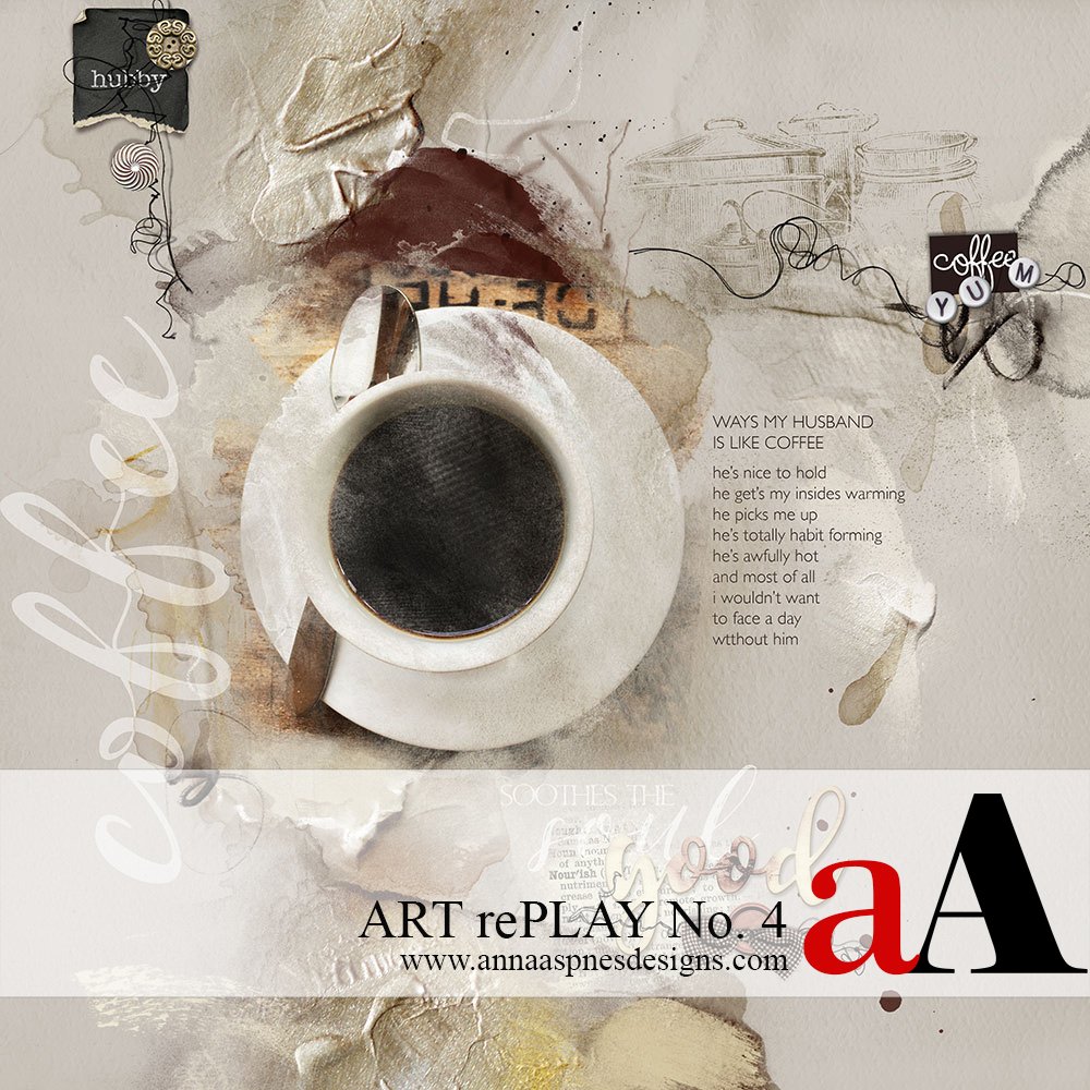
Background. Every year my husband gives me two birthday cards, one romantic and one funny. The funny card on this year was an analogy of love and coffee. The BEFORE page, created in 2013, was a spoof comparing my love for my husband and his love for Dunkin’ Donuts coffee.
BEFORE.

AFTER.

6 Ways to Improve Your Digital Scrapbooking and Artistry Layouts
1. Artsy Papers. When creating pages, I tend to gravitate to solid papers and then build up the design. But Anna’s Artsy Papers make it easy, the work is already done. Her papers have an open space perfect for adding photos, WordART or Elements. Artsy Paper 1 from ArtPlay Palette Fare was used on the AFTER page creating a vertical design. The contrast of colors and textures added more interest to the page.
2. Visual Texture. Visual texture is created through the use of various artistic elements such as line, shading and color. It is the illusion of having physical texture. The use of rough surfaces can be visually active and smooth surfaces can give the illusion of being restful. On the BEFORE page I attempted to add some texture by using Splatters, a few ArtStrokes and a stripe brush. However, the image still looks flat. On the AFTER page by using the Artsy Paper, the colors, tapes and paints have added the visual texture and contrast making the page feel more tactile.
3. Photography. Photography, not the mechanics of photographing, but the artistry of taking photos has been my focus lately. Both pages show a cup of coffee, but the AFTER page has more interest because of the perspective of the photograph. I use my iPhone for most of my photos. It’s lighter than carrying around my Canon and bag of lenses. The resolution of phone photos has improved greatly.
4. Masking. Anna has a plethora of FotoBlendz masks that can be used. On the BEFORE page a mask from Original FotoBlendz No. 14 was used. My blending skills were limited at that time and I used an eraser brush to shape the mask. On the AFTER page, Transfer 1 from Artplay Palette Fare was used. The photo was clipped to the Transfer and a Layer Mask was added. Using a brush from AnnaBlendz Artsy No. 4, the edges of the Transfer were softened up. Some of the Transfer was erased in the middle of the coffee cup giving the illusion of steam. The Blending Mode of the Transfer was changed to Hard Light which also allowed some of the texture of the Transfer to show through. Anna’s LIVE Classes have helped me tremendously with blending techniques.
5. WordART. On the BEFORE page, the word art circles the coffee cup, duplicating the roundness of the cup rim. But it is hard to read, not knowing where to begin or end. I did use two different fonts to help emphasis the most important point. Also, the title is stands apart from the journaling, making the eye travel. On the AFTER page I decided not to use a circle path because of the circle shape of the photo. The journaling is left justified with the title capitalized. The words that are being compared: coffee and hubby are juxtapositional, emphasizing the analogy.
6. Visual Triangle. The concept of a visual triangle is to use elements and color to draw additional attention to particular parts of the pages. It’s also a way of framing the focal point. The BEFORE page uses a diagonal design with no point of interest other than the cup of coffee. The AFTER page, as mentioned, has a vertical flow. By creating three distinct clusters and placing then in a triangular fashion, the cup of coffee has been framed with the invisible visual triangle.
Stay tuned for more Creative Team insights to be shared in the new ART rePLAY series.


I like them both, Miki! The older one is kinda perky—perfect for a Dunkin Donuts layout. Your revised design reminds me of how warming and addicting coffee and/or husbands can be. Comforting too.
Thanks, Christy! My husband loves his Dunkin Donuts coffee and I’m kind of fond of him!
Thanks for sharing your layouts, process and thoughts, Miki!
Thank you, Ulla-May. I’m forever learning new artsy techniques from Anna!
I love your rePlay. When I look back at the pages I created 3-4 years ago, and compare them to the ones I am making now, the improvement in my skill level becomes very apparent. The BEFORE and AFTER of your transformation is visually profound, and the text in your rePlay reinforces some of the skills and understanding that I have learned from Anna Aspnes and her team. My eye is getting better at discovering ways to improve my work, and because of helpful tutorials like this, I feel like a bit of an alchemist sometimes! Thank you for sharing your creative magic.
Thank you, Louise. I agree with you … a bit of chemistry and a lot of Anna’s magic!
Great reworking I love it.
Thank you, Viv!