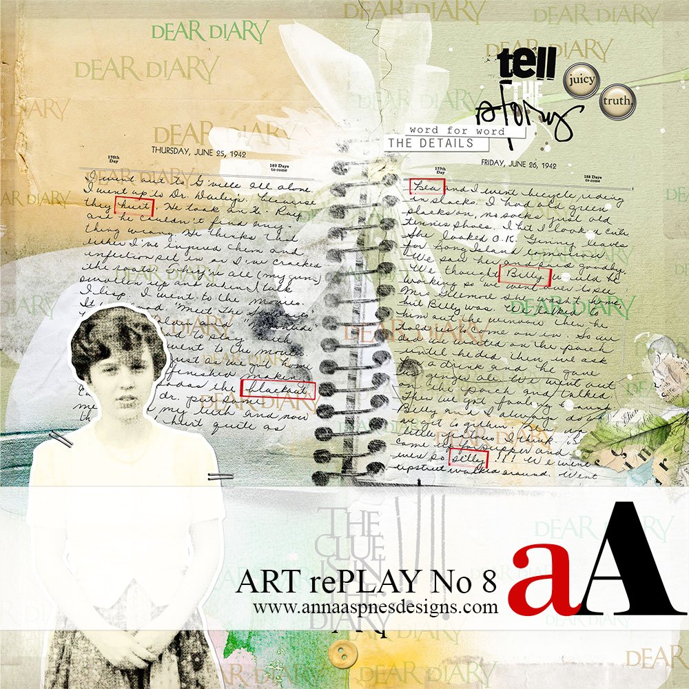
Today, Creative Team Member, Miki is sharing the ART rePLAY No 8.
In this series of tutorials, the aA Creative Team show you some of their older layouts, before reworking them to demonstrate improvements.
Before and After ART rePLAY No 8
Artistic styles change, new techniques are learned, and Anna is always coming up with exciting new products, giving me more ideas.
I wanted to redo this page with a little more pop, using new products and techniques.
Background. 1942 must have been a big year for Sally.
She kept the diary for years. Most of the diary entries were about her relationships with girlfriends and the boys that she thought were cute and then didn’t think were cute.
There were also a few entries about movies and movie stars (William Holden, James Cagney, Betty Hutton).
Her first job was at Grant’s Department store, making 25¢ an hour and complaining about it.
An awareness of WWII and the boys leaving school to join the war effort were hinted at, also. I think this was the beginning of the end of a young girl’s innocence.
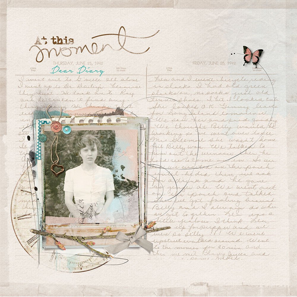
I wanted the diary page to be the focal point and also to include a picture of Sally at age 16, when she wrote the entries. But the page seems flat to me now. There just isn’t enough color or depth to reflect the excitement that she must have experienced at that time in her life.
BEFORE.
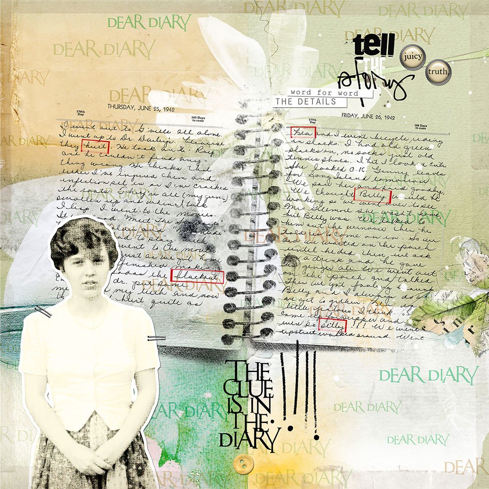
AFTER.
DigitalART Supplies
I tried several different background papers, but finally settling on a multi-colored paper from ArtPlay Palette Imagination. This provided had four areas of color/interested that wouldn’t overwhelm the handwriting.
The brush with the spiral binding came from Notebook No. 2. It was perfect for adding dimension to the diary entry.
Key words were outlined using the Mask the Mask Label Set No. 2 (now retired from the aA DigitalART store).
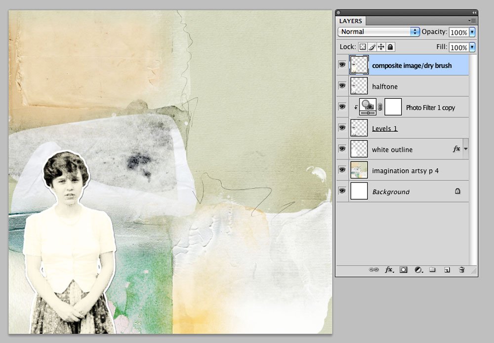
DigitalART Process
Step #1. The photo had aged, giving it a yellowish gray color, so it was converted to black and white.
This was achieved by de-saturating all the color using the Hue and Saturation tool.
- Image> Adjustments> Hue and Saturation
Step #2. Create an extraction of the image, removing the background of the photo and retaining the photo subject only.
Step #3. Apply a color filer to change the overall tint of the image.
- Image > Adjustments > Photo Filter.
Step #4. Duplicate the photo layer in the Layers panel and apply a Halftone Filter.
- Filter > Pixelate > Color Halftone (The maximum radius was changed to 4 with all other settings remaining the same).
Step #5. Create a composite image of the three layers , or duplicate the these layer and merge the copy layers.
Note that I kept the original layers in case I needed to make some adjustments.
Step #6. Apply a dry brush effect to the extracted image.
- Filter > Artistic > Dry Brush.
Step #7. Create a sticker background on a separate layer.
- Create a selection, by holding down the CTRL/CMD key on your keyboard, and clicking on the merged extracted photo layer in the Layers panel. This will yield ‘marching ants’ around the outline of your image.
- Go to Select > Modify > Expand (20 px).
- Fill with WHITE using the Paint Bucket tool located in the Tools panel.
- Add a Drop Shadow Layer Style from the Layers Menu.
Step #8. The WordART was added in the background, using one of the brush techniques demonstrated in the aAdvanced Brushes in Adobe Photoshop workshop.
I think the AFTER page reflects more of the ups and downs of young love and eyes opened to a changing world of a 16 year old girl.
Click on the above images to see digital supplies used in Before and After ART rePLAY No 8.
Stay tuned for more Creative Team insights to be shared in the new ART rePLAY series.






Love what you’ve done here, Lindy! The redo has an exciting “scrapbook” ambience that’s vibrant and current. Fabulous colors too.