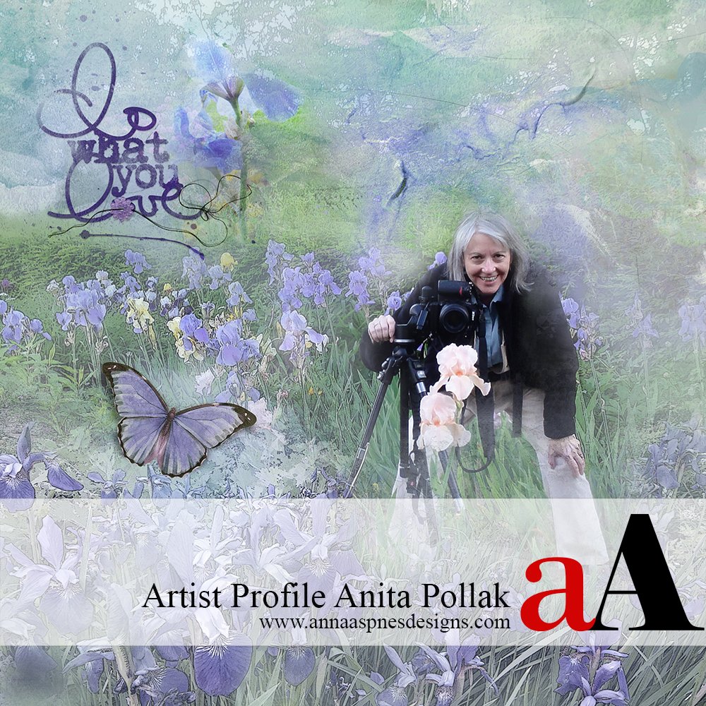
Today we are sharing a Q & A Artist Profile Anita Pollak .
Anita Pollak is a digital memory keeper and digital artist who loves creating unique art using Anna Aspnes Designs.
Big thanks to Anita for allowing us to share her artistry.
Artist Profile Anita Pollak
1. Tell us about yourself and how you discovered digital art?
I didn’t come from an artistic or creative background, and I certainly never thought of myself as an artist. After all, I couldn’t draw or paint and, until I met my husband Rick, the most sophisticated camera I had ever used was a Kodak Instamatic!
Rick’s father did photography jobs on weekends, and Rick often assisted him. He taught me to use an SLR and my passion for gardening naturally led to my focus on flower photography.
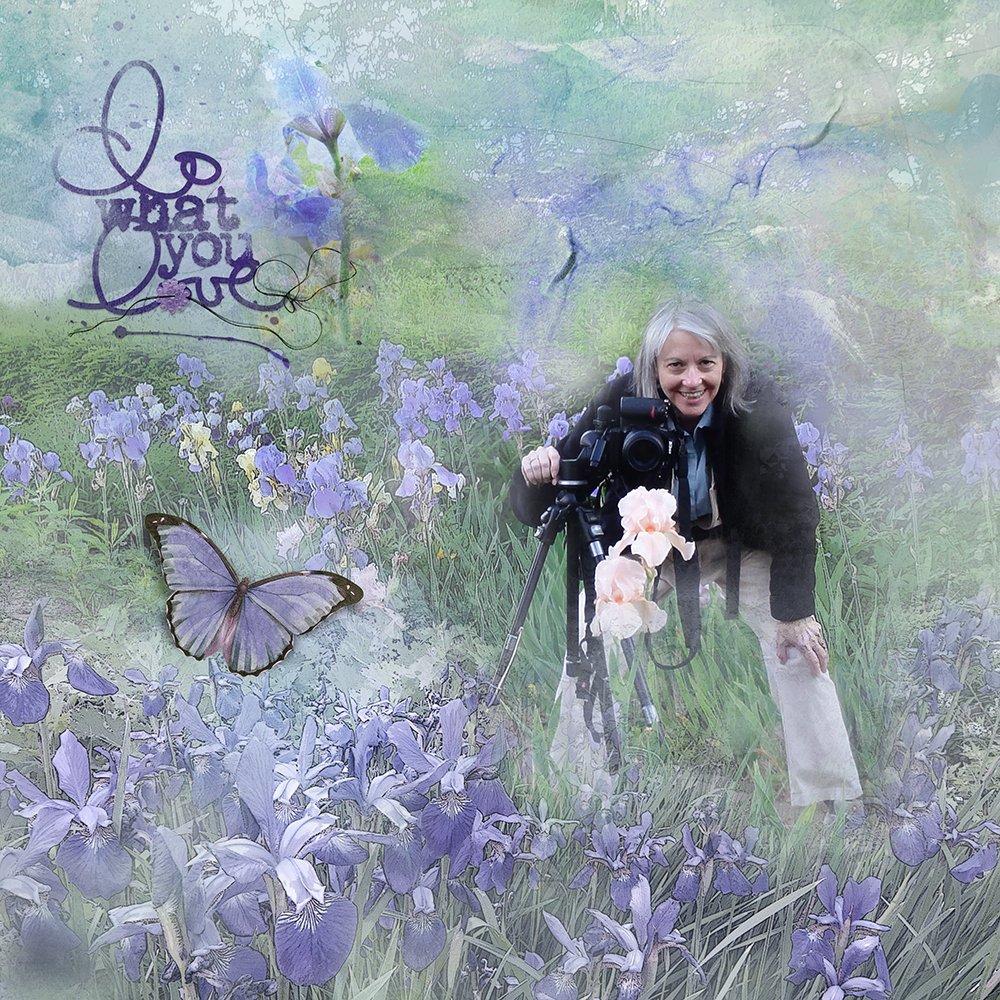
I first discovered digital art back in 2004 when I purchased a program called “Buzz,” a simplifier plugin for Photoshop that gave photos the look of a painting. Playing with Buzz led me to join a Yahoo group where I learned about other plugins and found great tutorials and supportive members to help me as I developed my digital art skills. As someone who can’t draw or paint, this offered me a wonderful outlet for my creativity.
When Buzz was no longer available, I found that Topaz Simplify had filters that created a similar effect and I still use Simplify today, along with filters from On1, Nik, and Alien Skin. I also discovered the magic of textures and I often use both filters and textures on my images.
I began doing digital scrapbooking at about the same time, and found it both challenging and fun. I hadn’t done it for many years, but I came back to it after seeing the amazing work that Viv Halliwell, Beverly Cazzell, and Carolyn McIntosh were creating with Anna’s products. I then signed up for a Year of ArtPlay and I am in love with Anna’s artistry, style, and approach to scrapbooking.
2. What kind of process do you follow when you create a page?
I tend to work slowly and deliberately ‐ OCD will have that effect! I start by picking the images I think I want to use, and I usually choose many more than I end up using. Then I look through the ArtPlay Palettes that I think would work well with the images and select a background paper, or several to try. I often use solid papers because they give me more flexibility when I add the transfers. And how I love my transfers!
I’ll open a lot of transfers, group the layers of each, then drag them onto my layout. And then the fun begins! I move them around, recolor some layers, and turn layers on and off until I get a look I like. I may not use all of them, but I have fun “auditioning” them!
Sometimes I will clip a photo to a layer in a transfer, other times I’ll blend the photos using Anna’s wonderful blending brushes or Artsy Paintbrushes. I’ve also become more comfortable stamping brushes on my layout since I took Anna’s Advanced Brushes class. I do that more than painting with them, although I will try painting a few strokes from time to time for the fun of it.
I love using embellishments and I usually try many things to see what works best. I particularly like working with layered elements so I can use them the way I use the transfers. After adding a title, I enlarge the layout and use the navigator in Photoshop to check every part of the layout to make sure I haven’t missed a line or added something that doesn’t work on closer inspection.
3. Do you have a time of day when you are most creative?
Oh, this one is easy! I’ve been a night owl my entire life so I’m much more creative at night. I often stay up later than I would like when working on a layout, but since I’m semi‐retired I don’t have to worry about getting up early!
4. Your pages have a lot of blending. Do you have a favorite blending technique?
When I first started the ArtPlay class I tended to use more seamless blending, and I still do that but I really like intentional blending using Artsy Paintbrushes on a layer mask to bring back some of the photo. This gives me a chance to play with many brushes, as well as brush size and opacity, since my first try rarely gives me the result I like. And working on the mask is so forgiving, so I don’t have to worry about making a mistake.
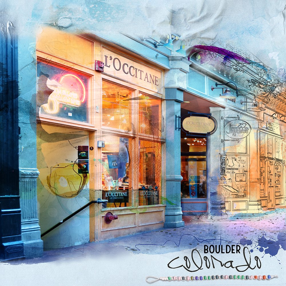
5. How did you create the page “Boulder Colorado,” especially the brilliant colors?
I had so much fun with that one! I made it for the June lesson in the ArtPlay class, which centered on using one image with a sketch technique applied to part of the image. It was initially a big challenge for me to find an image that works well with the sketch technique, since most of my photos are either flowers or fall foliage. I went back to a storefront shot I took in Boulder back in 2009 and was pleasantly surprised to see how well it worked.
The brilliant colors came from the paint layers and transfers I added and the different blend modes I used on many of them. I used transfers from APP Go Retro and APP Crazy Life, which are both very colorful palettes. Also, the papers from Destiny (normal blend mode) and Go Retro (linear burn blend mode) deepened the colors.
6. How would you characterize your style, and how do you think your style has evolved over the last year?
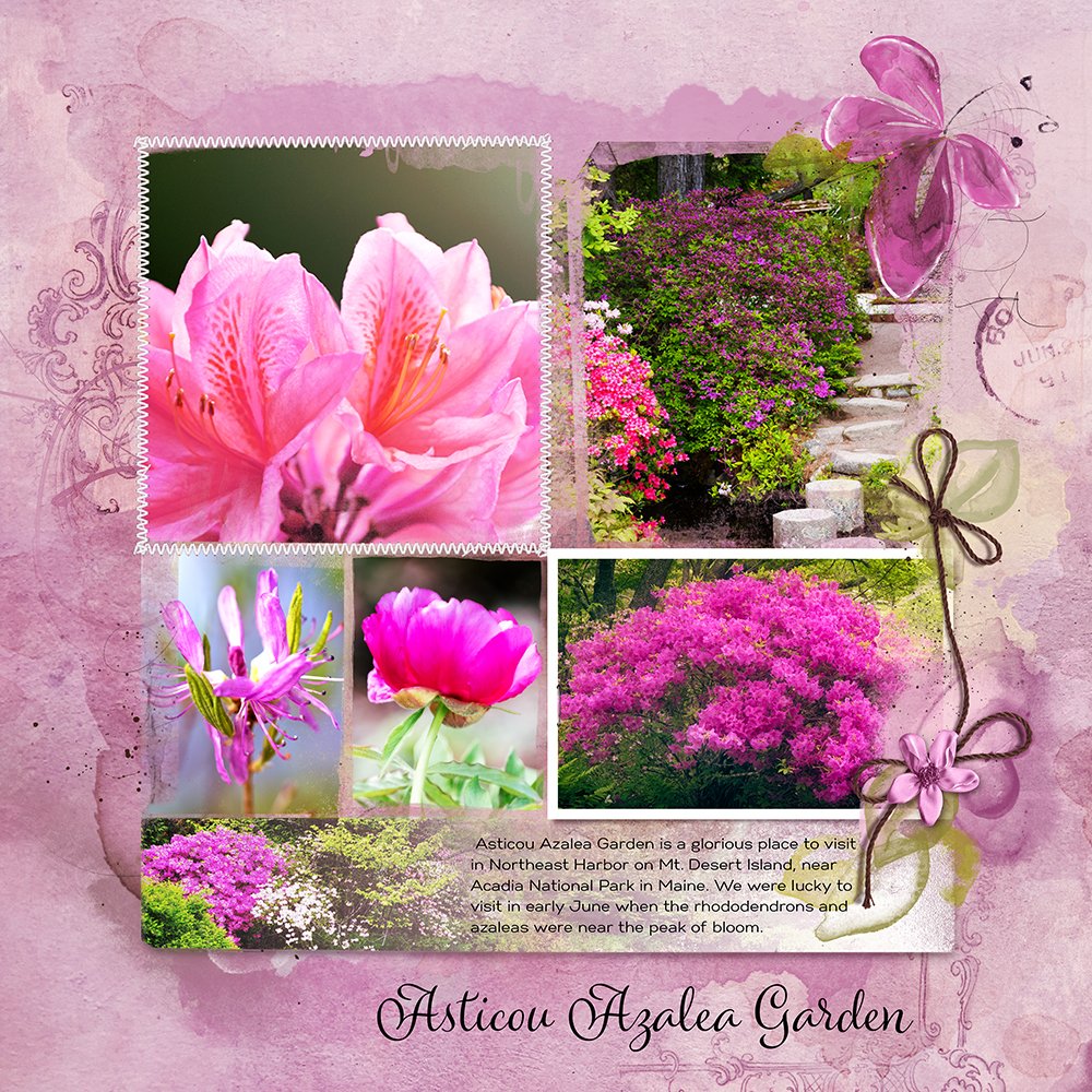
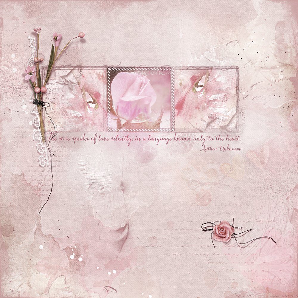
Ah, my style! I love color and texture and my layouts are usually complex, using a lot of transfers and MultiMedia elements. I think when I first started my style was a bit constrained ‐ a lot of boxes and notenough freeform. As the class has progressed, I’ve learned to bring more openness and movement to my work.
7. When you experience creative block, what do you do to move past it?
I often experience creative blocks, and they usually occur when I am trying too hard. What works best for me is to step away from layouts and play around with some of my photos using filters and textures, without any particular result in mind. Also, taking a walk or shooting in my garden always helps free up my creative juices.
Final Thoughts
I am so grateful to you, Anna, and everyone on Anna’s team for all the support you have given me on this creative journey. Thank you so much for giving me this wonderful opportunity to share my work and more about myself and my process!
We hope you have enjoyed this Artist Profile Anita Pollak. You can see more work by Anita in her gallery.
The Artist Profiles is a category of posts in which we aim to inspire you with the work of other artists, photographers, memory keepers, makers and curators. I believe we can learn much from others and inspiration can come from a variety of creative sources.
Please email me if you are interested in having your work featured in this space.


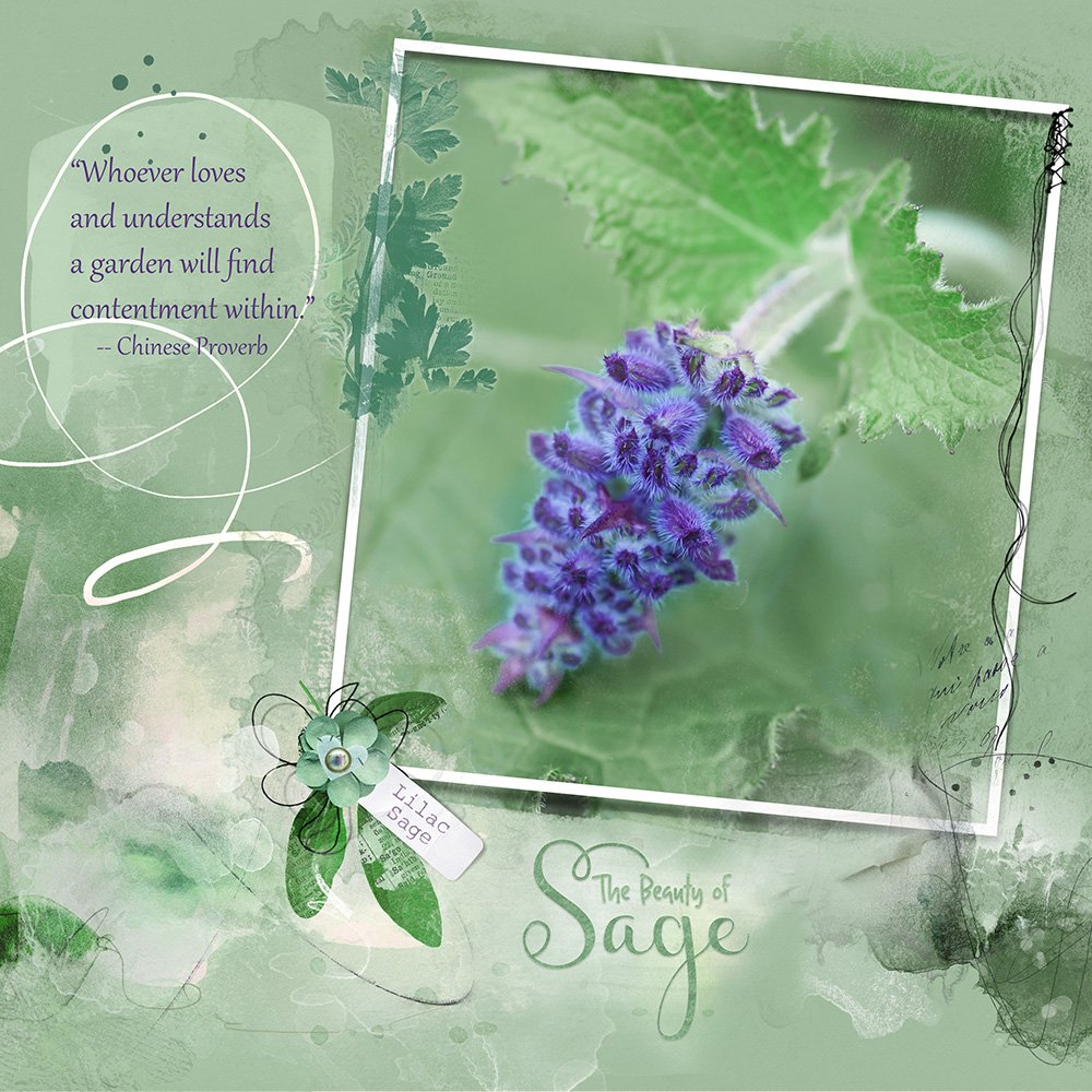



Anita, your interview is just lovely…filled with stunning artistry of your favorite thing to shoot, flowers, and the masterful L’Occitane store front (one of my favorite stores). I enjoyed learning about your deliberate processes, and the tools you use to create such beautiful work. Thank you for being open and sharing…you continue to inspire me!
Agreed.
Thank you so much, Anna! I am so grateful to you and Adryane for this wonderful honor!
Thank you so much for your beautiful words, and I’m so glad you like the interview! And you know how much I am inspired by your wonderful work!The support and encouragement we give one another in this class helps all of us become better artists!
Thank you for sharing yourself and your art, Anita!
Thanks for planning and conducting these interviews Adryane. Always so fun to read.
You’re welcome, Adryane! And thank you so much for giving me this opportunity and for all the work you put into these wonderful profiles!
I am SO inspired! I love your journey, and it is clear that your love of flowers is grand inspiration to your artistic side. Your eye (and your skill) for enhancing their beauty through art is INCREDIBLE!
Wow, what a wonderful thing to say, Louise! Thank you so much for your lovely comments! I’m so glad you are inspired by my work and my journey. and yes, my love of flowers is an endless source of inspiration for me.
I always enjoy your pages in the gallery Thanks for a glimpse of your artsy journey!
Thank you so much for your lovely comments, Pam!
Beautiful pages Anita!! Great interview Adryane!!
Thank you so much for your wonderful comments, Linda!
Anita this is such an amazing incredible interview. Your work is just so stunning. Each piece is beautiful. Thank you for sharing your art with us.
Love ❤️❤️❤️