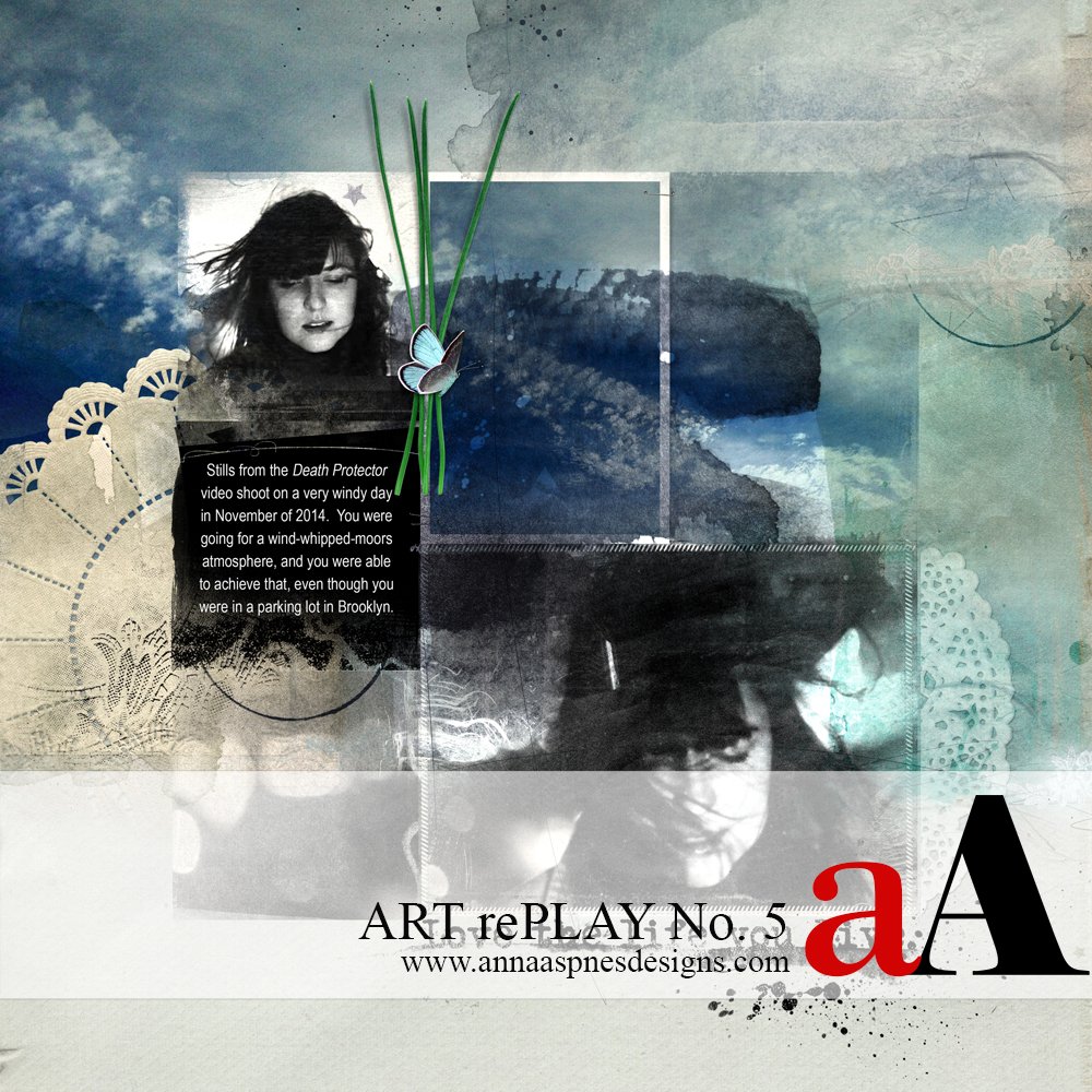
In this series of tutorials, the aA Creative Team are reworking older layouts to show you how they made improvements. Today, Creative Team Member, Laura is sharing her Before and After ART rePLAY No 5.

Before and After ART rePLAY No 5
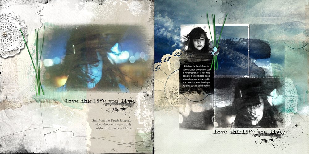
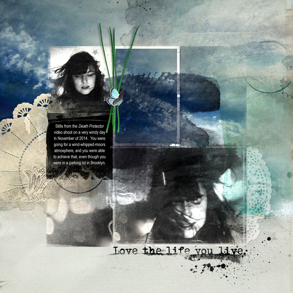
I don’t know what I was thinking when I made the original page a little over two years ago. I liked all the intense blues at the time and I still do, just not on my daughter’s face.
Definitely time for a makeover for Before and After ART rePLAY No 5.
I set the intention of my challenge as trying to keep (and even develop) the color intensity without having my daughter look like a ‘Smurf’.
I selected one of the FotoInspired Templates for this makeover because I’d been seeing a lot of amazing work with these templates in the gallery and FotoInspired Facebook group..
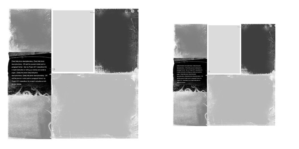
The template I chose was FotoInspired Double Template 38 A. After dragging it into a new document, I downsized all of the layers (except the background), just to create more breathing room.
I like to move all the layers together—to do this, click on the layer above the background layer, hold down the SHIFT key, and click on the topmost layer. This will highlight all the layers in between.
From there, it’s simple to grab one corner of the Bounding Box and draw everything inward until the template is the right size. (When you do this on a template, the font size is going to shrink, so make sure to up-size that at some point.)
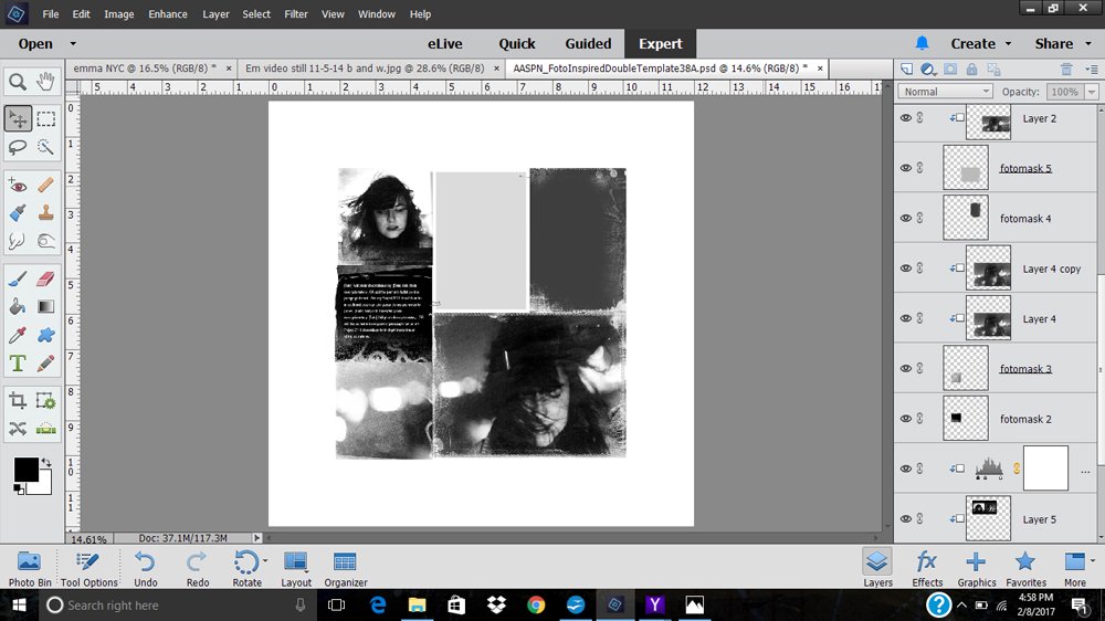
I clipped my photo to the largest mask and then added another photo from the same shoot, clipping it to the mask at the top left.
To make the photos more dramatic, I duplicated the layers and then applied the Soft Light Blending Mode at 89% opacity to the copy layers.
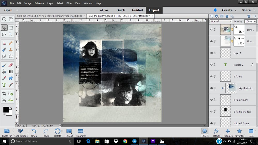
I then went to work on the background. I chose ArtPlay Palette Sky’s The Limit Artsy Paper #2 for the background, then clipped the sky paper to the remaining template masks.
To apply texture and pattern, I placed two papers as overlays at the very top of the Layer stack—Artsy Paper #1 and Artsy Paper #5—on Multiply Blending Mode at full opacity.
You can see in the layer panel that I used layer masks to remove the overlay patterns and colors from certain areas.
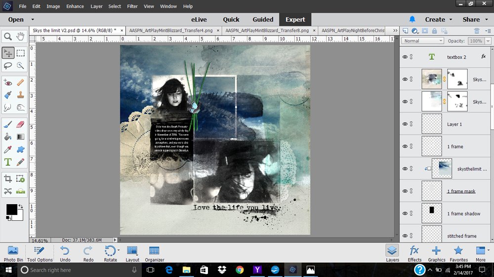
I finished up by adding WordART from Life WordART No. 5, a Lacy Texture from ArtPlay Palette Shabby Christmas, and the same pine needles from ArtPlay Palette Mint Blizzard that I had chosen for the original layout.
I also added a little butterfly from ArtPlay Palette Sky’s The Limit.
I was really happy with the color effects I was able to achieve by simple techniques like clipping to masks and overlaying with Blending Modes, thanks to the layout of the FotoInspired Template.
Click on the above image to see digital supplies used in Before and After ART rePLAY No 5.
Stay tuned for more Creative Team insights to be shared in the Before and After ART rePLAY series.






LOL, like the after so much more, has extra visual impact. Fab idea to use the FotoInspired Template too.
Thanks, Christy, I’ve been wowed by the FotoInspired work in the gallery, but at first I didn’t think that the use of the templates was all that relevant to me because, with the kids out of the house, I don’t do that sort of documentation anymore. And then, with all the gallery examples, I realized that I was seeing things with tunnel vision. I will definitely be using more of these templates in the future!
Very nice! Plus, I love your comment “I don’t know what I was thinking when I made the original page…”. I have a few of those pages in my files, and even a few in print! Yikes. Love the rePlay and the great way you kept the rich, vivid blues!
Thanks for the kind words, much appreciated, Louise, And I definitely hear you, having made a TON of pages that now make me wince, and since I print as I go, ALL are there to remind me of my…shall we say…learning curve? Hahahaha! I guess that’s what keeps this all so interesting, all those steps forward and having a great community to share it all with!
Wonderful redo Laura, love how you used the foto inspired template!!
Thanks so much, Linda. I was really taken by the work I’ve been seeing in the gallery. These templates are SO versatile!
I like your take on the template. I would never have thought of using it in this way. Thanks for the inspiration. I really have trouble thinking outside the box.