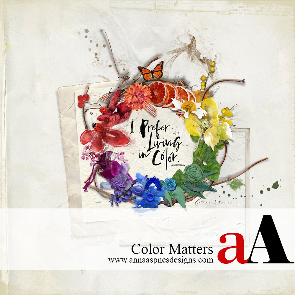
Creative Team Member, Marnie, shares her thoughts for why Color Matters.
Color Matters
Why is color important? Color can be a powerful design tool when used effectively. Color guides the viewer’s eyes to the desired focus, aids in story telling, and creates mood.
In this post, you will learn how to engage the viewer with color and create a sense of visual interest in your layouts using Anna Aspnes Designs products.
I love color. Oh, the memory of that first box of 64 crayons is still fresh decades later. Upgrades from the 48-pack included metallics, a built-in sharpener, and my favorite color, periwinkle…pure delight. I still get a little giddy when I think of cracking open the lid, tilting it back, and smelling newness and possibilities. I experience similar feelings and sensations when I open a new ArtPlay Palette from Anna Aspnes Designs…endless prospects!
Complementary Color Schemes
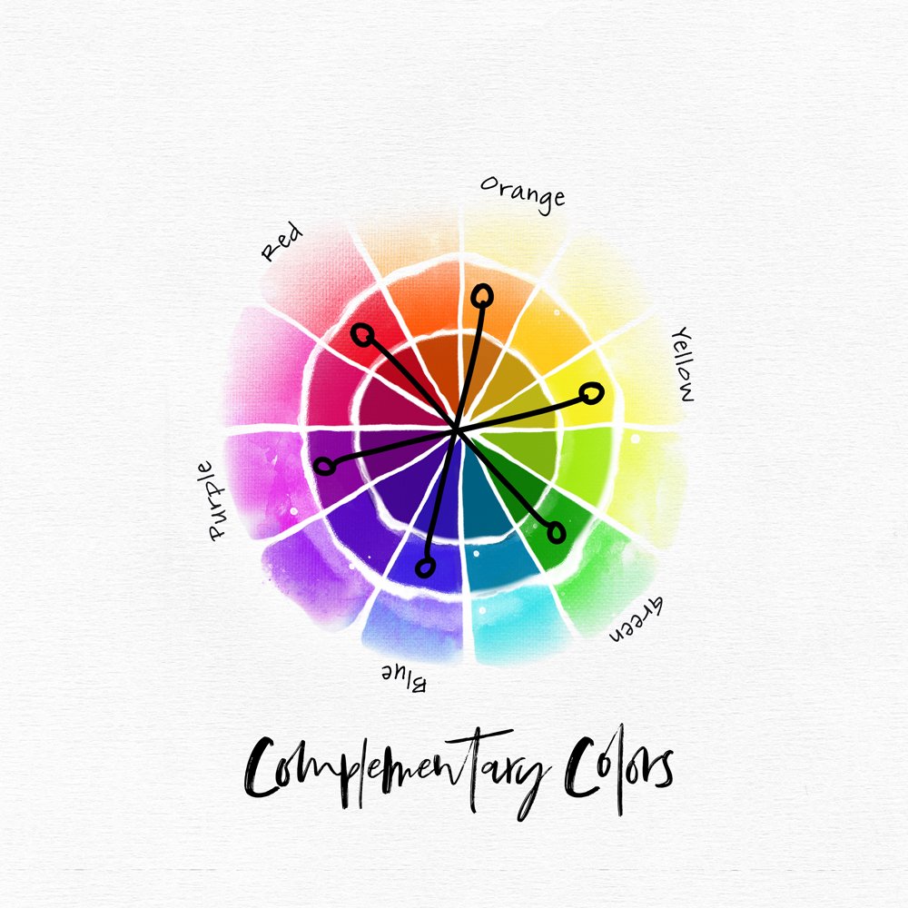
The topic of Color Theory is far too broad for one post so we’re going to focus on Complementary Color Schemes using the standard artist’s 12-color wheel.
Complementary colors are any two colors which are directly opposite each other, such as red and green or red-purple and yellow-green. The following layout examples focus on the Primary hues: Red, Yellow, and Blue; and the Secondary hues: Green, Purple, and Orange. These color combinations pop and are pleasing to the eye when used appropriately.
Red/Green Complementary Color Scheme
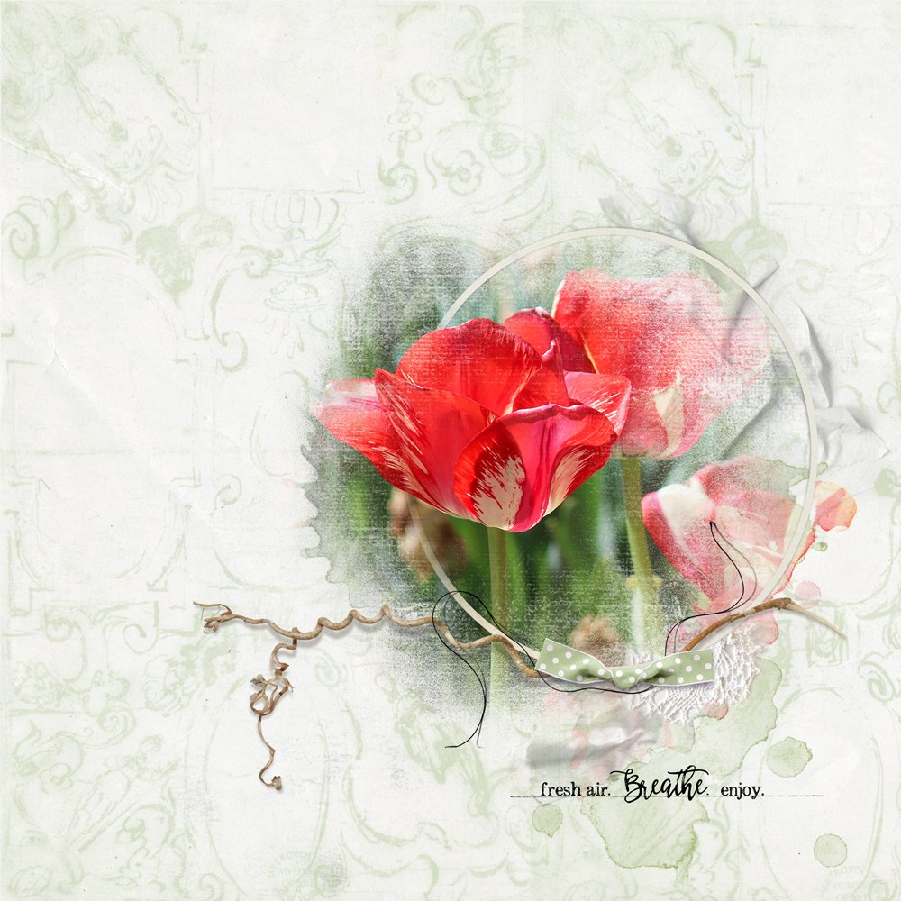
Typically, we think of Christmas associated with the Red/Green color scheme, but how about those red poppies against a grassy hillside or tomato and basil topping your favorite pizza?
The example below is straight forward using green accents to support red tulips. The gorgeous paper overlay is from ArtPlay Palette Meadow which was included in the 2019 National Scrapbooking Day Value MegaPack from Anna Aspnes Designs. I recommend revisiting your Christmas stash…Anna includes gorgeous frames, elements, papers, and transfers you can use year around.
Blue/Orange Complementary Color Scheme
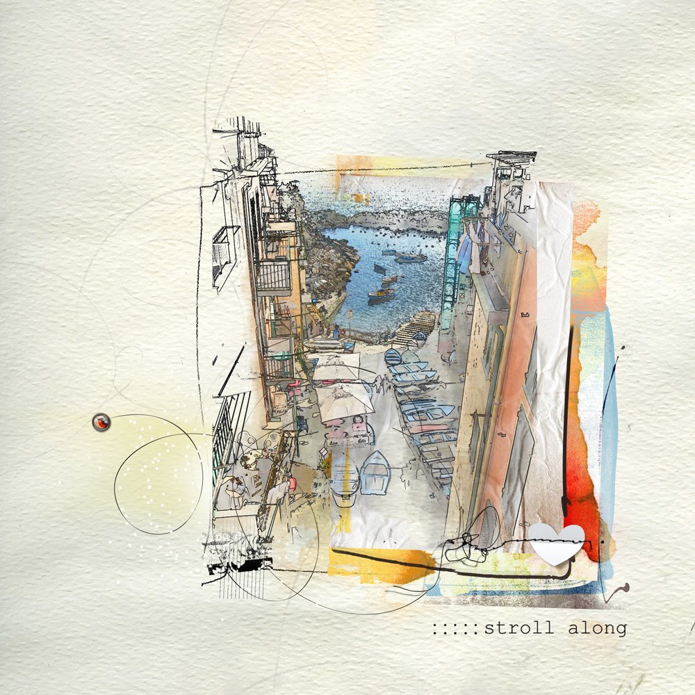
When scrapping your next sunset photo, consider supporting it with a Blue/Orange color palette…this cool/warm duo can be captivating.
After creating the layout of sea and boats, I was happy with the watercolor sketch but it seemed incomplete. With the addition of a transfer from ArtPlay Palette Crazy Life, it came alive. The vivid orange vertical paint brings the water forward so it doesn’t get lost in the background.
Yellow/Purple Complementary Color Scheme
Spring ushers in those lovely old-fashioned purple irises with yellow centers…happy representations of the Yellow/Purple complementary palette.
In the final layout, a dear friend greets a bronze penguin. Her yellow top and the purple flowers overhead provided cues for choosing ArtPlay Palette Generations with its gorgeous plums and yellows. The leaves, from ArtPlay Palette Amidst, were recolored by adjusting the hue. Image> Adjustments> Hue and Saturation (Photoshop) = Enhance> Adjust Color> Hue and Saturation (Photoshop Elements).
Summary
Color is important because it affects how we perceive the landscape of our lives…literally and psychologically. Figuring out which colors work well together isn’t just a matter of chance. There is a science behind color interaction. Once you know the basics, you can take liberties with these color combinations…the fully saturated blue and orange mute into a smokey blue and a warm peach. The complementary color scheme provides the greatest amount of color contrast, therefore it comes with a caution. When complementary colors are used at full strength/saturation and in equal amounts the result can be jarring. For an example, see Van Gogh’s painting, The Night Cafe, in which he intentionally uses red and green to express an unsettling effect. For a harmonious effect, it’s best to use one color of the complementary pair as dominant and the other as an accent.
- Up the color and pizzazz of your digital artistry and scrapbooking projects with Anna’s COLOR TECHNIQUES Self-Paced Class.
- Read ‘The Power of Color Adjustments’ by Creative Team Member, Miki, on the aA Blog.
- Read ‘Tutorial | Create Cohesion with a Color Fill Layer’ by Creative Team Member, Ulla-May on the aA Blog
- Check out AnnaAspnes Designs ArtPlay Palettes for Complementary color schemes.
Post your digital artistry and artsy digital scrapbooking pages in The Gallery, and if you liked this Inspired by this Color Matters Tutorial, I would be grateful if you would consider sharing it with your digital friends using the social media buttons below.







A fresh reminder about the color wheel is always a delight, Marnie! Thank you for sharing your insight and perspective how it all flows together, and keeping in tune the saturated and accent colors. Love this post, and the linked ones to review.
Sure appreciate the feedback! Thank you, Beverly!
Superb blog post, Marnie. Informational and interesting. I, too, was fascinated with my crayons. Color makes everything pop!
From one crayon lover to another…Thanks, Christy! Appreciate the comment!
Yes!
Great tutorial! Love color!
Thanks, Miki! Just admired today how you changed a lemon into a lime…fun with color!