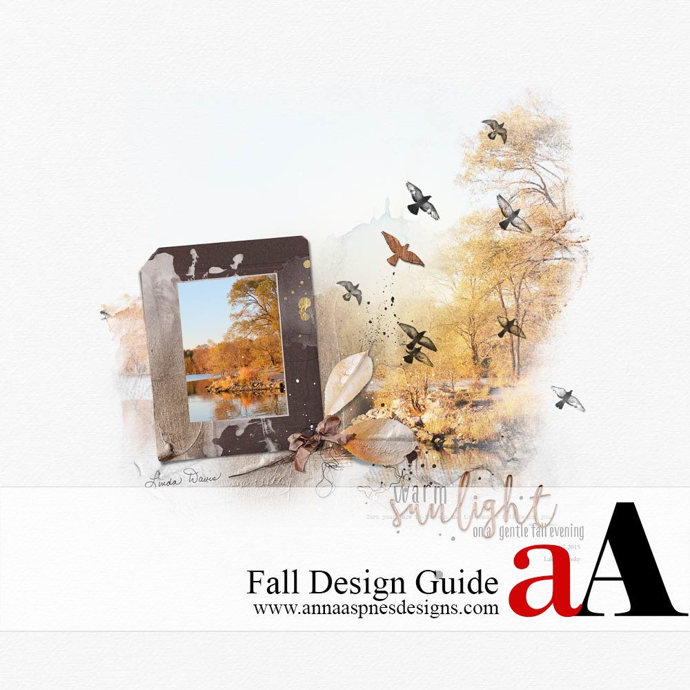
As part of a new fall series, Creative Team Member Linda Davis shares her Fall Design Guide Tutorial from an excerpt of her blog post, Warm Fall Sunlight.

Fall Design Guide
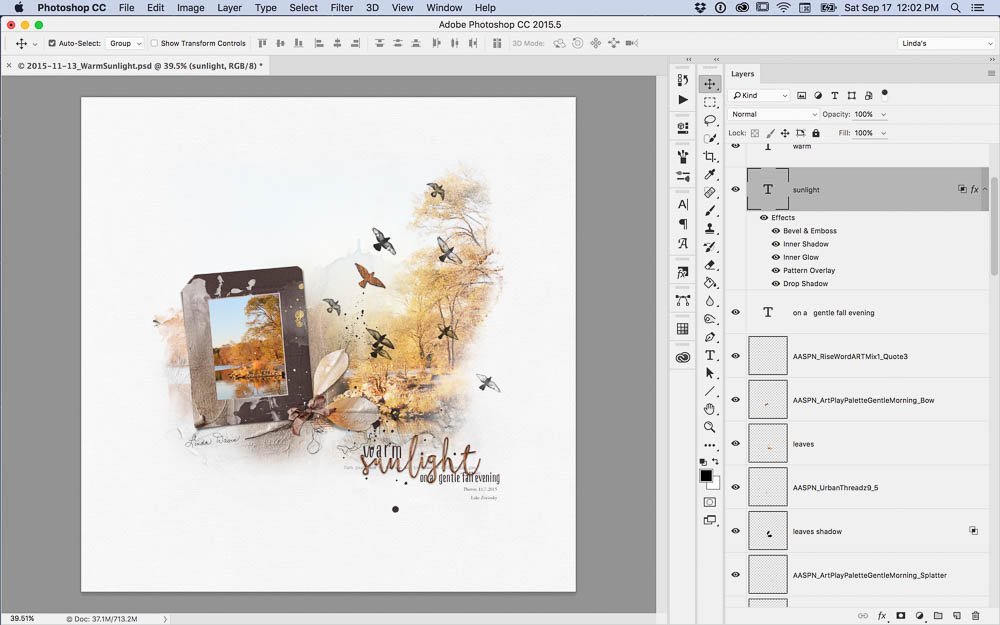
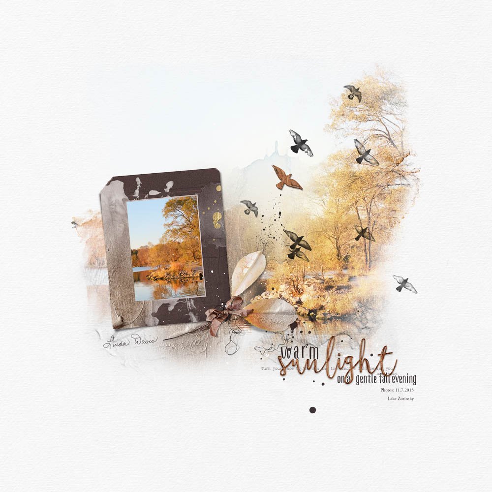
In September, I wrote in a post, Then and Now, that “…there are layouts that I created early in my art play that I still love. There are also layouts that I’ve actually deleted from my Oscraps gallery.” Below is one of those layouts that I created last fall but still love for a number of reasons. I love the white space, the asymmetrical but centered design, the depth and interest created with two versions of one photo, the fall color and texture. I also like the mix of fonts in the title. I used ArtPlay Palette Gentle Morning to create a page simply for the sake of art. I hope this tutorial inspires you to create a page of your own.
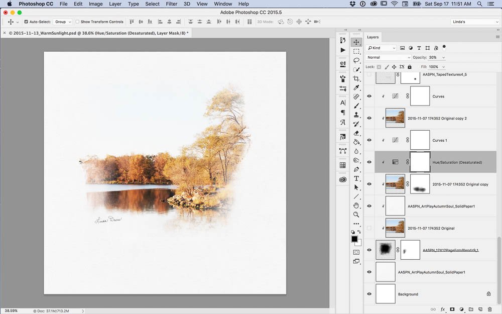
Select a Photo. Select a photo, duplicate it and link the copies. Give one copy a high key lighting effect using either a plugin filter like Topaz’s Adjust or adjusting the curves with an adjustment layer. Resize mask 1 from 12×12 Page FotoBlendz No. 9 and the photo as needed. Clip solid paper 1 from ArtPlay Palette Autumn Soul and the high key photo copy to the mask. Change the blend mode of the high key photo to multiply. Add another copy of the high key photo on blend mode soft light or overlay at 30%.
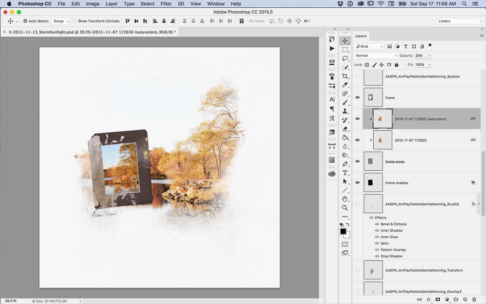
Frame a Second Copy of the Photo. Place the frame and clip another copy of the photo to the frame’s mask. Increase the saturation on this copy of the original photo with the Camera Raw filter. Position taped textures 5 and 9 from TapedTextures No. 4 below the framed photo.
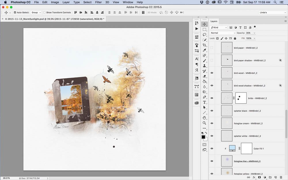
Add Texture and Interest. Place brush 5, transfer 4 and overlay 2 from ArtPlay Palette Gentle Morning above the photo clipped to the fotoblendz mask. Add the layers of file 2 from MultiMedia Birds No. 1. Note: I turned off some of the layers, added a color adjustment layer and erased a few of the birds using a layer mask.
Create a Cluster and Title. Create a small cluster with leaves and a bow from the ArtPlay Palette to anchor the frame to the page. Mix fonts and word art to create a title summarizing what you might have said with more detailed journaling. Place a quote from Rise WordArt Mix No. 1. Above the quote, extend title with a phrase. Add a wood style to one word in the title and give it a small drop shadow. Add the date and place.
I hope that I have inspired you to create a layout based on this tutorial. I encourage you to create a page with white space, an asymmetrical centered design or repetition of a photo with different treatments. Say something about your photo on your page with fonts and word art rather than traditional journaling.
We would love to see you create a Fall Design Guide layout with this tutorial so we are offering a $2 Discount on Rise WordART Mix No. 1 to help inspire you! Use the following coupon code:





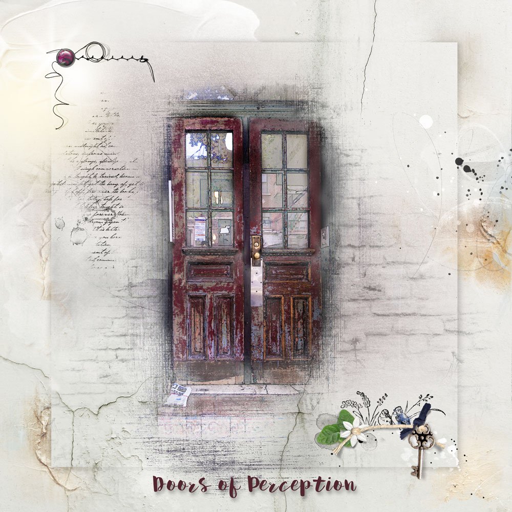

Thanks so much, Linda! Really enjoyed this tutorial…big help with my most recent post! Well written and easy to follow!
http://ozone.oscraps.com/gallery/showphoto.php?photo=359140&nocache=1
Love your take Marnie. It so fun to see how the inspiration and tutorials here translate into the artistry of others 🙂