

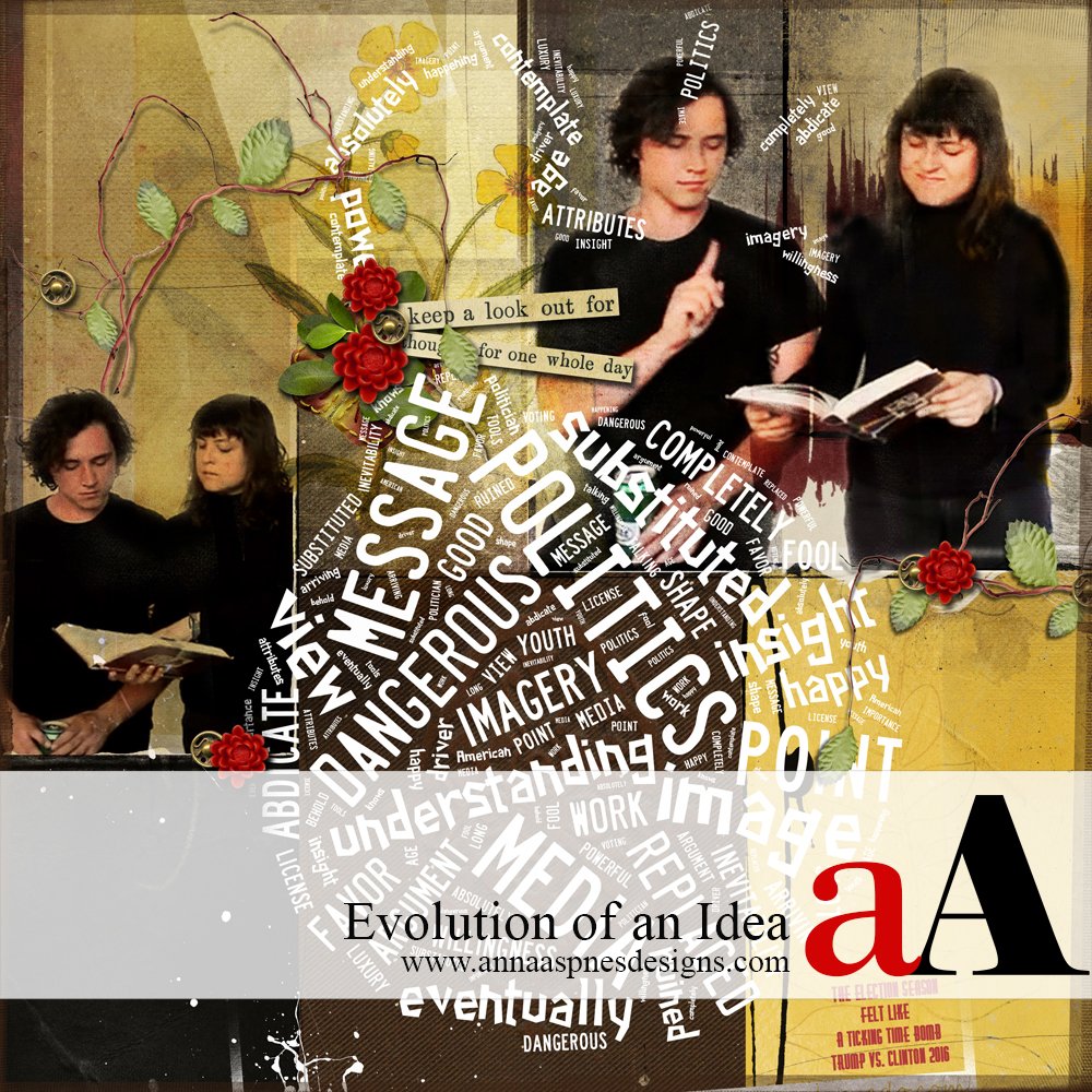
Today, Creative Team Member, Laura is demonstrating her Get Started With Idea Evolution process with her ‘Ticking Time Bomb’ layout in Adobe Photoshop.

When I am trying to evolve an idea that is more about content than artful presentation, sometimes the most challenging work happens at the front end, in just getting started. Letting an Artsy Paper lead the way has proven helpful to me time and again.
In this layout, with political campaigning now at full throttle, I wanted to make a page for my scrapbook documenting the contentious spirit of this election season.
My concept was to make a page about not believing everything you see or hear—bad or good—just because you read it or hear it. How I approach a documentary page like this is different from when I am working in a more artsy mode.
Get Started With Idea Evolution

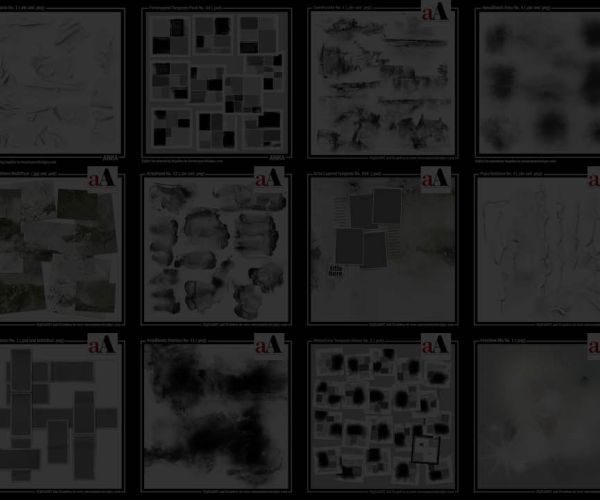
I started with two photos, of my daughter and her partner, that seemed to represent the idea pretty graphically. These were low-resolution screen shots from a music video with awkward crops. When I am in this position with photos, my first step is often to choose an Artsy Paper, just to get a feel for how to direct the composition.

I scrolled through my Paperies looking for papers with strong horizontal lines that might work with the cut-off bottoms of the photos. I selected several, set the photos to Multiply Blending Mode, and gave each a try. I ultimately chose ArtsyPaper4.jpg paper from the ArtPlay Palette Tapestry.
 Here is how the photos looked with some of the other options. Each of these choices could have taken the composition in a totally different direction.

With the addition of a little masking and resizing, and a switch from Multiply to the Hard Light Blending Mode, I felt like I had the structure in place and could proceed with adding embellishments to support my concept.

Because of the subject matter of the design, I chose to incorporate a word bomb made with quotes from Marshall McLuhan, the philosopher who coined the phrase “the media is the message.” (Thanks to Hoodsmom, for the link to the word-cloud site ). I saved the word bomb in black on white—by using Screen Blending Mode I was able to knock out the background without having to do a laborious extraction.
I added textured overlays from ArtPlay Palette Tapestry, some foliage and an edge treatment and was done.


This is so very interesting, for so many reasons. The subject, process, word bomb are so intriguing, but I think I like the triangulated flower clusters the best. I have such a time adding flowers and bows sometimes, thinking, my page has nothing to do with flowery, bowy things. Yet these little clusters of red and gold add such wonderful visual anchors to the composition. Enjoyed this!
Thanks, Diane! I used to be a Button Only person but now I’ve branched out (literally) into flowers and other botanicals and even (gasp!) ribbon on occasion. One of the reasons is that I’ve found that an overlay of embellishments can really anchor the eye and give direction to the (very) full pages that I tend to compose, which is why I use them a lot in the Visual Triangle Configuration. Once I developed a purpose for the clusters, my head got around the fact that sometimes they didn’t have much to do with the actual content. Believe me, I know what you’re saying about that!