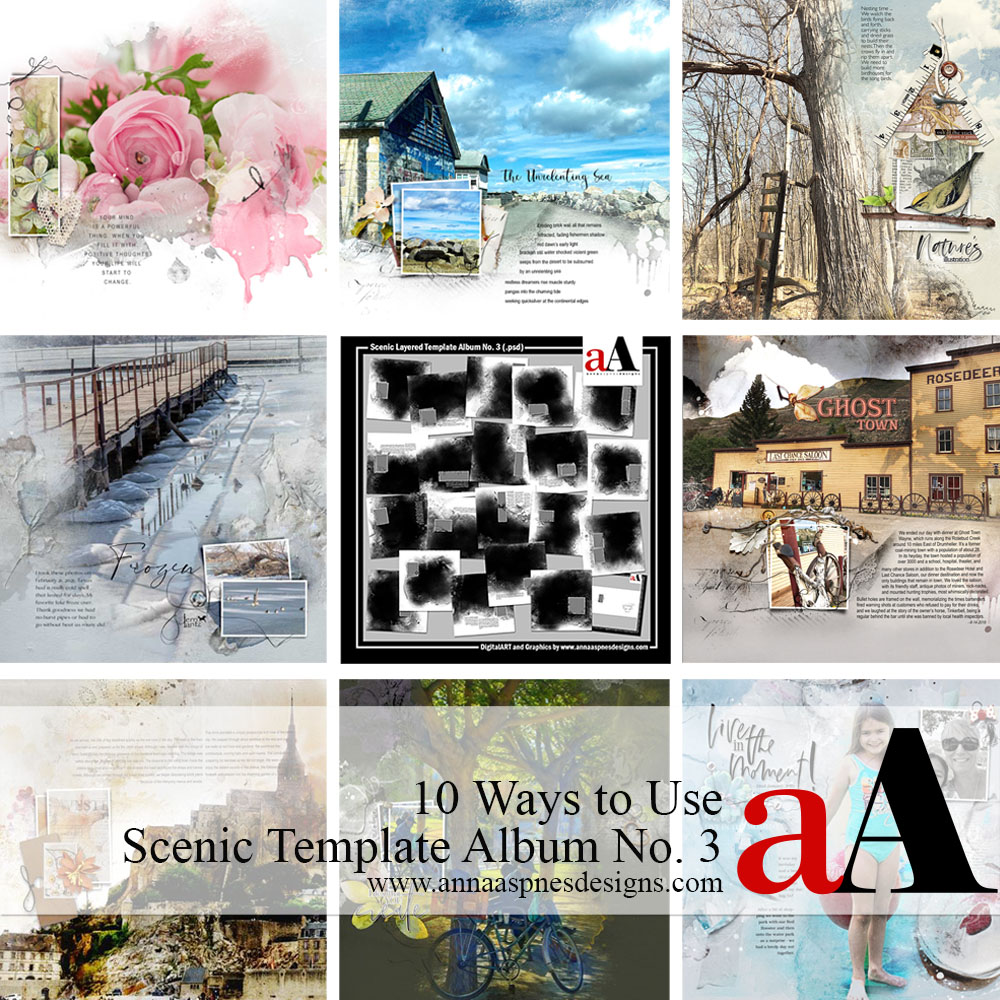
Happy Monday! I’m delighted to be sharing a new 10 Ways to Use Scenic Template Album No. 3 post today.
10 Ways to Use Scenic Template Album No. 3
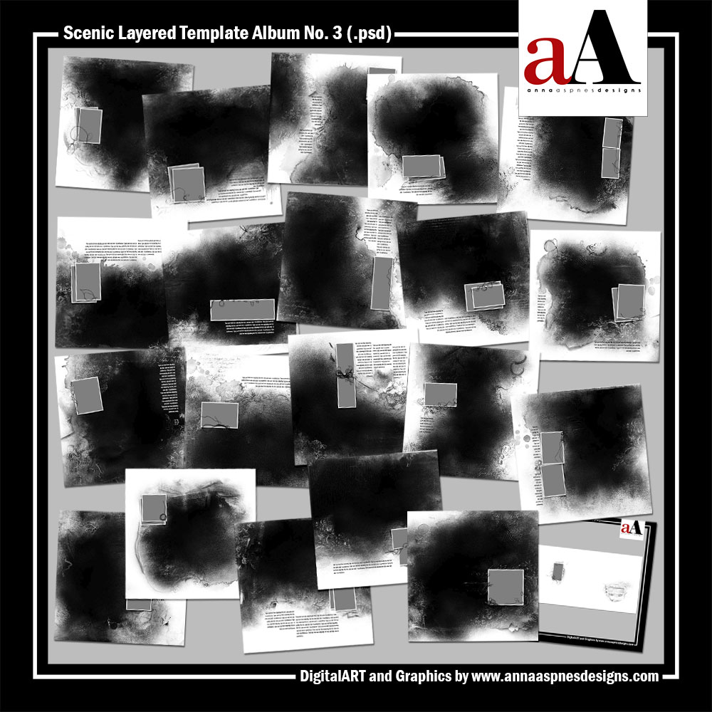
A collection of 20 – 12 X 12 artsy and blended layered templates.
The product includes:
- A BONUS Cover Set for photo book printing.
- All layer styles, masks, frames, brushwork, stitching, titles and text boxes as shown.
Use for blending large photos in photo book format such as scenic, landscape or panoramic images.
- Templates may be used independently as individual layouts or combined to create cohesive double-page spreads.
- which can be used with the clipping mask function and for recoloring in Photoshop, Elements and Paint Shop Pro.
- Clip your images to the FotoBlendz masks and add your own personalization through DigitalART supplies and words.
THIS PRODUCT IS FOR PERSONAL AND LIMITED COMMERCIAL USE. View the complete Terms of Use for details.
Ideas to Inspire
This post provides 10 Ways to use the Scenic Template Album No. 3 in your photo artistry and digital scrapbooking layouts.
Click on the images below for aA DigitalART supplies and bonus process notes.
1. Frame with Elements
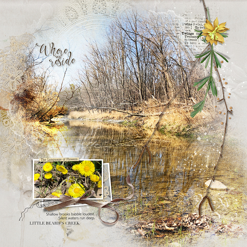
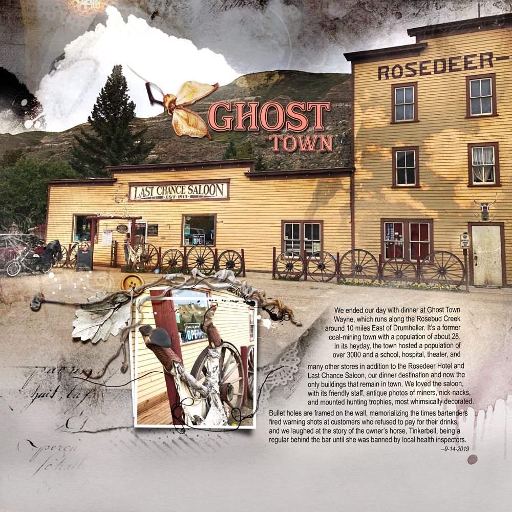
Place elements along the edges of the blending photo to frame.
- Notice how the twig and lace elements from ArtPlay Palette Narcissus Align with the edges of the blended template photo.
- They ‘sandwich’ and consequently draw the eye to the large image Focal Point.
- The addition of the frame creates a Visual Triangle.
See also:
2. Dark Background
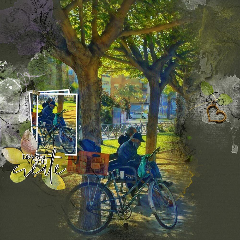
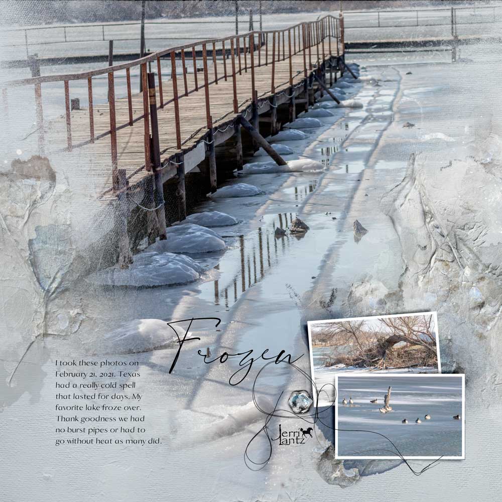
Select a darker background to create contrast.
- Notice how the lighter bright greens ‘pop’ against the more muted darker tones of the Solid Background from ArtPlay Palette Vie.
- The white and blues shades also become more noticeable bring great Visual Interest to your photo artistry layout design.
- You can also also adjust the Levels in Photoshop to make the hues in your image more Saturated.
See also:
3. Double Page Spread
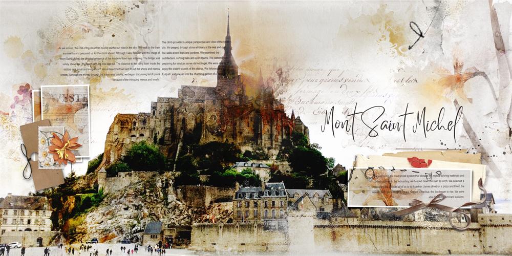
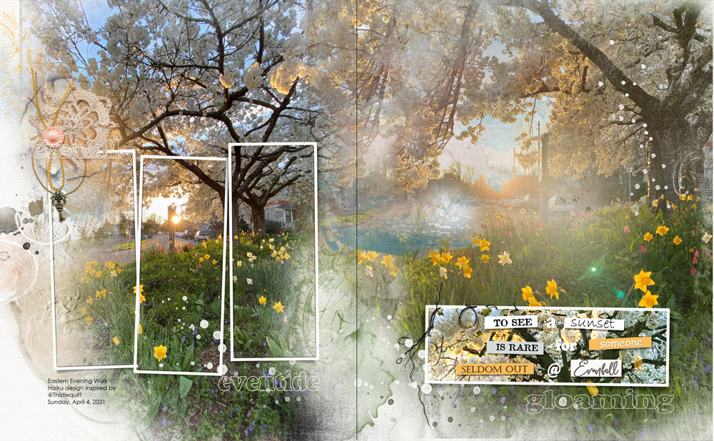
Use 2 coordinating templates to showcase a stunning panorama photo.
- Create a layout that is Twice the Width and the Same Height as your preferred layout design. e.g. 24 X 12 for a 12 X 12 digital scrapbooking design.
- Position the template layers on each side of the layout foundation then import your photo.
- Ensure the image spans BOTH the FotoBlendz mask layers, before clipping copies of the same image to both masks.
See also:
4. Modify a Template
Adjust the template to better suit your layout size preference and photos.
- Modify the template layers to best Enhance your story telling.
- Duplicate, rotate and reposition frames as preferred.
- Remove the mask layers to simulate a Window Effect.
See also:
5. Modify Clipping Masks
Make changes to the FotoBlendz mask layer so that it better supports your photo.
- Use Brushes to Modify Clipping Masks.
- Duplicate stain layers to increase their Intensity in your photo artistry.
- Experiment with Blending Modes to enhance the effect.
See also:
6. Elevate Color
Create brighter and more saturated colors using Blending Modes.
- Duplicate the photo layer clipped to the large FotoBlendz mask Multiple times.
- Apply Blending Modes such as Screen and Overlay to the different layers.
- Adjust the Opacity to yield desired effect.
See also:
7. Frame a Frame
Use embellishments around a frame to add more visual weight.
- Draw the eye to smaller supporting photos by embellishing a frame.
- Notice how Element Properties come into play in achieving design Balance.
- I love how the twig Aligns with the ‘mountain’ horizon.
See also:
8. Close-Ups
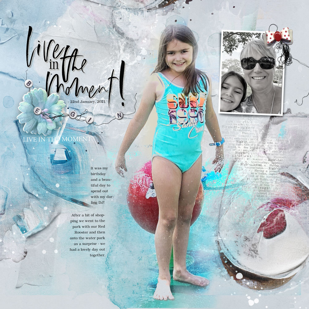
Accentuate detail using closely cropped photos.
- The larger FotoBlendz clipping masks bring greater Visibility to the details in ‘close-up’ photos.
- Use the smaller frames to provide a ‘bigger picture’ view of the Visual Story.
- Notice also how you notice the button element Encircled by the UrbanThreadz in the template.
See also:
9. Custom Element Clusters
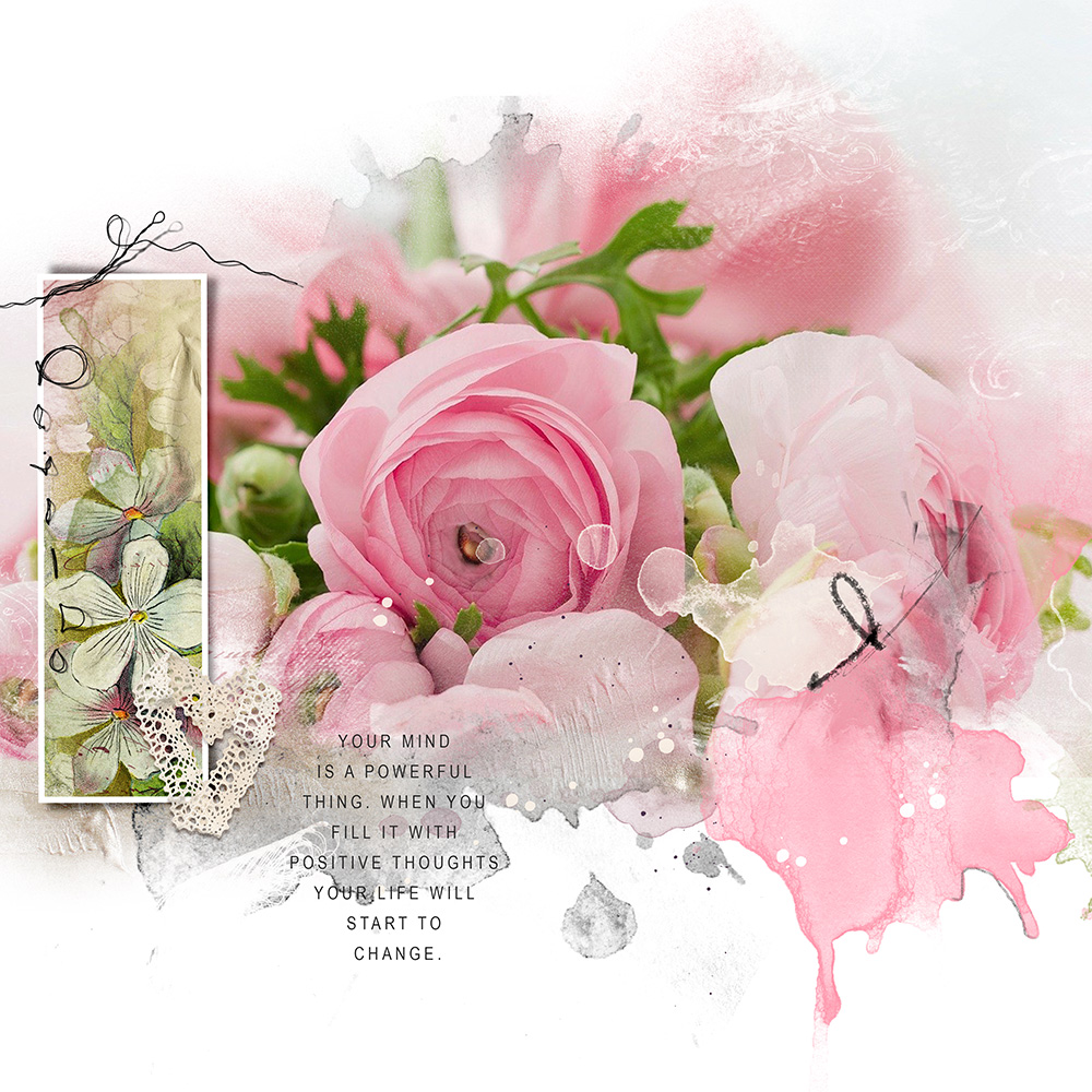
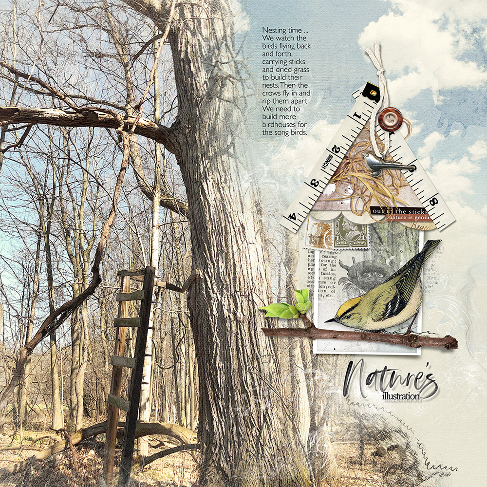
Large blended photos call for more extravagant embellishment.
- Single photos offer the opportunity to add MORE embellishment to create greater Visual Interest.
- Try your hand at Creating Custom Element Clusters Part 2.
- Miki has supported her digital scrapbooking theme by creating a clever little birdhouse.
See also:
10. Hide Stuff
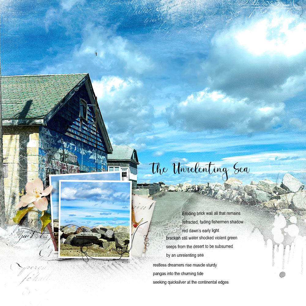
Use the frames in the templates to deliberately hide less attractive areas of a larger photo.
- Bigger Doesn’t always mean better.
- Larger photos make LESS attractive parts of an image more noticeable.
- Frames placed strategically over a larger photo are a great way to hide Imperfections.
See also:





Recent Comments